New vintage style basketball jersey
February 22nd, 2015 at 1:57 PM ^
Sent from MGoBlog HD for iPhone & iPad
February 22nd, 2015 at 1:58 PM ^
What tournament are your talking about? Seriously, doubt they will ever wear something like that. David Brandon is gone you know?
February 22nd, 2015 at 2:09 PM ^
February 22nd, 2015 at 1:58 PM ^
February 22nd, 2015 at 2:03 PM ^
or , to be brutally honest, you WANT it?
February 22nd, 2015 at 2:07 PM ^
February 22nd, 2015 at 3:37 PM ^
February 22nd, 2015 at 3:48 PM ^
Have you seen his room?
February 22nd, 2015 at 2:09 PM ^
YES! Those are awesome!
February 22nd, 2015 at 2:23 PM ^
February 22nd, 2015 at 2:34 PM ^
February 22nd, 2015 at 3:50 PM ^
It isn't the same thing as having real bills to pay every month. Clueless you are.
February 22nd, 2015 at 4:20 PM ^
Imagine how many alternate uniforms, Michigan Wheaties boxes, and Twin Cities socks could pay for a semester of college tuition.
February 22nd, 2015 at 1:59 PM ^
Sent from MGoBlog HD for iPhone & iPad
February 22nd, 2015 at 2:01 PM ^
WD now has competition!
February 22nd, 2015 at 2:03 PM ^
Sent from MGoBlog HD for iPhone & iPad
February 22nd, 2015 at 2:05 PM ^
Sent from MGoBlog HD for iPhone & iPad
February 22nd, 2015 at 2:07 PM ^
February 22nd, 2015 at 2:09 PM ^
Someone give me a price!
WD What's the price?!?
February 22nd, 2015 at 2:11 PM ^
February 22nd, 2015 at 2:13 PM ^
Okay now I need coupons!
Anyone got Adidas coupons?
February 22nd, 2015 at 2:21 PM ^
Ugly. Pinstrips remind me of the Yankees. Makes the yellow stand out like the halo around the Big House.
Kill it with fire.
#GetOffMyLawn
But seriously, the jersey is hideous
February 22nd, 2015 at 2:22 PM ^
short shorts than shorts.
gotta say, those are pretty sweet.
February 22nd, 2015 at 2:22 PM ^
February 22nd, 2015 at 5:02 PM ^
I have always preferred Adidas, too. It's partly because they dominate in soccer, where their designs are just. . . nicer. It's also because I was at UM during the divestment campaign, and really developed a dislike for Nike the company. I'm sure there's not much difference between their employee practices at this stage.
February 23rd, 2015 at 10:34 AM ^
in the reasons-to-divest department? hard to compete with nike's $1/howeverlong wages without doing the same...
Wilt scored 100 in canvas chuck taylors...
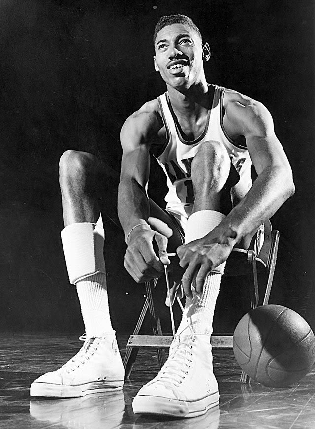
(money, it's NOT the shoes!)
February 22nd, 2015 at 2:31 PM ^
February 22nd, 2015 at 2:33 PM ^
Reminds me of the Pacers too much.
February 22nd, 2015 at 2:53 PM ^
Also see: 90s Houston Rockets.

February 23rd, 2015 at 8:28 AM ^
Yup. And when I think Pacers, I think Ron Artest, and that kills it.
February 22nd, 2015 at 2:33 PM ^
Not a fan of a whole lot of alternate jerseys...
But this is one is pretty sweet.
February 22nd, 2015 at 2:36 PM ^
Typical Adidas trash
February 22nd, 2015 at 2:50 PM ^
Oh good lord no. It's like a bad Steve and Barry's knockoff circa 1999.
February 22nd, 2015 at 3:00 PM ^
February 22nd, 2015 at 2:56 PM ^
Sent from MGoBlog HD for iPhone & iPad
February 22nd, 2015 at 2:58 PM ^
Also considering we've never worn anything remotely resembling either the shorts or the jersey. With a few legitimately good throwbacks over the last couple years (the 80s home and away unis, the 60s throwbacks), why go with this made-up, cheap, offbrand-looking garbage?
February 22nd, 2015 at 3:02 PM ^
February 22nd, 2015 at 3:04 PM ^
Sent from MGoBlog HD for iPhone & iPad
February 22nd, 2015 at 3:25 PM ^
February 22nd, 2015 at 3:52 PM ^
Here's the whole shebang together:

Yikes.
February 22nd, 2015 at 3:59 PM ^
Thanks for posting this.
I love em. They're sick. They kind of look like the old Pacers uniforms.

February 22nd, 2015 at 4:00 PM ^
Sent from MGoBlog HD for iPhone & iPad

February 22nd, 2015 at 4:14 PM ^
Your Hail and Unite boys.
February 22nd, 2015 at 5:51 PM ^
February 22nd, 2015 at 5:09 PM ^
but then I quickly changed my mind. Once I accepted the pinstripes, I realized that they're actually pretty clean (without all the frilly gradient dots that have been the style as of late).
February 22nd, 2015 at 6:53 PM ^
Looks like FUBU to me. No thanks