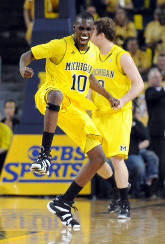
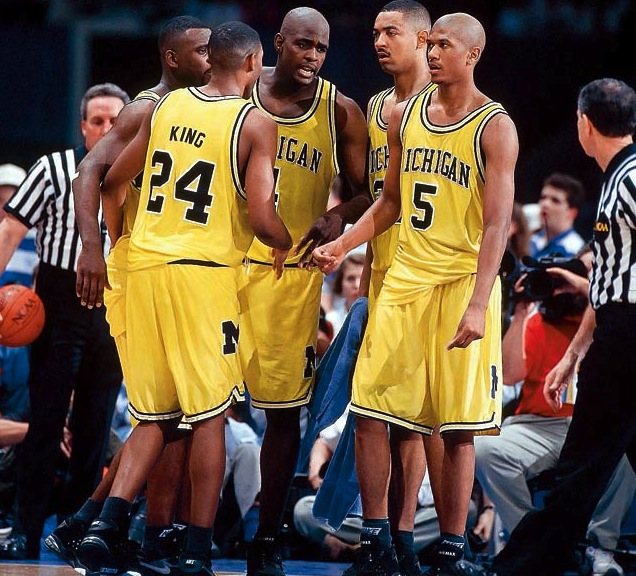
New Michigan Basketball uniform design (photo)

Following the adidas pattern of the changes they make to their Basketball uniform templates, the new one is due up for 2014-15 since they usually go 2 years and then change.
Example-
2008-09 - 2009-10

2010-11 - 2011-12
2012-13 - 2013-14

Adidas has released their complete line of catalogs for 2014-15. Here is what looks to be their new uniform template.
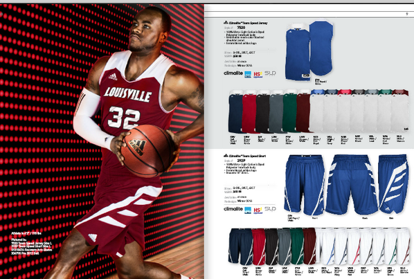
What backs up the claim this is this the new design is that it said they are available "at once" and the redesign will be two years from now, in time for the 2016-17 season.
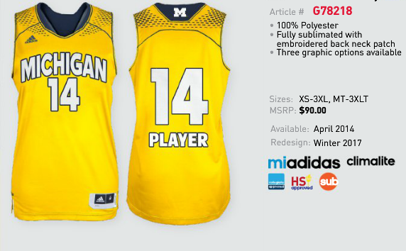
Bonus: this is a jersey the Women's team will be wearing next year. WTF
There is no way in hell this is their standard Maize uniform. This HAS to be a one-off or a special alternate similar to the Bleed Out. They should name this line "My Eyes Are Bleeding Out"
/ducks tomatoes
Those uniz are atrocious.
I'll never understand why people get so bent out of shape over waredrobe changes...my assumptions is its mostly old people who hate change.
I agree that people hate change and usually assume the worst, but that particular jersey is ugly and ridiculous.
It's alumni and fans who don't want to see Michgan wearing atrocious looking uniforms. Most fans don't want their team to look like a clown show on the field or court.
it;s pretty clear that a huge % of the population think these kind of uniforms are anything but atrocious...esp those who are currently or soon will be enrolling in college. i don't think its makes a bit of differnece whether your Oregon or PSU, what people think of your team is based mostly on performance, but piping and color schemes.
is always the most important thing. That's a given.
Kids with their Zimas, hula hoops, pac-man video games, and Dan Fogelberg music probably like the jersey changes.
I dont know about that. I was "old" back when these came out and still think they are the best looking uni's Michigan has ever worn and wish we'd go back to them.

the big M needs to come back to the shorts.
to your top pic as Adidas would probably ever get. Of course they're heavily invested in change for change's sake plus they apparently like the sports bra look for guys. I suppose it's too much to hope that they would go back to something simpler like that.
That uniform looked good except for the tiny M on the shorts. Almost like Adidas asked "What's our smallest font available? Go ahead and use that for the M on Michigan's shorts."
Dammn shame our maize being held hostages by nike. I'm for change...just not for any kind of change,tho.
Although I understand the logic from the OP and agree this is a viable and postable thread I am not going to react until we know for sure just what the new uni is if any. If DB ever alllowed this on the floor there would be a riot.
It's a damn jersey. Objectively, they're not aesthetically terrible. We're not talking about changing the winged helmet or anything. So what's the fuss?
Many of us will be staring at people wearing that jersey for 30-60 hours in the next year. Maybe it's not "aesthetically terrible," but it would be nice to have a jersey that (1) doesn't just look like an intern used the "paint" tool to recolor the jersey of any other Adidas school, (2) doesn't look like a strapless dress, and (3) gives some hint of the tradition and pride of our school.
If I ran, say, a consulting firm, and gave each client exactly the same report, except I changed the colors and put the client name on front, I bet my clients would be pissed. So why is this acceptable in the sports world? Like it or not, our uniforms are the face of the university to most Americans, so it would be nice if we weren't just lumped in the same pool as everyone else.
I've heard that #14 is quite a player.
I hate adidas so very, very much.
can go away any day now.
Bring back the '89 look... and while they're at it bring back NIKE.
Everytime I've looked at the men's basketball jerseys in their latest incarnation (and it looks like it will continue next year) I've thought that the differentiation between the shoulders and the body of the jersey makes it look like they are wearing women's busteirs (or corsets). The pattern and the coloration creating a beautiful sweetheart neckline highlighting the bust. It's weird.
that's the worst uniformz in the history of uniformz. i hope that our contract has a "no fucking way" clause.
Where are the sleeves and v-neck?
/s
For 2014-2015...must....bring....back these classics...and with the high and tights.

Away whites 1975 - Rickey Green on the right vs. Notre Stain.

August 9th, 2014 at 10:02 PM ^
sucks giant ass clowns.