Better look at the Nike Michigan Hockey road jerseys......woof

The original retail jersey looked better than this.
These are the ones the players will wear. Cluttered sleeves, cluttered front......not great, Bob.
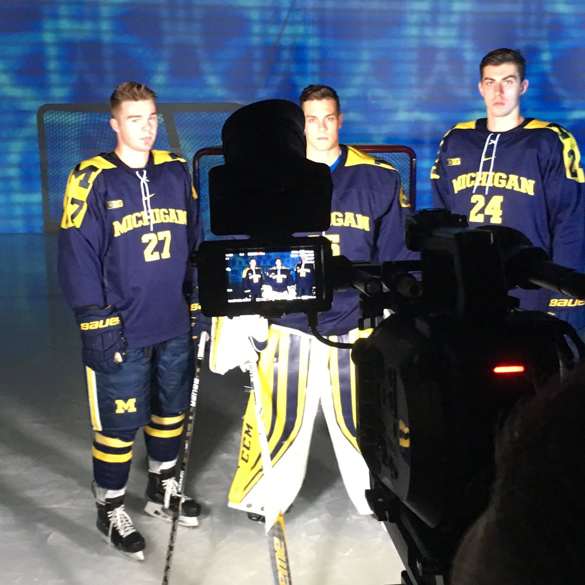
Friday night video session with the boys! #GoBlue pic.twitter.com/Fzb6yrBjue
— Michigan Hockey (@umichhockey) September 23, 2016
September 29th, 2016 at 3:25 PM ^
Red, your girlfriend. Woof!
September 29th, 2016 at 3:34 PM ^
Look what you did you little jerk!
September 29th, 2016 at 3:38 PM ^

Here's a fun fact. The "girl" shown above is actually a boy with a wig on. Apparently, the director did not want to hurt any girl's feelings. : )
September 29th, 2016 at 3:42 PM ^
I never knew that but it makes sense. That seems like a John Hughes kind of thing to do.
September 29th, 2016 at 3:46 PM ^
Yes. You have posted that before.
September 29th, 2016 at 3:51 PM ^
Damn. Must have forgot. Fuck me right?
September 29th, 2016 at 4:15 PM ^
and I'll let you know. In the meantime, thanks for the tidbit.
September 29th, 2016 at 3:57 PM ^
September 29th, 2016 at 4:23 PM ^
Sent from MGoBlog HD for iPhone & iPad
September 29th, 2016 at 4:35 PM ^
Isn't the director's name Chris Columbus?
September 29th, 2016 at 5:53 PM ^
September 29th, 2016 at 3:57 PM ^
September 29th, 2016 at 6:33 PM ^
Sent from MGoBlog HD for iPhone & iPad
September 29th, 2016 at 7:18 PM ^
Not a Michigan hockey fan?
September 29th, 2016 at 3:25 PM ^
Yeah, no.
Never liked the script version either. Just a nice, big BLOCK M, please.
September 29th, 2016 at 3:37 PM ^
compared to the pants
September 29th, 2016 at 3:25 PM ^
September 29th, 2016 at 3:29 PM ^
There is always a contrast between pants and jerseys, due at least in part to different material. The light makes it look worse than it is, but it's there.
September 29th, 2016 at 3:30 PM ^
Im assuming (and hoping) that since they are different materials it is the lighting
September 29th, 2016 at 4:25 PM ^
September 29th, 2016 at 9:05 PM ^
September 29th, 2016 at 3:27 PM ^
September 29th, 2016 at 3:28 PM ^
Eh. Don't like them, don't hate them. The block M on the shoulder it at least interesting, though I agree that it becomes way too busy. And the blue socks are a major improvement from the white ones that were glimpsed on Nike Launch Day.
I feel like this has other, subtle detail changes from that jersey as well, but my memory is fuzzy. Any pics of the original launch jersey?
September 29th, 2016 at 3:30 PM ^
Not the worst hockey jersey the team has ever suited up in by far from the best too. Ugh.
September 29th, 2016 at 3:33 PM ^
Point to the worst please if these arent.
Cause to me they are butt-ugly and I cant think of any worse in my lifetime (granted only 57 so maybe there were some earlier).
September 29th, 2016 at 3:39 PM ^
I disliked the Big Chill jersey more, and a couple of the one-off abominations that the team has worn. There was that "advanced" Nike template jersey that I believe they wore once in the GLI that I hated. Doubt I can find a pic for that, though.
They need to bring the 2004 jerseys back, full stop.
September 29th, 2016 at 3:39 PM ^
It's a matter of opinion but these two come to mind:


September 29th, 2016 at 3:53 PM ^
With the former, I generally agree.
The latter isn't my favorite but I consider it far superior to this year's jersey and many think of it as one of the classics.
September 29th, 2016 at 3:59 PM ^
Just go with this set please-


September 29th, 2016 at 4:01 PM ^
September 29th, 2016 at 4:35 PM ^
Yes... 100 times this combo...
Anything else literally a waste of time.
September 29th, 2016 at 4:46 PM ^
Throwback white? Not sure which one that is, but I agree on the other two.
September 29th, 2016 at 4:55 PM ^
The version before they changed the M to the thick Block M.
September 29th, 2016 at 5:24 PM ^
Sent from MGoBlog HD for iPhone & iPad
September 29th, 2016 at 5:33 PM ^
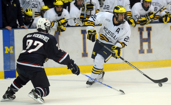
These are my favorite jerseys hands down. If there was one thing Adidas did really well it was the hockey uniforms.
September 29th, 2016 at 3:33 PM ^
On the far right.
September 29th, 2016 at 3:35 PM ^
September 29th, 2016 at 3:39 PM ^
Beat Wisconsin.
September 29th, 2016 at 3:44 PM ^
Adidas did a better job on last year's hockey jerseys. Would've liked to see a similar design from Nike. These are bad and remind me of some of the Olympic hockey jerseys they designed, with no jersey stripes. Looks more like a soccer jersey.
The maize jerseys look better, but I'd like to see the sleeve stripe pattern repeated on the bottom of the jersey.
September 29th, 2016 at 3:45 PM ^
Just imagine if the blue with the jersey matched that of the pants.
September 29th, 2016 at 3:47 PM ^
September 29th, 2016 at 3:53 PM ^
September 29th, 2016 at 3:53 PM ^
Well done.....NOT. They look like fecal matter.
September 29th, 2016 at 3:58 PM ^
Sent from MGoBlog HD for iPhone & iPad
September 29th, 2016 at 3:59 PM ^
September 29th, 2016 at 4:45 PM ^
Sent from MGoBlog HD for iPhone & iPad
September 29th, 2016 at 3:59 PM ^
September 29th, 2016 at 4:00 PM ^
September 29th, 2016 at 4:01 PM ^
September 29th, 2016 at 4:05 PM ^