Awesome Uniform Timeline on MVictors

Didn't see this posted anywhere but just want to make sure people know about this.
An accurate uniform timeline on MVictors. Throw away that wrong picture with a limited # of jerseys, this has everything you can think of. They even started one on just SHOES!
http://mvictors.com/?page_id=63647
My personal favrorite is something I had no idea about. That popular picture with all the jerseys shows a Maize jersey in the 60s which never existed. However, Michigan wore Maize jerseys. Once. The canary disaster of 1928-
11/10/1928 vs. Navy, Baltimore Stadium, Baltimore, MD
JERSEY: Navy insisted on wearing blue, so Michigan teamwore “bright yellow jerseys with blue numbers.
The team was said to look like canaries, and the uniforms
were put away after the 6-6 tie.”
Source: Champions of the West)
Further proof DB has been ruining Michigan tradition for over a 110 years. /Brian
The way that the MVictors post (a wonderful job, for sure) sets up, all you see is one change after another. Without a good appreciation for the growing rapidity of uniform changes.
The simple fact is that yes there have been changes, and no there is no good reason to expect that the Michigan uniform won't change and evolve in the future.
But the Brandon/adidas era does represent a time period in which there have been more changes for the sake of changes and promotion, than ever before. No, Michigan is not alone in that. Yes, other schools do it.
But some don't. USC and Alabama are the best examples. And the Trojans and the Tide clearly don't need uniform gimmicks to attract top-level recruits.
The MVictors timeline is a good tutorial. It is not a valid defense of clowniforms. And the striking thing to me is how awful most patches are. NO matter what the year, or what the cause. Bowl patches; tribute patches, historical patches: they all look like cheap generic soap containers.
The graphic timeline puts things in context; but I don't see it as a very good defense of the adidas clowniformz.
There's no doubt Brandon/adidas have been changing the uniform, more often and more radically, than in living memory.
Look at the 80's and 90's. Essentially each year has one change, which is the patch for the bowl - a minor thing. There are few other changes that were significant (e.g., the switch to Nike in 1994), but there's basically 1, maybe two, changes a year and they are essentially 1) patch and 2) perhaps something like helment decals. Earlier, the chart goes from 1968 and then jumps all the way to 1960, i.e., no changes to report.
Then you get to the last 3-4 years, and the changes go far beyond a different patch for each bowl. There's yellow stripes, blue stripes, number changes on jerseys, number changes on helmets, matte helmets, different socks, huge patches for 'legend' players, etc.
All this frequent change may be your thing, and thus not ruining anything, but it's not a "Michigan tradition".
Maybe 17, 18 year old recruits actually like the fact that we create different uniforms? As long as we win, I really don't care.
...to universities to change themselves. It's not the other way around.
One thing I will say about the recent use of alternative uniforms - one look and I know immediately which game is shown in whatever photo I'm seeing. I usually get all tingly when I see striped shoulders (UTL, Sugar Bowl), but I shudder and cower when I see any of the others.
Seem of the simple changes have been a positive in my opinion. The best example was probably the matte helmets. Simple change that is not altering the actual design. Recruits love these simple changes. I just wish if we we going to get them once or twice a season they could at least be original. Instead we get to watch Wisconsin and Nebraska sport the exact same design a year later.

Just, by far, my favorite white (road) uniforms ever.
[edit]: so entranced by the beauty of this uniform, that I did not notice what was over Molk's left shoulder.
Dat ass.
Calm down, Urban [reference to other thread about Meyer's azz fetish]
1st off this is fantastic!
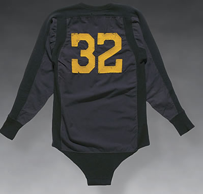
2nd. Am I the only one that wants a UM onesie from 1930? LOL
Note the number font on the old jersey. That font ought to be essential on any new design. We've departed from that font on a few designs ove the year, and if you're like me, you'd say, "That doesn't look right for some reason but I can't quite put my finger on it." It's the number font. When the jerseys are navy and the numbers are maize, with either a repition of the number or a block M on the sleeve, the number-font is what makes a difference.
Anthony Thomas jersey, with generic modern numbers:

1957 team photo (for more numerals than just "32", from Bentley. LINK for better resolution:

Onesie?
put the Big Ten patch on the uniforms. They caved.
damn, i guess kids in the 1890s loved them some beanie caps - that is the point of a uniform, right? the kids?
and I completely agree. Understated and classy. I just thought it was cool. I also am reminded through that history how much I do like the numbers on the helmets. Some may not agree, but I thought those were cool.
I agree. I wasn't a huge fan of the helmet numbers, or any time there were stickers involved. I am, however, intrigued by the matte colored helmets. I may have to try and pick one of those up sometime to add to my collection
It always comes up in a vague way, when people are discussing historic college football helmets from the late 1950's to mid 1960's.
It's been my conviction that it was a rule; I can hardly think of a school that did not have them during that general time period. But I have never found a link to a rule citation that proved the point. I suspect that there was a rule, or at least some semi-formal convention. Michigan only had the numbers for as long as it was mandated, give or take. (Michigan continued the numbers for a few years beyond what a few others did, but not much.)
I never cared for the numbers; it just busied up a classic design that did not need them. The numbers are fine on a plain design like Alabama. That uniform -- Alabama -- was made to have numbers on the side of the helmet. Michigan is just the opposite.
Ditto the "football" decals. Leave them to Ohio State; that's a helmet design that is made for them, and they have made it their own classic branding identity. Nobody (not even Georgia's dog-bones) does the helmet decal thing better than the Buckeyes. It does not matter who started it or who did it first. Hell, Michigan wasn't even close to being the first winged helmet design. But Crisler's teams made it an instant classic, like Bryant's teams made classic what we now know as Alabama's 1950's uniform, and what we now know as Woody Hayes' classic era for OSU uniforms.
Well don't I feel like the fucking ass hole...
looks like a marijuana leaf. they get all the good doper fans...
http://mvictors.com/WordPress/images/2009/image.jpg
That image was on the season tickets a while back. I have had a couple copies of the timeline in poster form hanging in various apartments over the years.
2004 I guess:

I'm a uniform nerd so this was really cool. But I have to say, even though I hated them at first, the UTL jerseys were very well done. Classy, not over the top, and as a previous poster said, it brings back the emotion of that game just from seeing them.
the UTL unis were really nice; the MSU bumblebee unis were the worst ever.
Does anyone suppose, that had the script of those two games (Notre Dame and MSU '11) been reversed, that people's impressions would also be reversed?
I have no doubt whatsoever that the UTL jerseys would be on the trash heap, had Michigan lost that game in a dull, defensive trash storm in which the most memorable plays were our quarterback getting repeatedly fouled and injured.
well in advance of the events in question. Certainly I would look more favorably on the MSU unis had we won. But I daresay that from many people's aesthetic perspectives--with the blue more dominant in the UTL gear--the ND game unis were more appealing.
I am with many people in disliking the constant avaricious tinkering with many schools' traditional game-day apparel. But I really thought the ND unis gave a sufficient and innovative nod to the school and its past to qualify as inspired.
agreed. I don't mind change if we stick with it and it is minor, but to go batshit crazy and have 5 different uniforms per year is Oregonish. Alabma, Texas, and USC don't need to change theres and we shouldn't either.
thank you for putting in. question for all: i had a sparty buddy tell me that sparty was the first with the winged helmet, and if not sparty, then princeton. i did see the early sparty 'wing' helmet (unknown year) and it just looked like a sperm was on the helmet. anyone know when sparty had sperm on their helmet? princeton?
Yes, MSC wore the winged helmet before Michigan did. And yes, Crisler brought it to Michigan from Princeton.
Nobody is quite sure who was first with the design. It definitely wasn't Michigan. And it probably wasn't Princeton either. But remember, it wasn't just some sort of symbolic design in paint. When it originated, it originated as a standard design-model by the makers of leather helmets. The wings, and the stripes, were integral/functional as part of the padding. MSC asked for an "S" stiched into the front of the wing.
When Michigan got is wings, it was a standard Spalding model (FH5). Anyone could buy one. Crisler specified Maize wings on a blue helmet. And it came with three stripes. You could order a one-stripe model just as easily. The MSC Aggies had the one-stripe version. Silver and black, their original colors.
True story!

on their helmet.