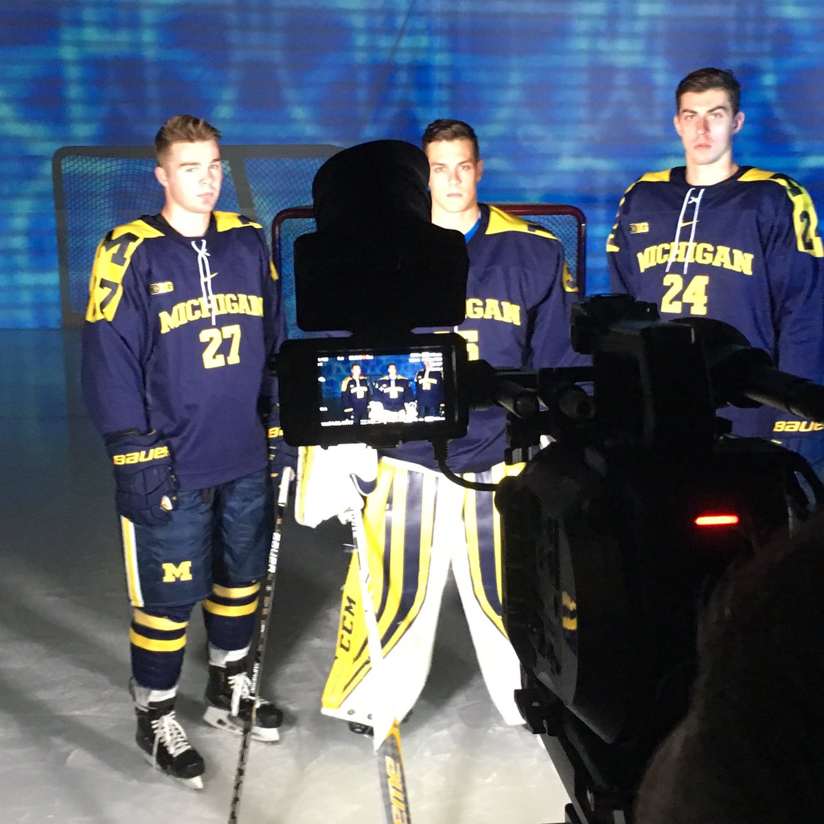
Better look at the Nike Michigan Hockey road jerseys......woof
The original retail jersey looked better than this.
These are the ones the players will wear. Cluttered sleeves, cluttered front......not great, Bob.

Friday night video session with the boys! #GoBlue pic.twitter.com/Fzb6yrBjue
— Michigan Hockey (@umichhockey) September 23, 2016
September 29th, 2016 at 4:14 PM ^
Sent from MGoBlog HD for iPhone & iPad
September 29th, 2016 at 4:15 PM ^
Sent from MGoBlog HD for iPhone & iPad
September 29th, 2016 at 4:15 PM ^
September 29th, 2016 at 4:21 PM ^
Sent from MGoBlog HD for iPhone & iPad
September 29th, 2016 at 4:30 PM ^
Sent from MGoBlog HD for iPhone & iPad
September 29th, 2016 at 4:34 PM ^
September 29th, 2016 at 4:35 PM ^
It looks like there were two competing jersey designs, and someone just said "Screw It! Let's cobble them together with random elements of both. Take the shoulders from one jersey and just go ahead and slap them on the other. Everybody wins!"
September 29th, 2016 at 4:37 PM ^
They still look like nice practice jerseys rather than anything you'd wear in a game.
September 29th, 2016 at 4:44 PM ^
September 29th, 2016 at 5:08 PM ^
beat wisconsin
September 29th, 2016 at 5:51 PM ^
Beat Wisconsin.
September 29th, 2016 at 5:54 PM ^
I expected Nike to fuck up everything hockey, but goddamn these are worse than I imagined. They somehow managed to make a jersey that is both bland and cluttered. Those are the biggest, dumbest-looking shoulder yokes I've ever seen, and then they cram both a shoulder patch and numbers onto them.
They better get some input from people around the sport and figure things out in years to come. Right now I'm just glad that I bought Reebok ones while I could.
September 29th, 2016 at 6:39 PM ^
Sent from MGoBlog HD for iPhone & iPad
September 29th, 2016 at 6:24 PM ^
Sent from MGoBlog HD for iPhone & iPad
September 29th, 2016 at 6:30 PM ^
that makes me question why design is even a college degree. I mean, you have to go to college to learn how to design utter s*$@ like this? Really?
September 29th, 2016 at 6:50 PM ^
September 29th, 2016 at 6:59 PM ^
And hockey has great unis, year in year out. I tried to warn people that Nike was a huge company with 100s of designers, that there were no guarantees. Oh well $.
September 29th, 2016 at 7:07 PM ^
September 29th, 2016 at 7:20 PM ^
Sent from MGoBlog HD for iPhone & iPad
September 29th, 2016 at 7:42 PM ^
Sent from MGoBlog HD for iPhone & iPad
September 29th, 2016 at 7:57 PM ^
Ultimately it's up to them to have some common sense and tell Nike to come back with something that doesn't suck.
September 29th, 2016 at 9:55 PM ^
I'm not sure who initiated it, but it has happened before. In the 2002-2003 season the team debuted new jerseys in a matte fabric with small "pit-stain" contrast mesh armpits and relatively classical striping similar to the uniforms in the 90s, albeit with the maize and white inverted on the blue jersey. The maize jersey had a script Michigan on it... but there was no underline, as in previous scripts. And the maize fabric contrasted rather harshly with the football maize of the helmets.
The uniforms were mothballed in midseason as a new set of uniforms, without the pitstains (or small sideblock Ms in the torso stripes) but with a new, nicer looking dazzle fabric and an underline for the maize jersey. That was, I am rather certain, a strong request from the hockey program. The new uniforms appeared quite different in texture and I strongly suspect were made by a third party and then stitched with Nike tags.
For what it's worth, I believe Ron Mason also rejected a jersey change for Michigan State when Nike first signed MSU to a deal. They simply wore their old uniforms for another year, then brought out a completely different design the next season.
September 29th, 2016 at 9:42 PM ^
Does anybody know why all Nike schools wear Bauer? Bauer used to be owned by Nike but Nike left the business years ago. Is it that Nike schools just don't want to use Reebok, CCM, and Warrior (owned by Adidas and New Balance)?
Just something I've always wondered...
September 29th, 2016 at 10:03 PM ^
That is a good question. I don't know how the equipment deals work for hockey, because it seems that when it comes to skates and sticks those deals mean nothing, but it does seem to dictate what gloves they wear.
September 29th, 2016 at 10:40 PM ^
I think hockey players are very picky about their skates and sticks and much less so on their gloves. I figured I would ask because if there's anyone in the world who may know it's WD.
September 30th, 2016 at 2:45 PM ^
I play hockey and players are definitely picky about skates and sticks, but is it just that much different than other sports? Are there no football or basketball players who choose to buy their own shoes or gloves rather than wear the provided ones?
September 29th, 2016 at 11:07 PM ^
September 30th, 2016 at 12:38 AM ^
I mean, the blues don't even match.
Sent from MGoBlog HD for iPhone & iPad
September 30th, 2016 at 6:19 AM ^
I really don't know much about hockey, never been a fan. The shoulders do look kind of odd but, they aren't that bad.
September 30th, 2016 at 1:45 PM ^
October 1st, 2016 at 1:14 AM ^
Sent from MGoBlog HD for iPhone & iPad
