OT: Nike changes Purdue's logo
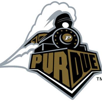
In the wake of my earlier board post about Northwestern getting Under Armour-ized, Purdue's student newspaper has published a story about how Nike has issued the university a new logo.
"It's really a Nike driven initiative," Associate Athletics Director Tom Schott said.
I had no idea that Nike and possibly other apparel companies were at liberty to up and change a university's logo. Apparently Phil Knight rules all.
http://www.purdueexponent.org/sports/article_0c4eceea-8f01-11e1-bbe0-00…

Looks like it came from ClipArt.
Not Nikes best effort. The old logo was quite a bit better.
Interesting. I don't like it, but don't hate it. Considering changes like this generally get a negative reception at first that's probably a good thing.
Also, for anyone still wondering, the full MMB will be going to Dallas. I know I read in the mgoboard update that they were unsure, but MMB's facebook page now says they will all be going.
...sucks. If I wasn't already familiar with Purdue, I don't think I would make out that it was a chugging train at all. Instead it has more the feel of looking down the smoking barrel of a gun or cannon.
Definitely not an improvement.
I see some strange creature hitting a bong, but maybe that is just my own personal bias.
It looks like a dial lock that is lying at the bottom of a staircase whilst stuck in a glob of cu...gum...
I hate it.
methinks they sold their soul if they gave up control of their own branding.
Doesn't matter so long as Purdue stays irrelevant in every meaningful sports. Can't wait for B10 hockey, so that they will have another thing that they will be irrelevant at.
They can continue to upset Ohio every other year, and that would be just fine by me.
The new logo sucks lol. I'd be pissed if I were a Purdue fan.
I had no idea that Nike and possibly other apparel companies were at liberty to up and change a university's logo. Apparently Phil Knight rules all.
It's been done before

Whether it sticks depends on the volume of fan complaints. But this Purdue update similarly seems to accomplish nothing besides enticing fans to buy new apparel without the old logo.
I was shocked by that quote from the associate AD, but to be fair, the article says that this is about a secondary logo, not Purdue's primary one.
Damn...I was really hoping it was Perry. That sucks.
When you're an ass clown like Danny Hope, you deserve to have to wear this logo.
As a reference point, I believe this was their logo before Nike re-did it:

Definitely like this one better.
EDIT: Just saw Turd's post. Guess this is still their primary logo?
“It’s really a Nike driven initiative,” Associate Athletics Director Tom Schott said. “Nike had come to us a while back with some suggestions. Nike said the train logo we used was not good on apparel. The smoke didn’t work on shirts and hats. They recommended this slight revision.”
http://btn.com/2012/04/25/nike-tweaks-purdues-logo/
That's more like it. Everyone is shocked that Nike is able to do this, but Nike will push for whatever they think will sell more apparel and it's in the best interest of the school to do so too.
Nike said the train logo we used was not good on apparel. The smoke didn’t work on shirts and hats.So why does the current logo also have smoke? How does this smoke work better on shirts and hats?
If I had a guess, I would say it has to do with symmetry.
Is why it's not selling shirts and hats...
i would guess that the P is still the primary logo and that the revised train replaces this one.
i rather like Purdue's athletic identity, the jerseys and field printing are set in something modern like Futura (its not technically...) while the P remains typical block lettering.

Purdue grad here... seriously I think the train looked dumb to begin with. Now it looks dumb in a different way. I am a bigger fan of the motion P myself. Unfortunately we cant have a timeless logo like the block M.
To the colors, it reminds me of the color creep mentioned on an earlier wall post. We are all witnesses of Michigan's migration from a deeper maize color to a more highlighter yellow color. This is accentuated by the more navy and less royal blue color of the uni's. Same thing happening here, no more Old Gold and Black, now it is Hollywood Gold and Black.
It looks like a train coming out of a gigantic nose made out of cocaine.
[insert "I Fucking Love Cocaine" jpg here]
No one outside of the Big 10 will know what that thing is supposed to be.
If you look at it a certain way it looks like the top-view of a cannon that was just shot with smoke coming out of the barrell.
Or some sort of metal object wearing a British Judge's wig.
reading fail
This is the other design under consideration:
I think the new logo is cross with the old logo
/thomas the tank engine in George Carlin's voice
The old logo is clearly better looking. This new one is some graphic artist totally phoning it in. You can't even really tell what that's supposed to be. Is that a train engine with smoke behind or it? Or is it a personalized Masterlock for Purdue fans? Or is it the bad guy from Fern Gully "riding' the top of that giant logging machine? Who knows and Nike probably doesn't care.
I will probably ruin the image for everyone. Look at it and think, little black penis pointing at a giant white veiny monster.
I may actually buy a Purdue shirt now so that I can point it out to my buddies.
To be fair though, I'm not sure that is a white veiny monster. Looks more like the Purdue phallus of justice is covering a criminal in some form of righteousness.
April 26th, 2012 at 10:15 AM ^
Boiler up indeed.
April 26th, 2012 at 12:02 PM ^
I dont get it.
You're saying that's a different logo?
April 26th, 2012 at 12:25 PM ^


