A Defense of the New B1G Logo

I know there have been quite a few critics of the new Big Ten logo around here. I thought some might find this defense of the logo interesting. I personally thing the B1G is much better than the BIG TEN variant.
Why Do College Sports Fans Hate The Big Ten's Smart New Logo?
December 27th, 2010 at 7:04 PM ^
I dont mind the B1G that much. But the division names are downright embarreseing
December 27th, 2010 at 7:09 PM ^
not nearly as embarrassing as your butchering of that spelling
December 27th, 2010 at 7:04 PM ^
You got drunk in Vegas and got a Tattoo with the new logo, didnt ya?
December 27th, 2010 at 10:39 PM ^
with tattoo jokes, for a long time.
December 28th, 2010 at 12:46 AM ^
Maurice Clarett's been gone for eight years. We're long overdue for some more Buckeye yucks 'round these parts.
December 27th, 2010 at 7:04 PM ^
I don't know what is worse. That G's attempt to be a 0 or the attempt for those jersey's to look like used tampons.
December 27th, 2010 at 7:34 PM ^
The G does make a good at attempt at you know, being a G.
December 27th, 2010 at 7:37 PM ^
I see it!!

December 27th, 2010 at 7:08 PM ^
It's not really a defense, as much as an explanation by the original designer why he thought his crappy ideas didn't suck. I mean, he can justify it all he wants, but B1G doesn't look like a 10, and every reproduction I've seen has the same shitty colors. It's not how it's printed. And really, contrary to what he says, I don't remember ANYBODY not liking the Big Ten logo with the 11 when they introduced it back in the day. Everyone thought it was a smart answer to the number problem. And would be too hard to incorporate more number changes? Except that the original designer gave them designs up to like 16. Guess if they became the "Big 128". It might be a problem...
December 27th, 2010 at 8:11 PM ^
It doesn't look like a 10 and reads more BIG than B 10.
December 27th, 2010 at 8:17 PM ^
Tom Hanks to start playing on giant piano keys.
December 27th, 2010 at 8:43 PM ^
"And would be too hard to incorporate more number changes?"
It's laughable --downright pitiful-- when someone rolls out the "Oh but it would be stupid to change the conference logo EVERY TIME the conference adds a new team!" So why change the logo this time? And how frequently is that going to happen, anyway?
/head asplode
December 27th, 2010 at 7:12 PM ^
I really, really like the small B1G logo, but the large one is just horrendous.
December 27th, 2010 at 7:15 PM ^
As a business owner who employs a designer to do a lot of logo and brand identity kit type work, I really think they blew this one. I have had my own hits and misses - impossible to create things that hit the mark every time. The trick is NOT to let the misses go public! The cutesy number/letter thing makes it hard to read. The color is awful. And the chunky font just looks stale. Overall it fails to provide any feeling of what the Big Ten was/is/will be. Do over time.
December 27th, 2010 at 7:25 PM ^
I'm not feeling it with the new design. It doesn't grab me, it doesn't project the image of the B10 well, and it isn't an improvement over the old logo. Even using the Big Ten Network logo with a 12th star would be better than this design.
December 27th, 2010 at 7:31 PM ^
Well said!

December 27th, 2010 at 8:40 PM ^
The G hurts my eyes when I look at it. It's like my brain wants to see a 0, because that's the obvious implication due to the presence of the 1, but it doesn't look like a 0 AT ALL. And that makes my eyes rain.
December 27th, 2010 at 7:19 PM ^
appear to be "you'll learn to love it", "there are other very simple logos that are good" and "at least we didn't do literal pictures of M-OSU football games, which we'll claim someone actually wanted to use".
Sure, they could've invented a new conference called The Intergalactic Twelve, and created a logo that consisted of a three-panel comic strip showing Herbstreit getting sacked, all in hues of baby-poo brown and magenta. And that would've been worse.
The fact that they didn't do the worst possible job doesn't mean what they came up with is a good design.
December 27th, 2010 at 8:04 PM ^
Sure, they could've invented a new conference called The Intergalactic Twelve, and created a logo that consisted of a three-panel comic strip showing Herbstreit getting sacked. . .
Is it too late to do this?
December 27th, 2010 at 8:21 PM ^
I'm down with that.
December 27th, 2010 at 8:52 PM ^
Or the IG2.
December 27th, 2010 at 9:04 PM ^
That's 102. EVERYONE knows that G=0. it's so obvious.
December 27th, 2010 at 7:23 PM ^
they chose are the worst part of it to me. I really can't stand the shade of blue that was chosen.
December 27th, 2010 at 7:33 PM ^
down with the baby blue
December 27th, 2010 at 7:41 PM ^
I didn't even notice that the BIG had a 10 in it until right now. I don't know if that makes me stupid or makes the designer bad. So i will choose the latter.
December 27th, 2010 at 7:54 PM ^
It's definitely the latter.
<br>
<br>Should have seen how long people were trying to see the nonexistent "12" when it first came out.
December 28th, 2010 at 1:18 AM ^
"were"?
"nonexistent"?
Is this confirmed?
Damn. Oh well, on to the next project... figuring out what all this "B1G" racket is all about
December 27th, 2010 at 8:27 PM ^
But there's a reason no school in the Big Ten has Cyan for a color.
December 27th, 2010 at 8:09 PM ^
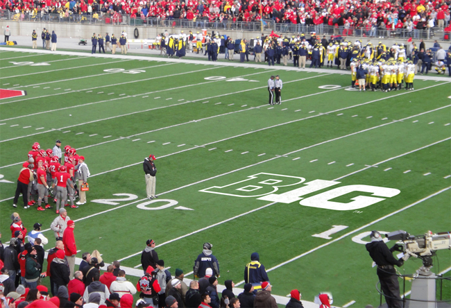
Should have had a two serve as the "hole" of the zero in 'Big 10' ... something similar to the O in this picture:

December 27th, 2010 at 8:19 PM ^
But almost EVERY idea put out there is better than what they came up with.
December 27th, 2010 at 9:02 PM ^
My first attempt at paint.

December 27th, 2010 at 9:12 PM ^
Draw that in crayon on a table cloth and we can fly it as a flag.
January 1st, 2011 at 9:27 AM ^
You should have taken up Paint a long time ago. I'd vote for yours over the "other logo" in a heartbeat.
Well done!
December 27th, 2010 at 8:12 PM ^
ever puts that logo on the field, I'm moving out west and finding a pac-10 team to be a fan of. Fanhood and alumni-ship can only be carried so far.
December 27th, 2010 at 8:14 PM ^
you are so right. Words that most never even notice during a game is a valid enough reason to like U$C
December 27th, 2010 at 8:18 PM ^
a Pac-10 team. I never said USC!!!!! I don't know that I would go that far!
Also, I don't know about most other Big Ten stadiums, but currently, Michigan Stadium does not have any logo on the field.
December 27th, 2010 at 8:32 PM ^
I'm all for keeping traditions, especially The Big House. You can't be serious that one logo is going to make you root for another team.
December 27th, 2010 at 10:52 PM ^
I'll still root for the hockey team, until the Big Ten Hockey Conference forms.
Really, if I CAN'T be serious, I guess I'm not and I actually am kidding, mostly, but that logo would be as bad as advertising in my book and I'm one of those "Say HELL NO to advertising" type people (obligatory get off my lawn). Especially as large as it is in those pictures. If they had to put the current (old?) logo in, a reasonable size, below the diagonal 30's, I'd be fine with that, but I'm against ruining such a nice looking stadium with that eyesore, in any way.
December 27th, 2010 at 8:35 PM ^
Fight on. lol
December 27th, 2010 at 8:33 PM ^
I cant stand it.
December 27th, 2010 at 8:42 PM ^
but will puke if its the 'stacked' version.
December 27th, 2010 at 8:48 PM ^
This write-up is snotty and unconvincing. It sets up a series of straw-men by cherry picking the least relevant complaints against the logo and knocking them down, framing college football fans as uncultured.
But, much like the logo itself, the success of this tactic relies on being vapid and insubstantial.
December 27th, 2010 at 10:46 PM ^
The author is from San Francisco. Shocking.
December 27th, 2010 at 10:55 PM ^
Wow, talk about condescending. Apparently us football fan "human beings" aren't intelligent enough to decide what we do and don't like. That is an absurd post by an individual living in some sort of insulated design world...we aren't allowed to have a worthwhile opinion until we've gotten our design degree from Parsons.
The complaints she offers rebuttals for aren't even the main issues that most fans have had regarding the new logo. She points out mathematical inconsistencies (note to the author: those are relating to the name, not the logo, and most of those are from fans of other conferences), evoking images (I haven't even heard an outcry for this), and too simple/ugly.
The first two don't even to be that important to fans, especially MGoBloggers, and the last one has pretty much been universally agreed upon. If those in the design world love it, but 90% of the public hates it, I have one question to ask: Who is the target audience here?
Is the Big Ten trying to impress designers and win design awards? If so, good for them and keep the design. Is the Big Ten trying to make a cool logo that makes its fans happy and proud? If so, get rid of this thing and give us something normal. Reading design blogs that defend the logo is like stepping into a bizzaro world.
December 27th, 2010 at 8:49 PM ^
They're claiming things that I've never heard before - I don't call myself a "Big Ten Alum," I'm a Michigan alum. I'm proud of the Big Ten, but I'd be just as proud of it if they called it the Big North or the Big Dozen or whatever. And nobody expected the logo to have an actual image of Michigan-Ohio State. That's about the only thing that could make this logo worse. As far as simplicity goes, I agree with them - but all their examples of simplicity were distinctive. The Pac 10's logo is simple too.
I will give them this though - the "B1G" alone is better than the B1G Ten. And the B1G has started to grow on me. But I'd be much happier if they trashed the whole thing and came up with something that was actually good. Instead of something they hope will grow on me.
December 27th, 2010 at 9:23 PM ^
December 27th, 2010 at 10:54 PM ^
Succinct and hit most of my issues with the logo. Nice.
I'm not picky, I was just hoping for something that doesn't look like garbage.