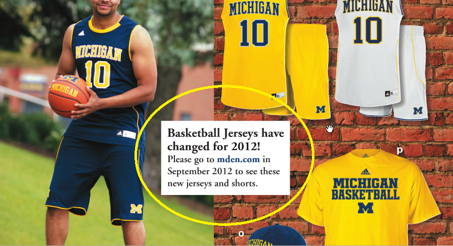
New Michigan Basketball Uniforms for 2012-13

Per MDen catalogue-
EDIT: The uniforms pictured ARE NOT THE NEW ONES. They are the same ones as the team wore. Read the note at the center of the page. It says to check MDen in September.
August 14th, 2012 at 1:13 PM ^
Neck looks weird and I wish we'd move more towards the Fab Five shorts...bigger M on the side panel rather than in front.
That said, not too drastically different.
August 14th, 2012 at 2:20 PM ^
I want that avatar picture.
voltronblue pls
August 14th, 2012 at 1:14 PM ^
The shorts look weird. But maybe it's just how that dude's wearing them.
August 14th, 2012 at 1:15 PM ^
or do those actually look maize?
August 14th, 2012 at 1:22 PM ^
Good catch. The athletic department has made it clear they want to go in this direction, and these certainly look more maize-y than last year's. Though that could very well be the lighting or any other effect, it's a very subtle difference.
August 14th, 2012 at 1:34 PM ^
August 14th, 2012 at 2:02 PM ^
August 14th, 2012 at 4:13 PM ^
this is all too funny.
August 14th, 2012 at 1:16 PM ^
Pretty sure those are the jerseys we had last year. It says check Mden in September.
August 14th, 2012 at 1:29 PM ^
August 14th, 2012 at 1:30 PM ^
The differences may just be due to being replicas rather than authentic.

August 14th, 2012 at 1:18 PM ^
I'm just thankful we don't have pants for shorts like other teams..
August 14th, 2012 at 1:20 PM ^
Bleh. I can't believe we're stuck with Adidas through 20-fucking-15. Switching from Nike to Adidas was defintely the second worst decision Bill Martin ever made as Athletic Director.
August 14th, 2012 at 1:23 PM ^
Sweet Maize jerseyzz

Yikes
August 14th, 2012 at 1:26 PM ^
the Uconn home and home, I know.
August 14th, 2012 at 2:10 PM ^
I'm taking this off the original topic, but I actually like that road game against UConn. It'll provide some early road game experience without, hopefully, posing too much threat of an out-of-conference loss. That 2013 schedule is challenging, but there aren't any games that you look at and say, "We're in trouble there."
2013 schedule --
home - CMU, ND, Akron, Minny, Indiana, Neb, OSU
away - UConn, PSU, MSU, Northwestern, Iowa
It sure would be nice to have a fifth-year Denard Robinson with that schedule (ARGH NO REDSHIRT).
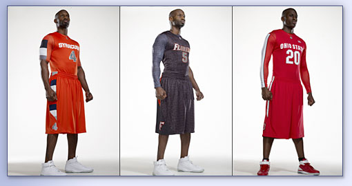
August 14th, 2012 at 2:02 PM ^
- Nike
- Pro
- Combat
August 14th, 2012 at 5:16 PM ^
touche, but Nike Pro Combat >>> Whatever the hell we wore against MSU last year.
August 14th, 2012 at 6:40 PM ^
Not sure about that. They're both pretty dreadful. Nike actually added a new color (gold) to MSU's ProCombat look.
August 14th, 2012 at 2:33 PM ^
August 14th, 2012 at 6:37 PM ^
Nike was paying us $4M a year, not $1M. Regardless, it was a big financial step up to go to Adidas.
August 14th, 2012 at 1:31 PM ^
there's going to be a new MMB jersey released to the public in a few weeks.
August 14th, 2012 at 1:48 PM ^
The Michigan Marching Band is getting jerseys?
August 14th, 2012 at 1:32 PM ^
I'd be ok with minor tweaks. I've got my jersey pet peeves, but subtle updates to the hoops uniforms aren't on the list.
Since you all (read "no one") asked:
Home football jersey is sacred. Do not touch. Same for Helmets (I am OK with helmet #s but don't like "good play" stickers)
Road FB Jersey - could update annually and I wouldn't care. I don't mind the "Bama" design or the Sugar Bowl design much... but I hate that they're 1 off designs. Enough with the 1-day jerseys. If the "bama" design was just our new road uniform I'd be totally fine with that. Same with the Sugar Bowl jersey. But in our last 13 games (including Bama) we're going to have worn 7 (!!) different jerseys. What the hell?
August 14th, 2012 at 1:41 PM ^
Bring back the Fab Five era shorts NOW!
August 14th, 2012 at 1:45 PM ^
I have always love the maize ones for home and love the road blues... I have never been a fan of the white jerseys.. I bet they are very similar to the ones already but very excited for michigan basketball this year!!
August 14th, 2012 at 1:46 PM ^
Will it be covered in Arby's logos?
August 14th, 2012 at 2:01 PM ^
...this is my approximate and very accurate (probably) rendering of the new basketball jerseys (made in MS Paint):

Features:
-Tristripes on the shoulders. Adidas is paying big money, people!
-Block M replaces the regular M on the previous jersey a la hockey. Fuck design flow. Branding is everything! Impossible is nothing!
August 15th, 2012 at 12:34 AM ^
Am I a horrible person for kind of liking how those shoulder stripes look?
EDIT: Apparently I am...
August 15th, 2012 at 9:23 PM ^
No, they look like a fierce wolverine scratched them. Pretty sweet.
August 14th, 2012 at 2:25 PM ^
The Uni's look a little tight.. Can you say shmediums
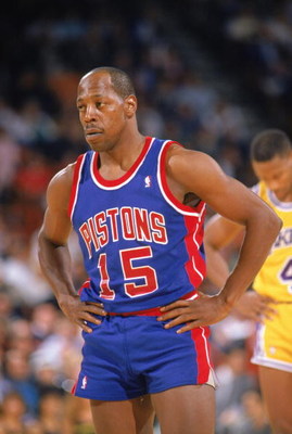
August 14th, 2012 at 3:11 PM ^
Vinnie Johnson approves...
August 14th, 2012 at 3:02 PM ^
Yay let's find new ways to advertise. Moooo money
August 14th, 2012 at 3:23 PM ^
As someone who bought two jerseys last season, I am disappointed. Every FREAKING TIME I buy a jersey the player either leaves or the design changes. Not exaggerating here!
- Bought a Nike Home #86 for Manningham in February 08 only to find he was going pro AND Michigan was switching over to adidas.
- Bought a $150 authentic Road #2 jersey because of Sam McGuffie in December 08, he transfers. Luckily Vincent Smith came in and made it better for me.
- Bought a Maize hockey jersey with the diagonal MICHIGAN lettering on it, and the team changes designs and over to Reebok the next season.
- Bought two #10 jerseys, Home white and Road blue last year only to hear this news. Figured I'd save Maize for #3.
WHY?!?!!?!
August 14th, 2012 at 4:10 PM ^
Or a walk-on's.
August 14th, 2012 at 6:19 PM ^
...further proof that there is no good reason for an adult to be buying jerseys.
August 14th, 2012 at 8:33 PM ^
I personally think the whole "adults shouldn't wear jerseys" is ridiculous. I only wear them for games and that's it. Period. I consider it bad luck to wear them when I'm not at or watching a game.
August 14th, 2012 at 6:38 PM ^
Let's go back to the Fab Five look, please.
August 14th, 2012 at 7:21 PM ^
I disgree with a lot of the negative attitude towards anything this company tries to do. IMO, we need a new look for the basketball and those shorts look like a huge step in the right direction. Fab Five shorts? UMM, that great look has been done, all the way from Arkansas to UCLA and back. I mean board shorts are Still popular, its been fifteen years.Twenty since the boys were doing it. Lets go with a new type of fabric and something that is the next look in line, much as the Fab Five did in their day. Adidas has done a fair job of keeping our look traditonal , MSU aside.
August 14th, 2012 at 7:38 PM ^
I'm not sure what you're getting at with board shorts and fabrics and such. I'm talking about the actual design - with a big block M on the sides (which is Dave Brandon's preferred logo anyway) and the traditional trim.
Incidentally, they weren't just Fab Five uniforms - we wore basically that same uniform throughout the '60s and '70s, too.
August 15th, 2012 at 9:13 PM ^
Look better than those tiny ass euro short that are trying to make a comeback.. No thanks.. 80's are over and skinny jeans look horrific