Photoshop Experts: Away Jerseys

Things have certainly slowed down around here, so I feel like now is a better time to ask this question rather than bowl week...anyway
To all the photoshop experts, I was wondering if you all could make a few mockups of some away uniforms for Michigan. Here are a couple I were thinking (maize pants for all of them, I'm trying to be as realistic as possible).
#1 2007-2008 Away Jersey's WITHOUT any piping (white jerseys, blue numbers, maize outline, blue collar and blue ring around the bottom of each sleeve)
#2 All white jerseys, blue numbers, maize outline
#3 All white jersey, maize numbers, blue outline...basically out home uniforms, but white instead of blue, and outline the numbers blue.
Any help would be appreciated! I'd like to see us find a classic look for our away uniforms that we could stick to and not touch like the home uniforms (except for special games like UTL).
THANKS!
January 8th, 2012 at 12:52 AM ^
Back in 09-10 when Michigan and Midnight Maize struck a thousandaire deal to make the jerseys...They later bought the contract out after the year..

January 8th, 2012 at 1:26 AM ^
Sorry dude
January 8th, 2012 at 9:25 AM ^
As a Late 20's fan i can say i like some style but its all subjective. I hate adidas.. Their maize is almost off it seems.. I want my nike back with some flat maize n blue.. States were awful so dont change my shades just flatten them out maybe.. Sidenote: the oregon bowl game helmets were the absolutely sick!
January 8th, 2012 at 10:13 AM ^
So I guess that puts me in the "old guy" group, and I hate that college football has resorted to this uniform war as a recruiting tool. I guess we have Phil Knight to thank for that.
<br>That being said, it's here to stay. If not embrace it, I guess it's time for an old soul like me to accept it.
<br>At least for us, we are fortunate enough that our REAL uniform is as much of a recruiting tool as anyone else's drawing board mock-ups.
January 8th, 2012 at 1:05 PM ^
The common misconception is that Adidas brought the highlighter maize...not true. Nike did. Especially when we started doing a Student Section t-shirt in the mid/late 00's. Nike was the one that switched us to the colors we have now...Adidas just ran with it.
January 8th, 2012 at 8:23 PM ^
January 8th, 2012 at 8:31 PM ^
Who was talking baout basketball? This thread is about football jerseys.
January 8th, 2012 at 8:38 PM ^
January 9th, 2012 at 10:41 AM ^
Same number and everything...

January 8th, 2012 at 8:25 AM ^
Tell me those are for Field Hockey
January 8th, 2012 at 12:49 AM ^
The 2007-2008 jerseys you mentioned, were actually 2006-2007. Those were Nike jerseys back then with no large piping. Michigan has had the elephant-tusk Maize piping since adidas signed on in 2008.
January 8th, 2012 at 1:54 AM ^
You said they signed the Adidas deal in 2008 (which they did)...then what did they wear in 2007-2008?
They were still with Nike, it was Carr's last season and we wore Nike in the 2007 season and 2008 Captial One Bowl.
January 8th, 2012 at 1:28 AM ^
Our shoulders have wings!
January 8th, 2012 at 1:29 AM ^
if it was'nt for the fact it was posted 6 months before I had the idea lol . Jersey number 2 is a complete rip off of my idea!
January 8th, 2012 at 6:51 AM ^
I'm probably in the minority, but uniform pic # 2 on this link is BADASS. not sure about the block M on the pants, but the shoulder wings are awesome. we don't mess with the home blue, so I'd settle for pic #1 with should wings with the white away jerseys.
January 8th, 2012 at 10:52 AM ^
way better than what we wore at state
January 8th, 2012 at 8:07 PM ^
Because number 1 and 2 on that link are awesome. I likes the shoulder wings. The block M number 3 is too much though. I do wish we could go back to Nike but I thought the sugar bowl jerseys were the best addidas has come up with yet as far as alternates go.
January 8th, 2012 at 8:43 AM ^
I like the first two, but not the third one.
However, I'd rather just stick to the ones they've been wearing the past few years. I didn't really even like the UTL or MSU uniforms this year. Nor do I like the helmet numbers as they remind me of Alabama too much. But then, WTF do I know?
January 8th, 2012 at 2:04 AM ^
Wasn't there a pretty much plain white (with blu collar/cuffs) tech fit away jersey this year? I seem to recall woolfolk wearing it with white pants in a camp pic. It looked good. I thought it was actually worn in the first away game but the linemen switched back to last years model because they thought the new jerseys were too easy to hold.

January 8th, 2012 at 2:42 AM ^
Eh maize pants are better. But didn't we actually take the field in those jerseys against NW?
January 8th, 2012 at 2:56 AM ^
I believe they were those, but with a yellow piping piece on the back going from the sleeve, above the name, to the other sleeve, and something similar on the front.
January 8th, 2012 at 9:16 AM ^
This is my favorite uniform. White or maize pants are fine. My second favorite is the bowl uniform. At first I thought the shoulder stripes were too much but they looked fine over pads. I can't stand piping or rams horns.
January 8th, 2012 at 1:38 PM ^
These practices jerseys look much better than the piping or stripes from the 90s. I also like the sugar bowl jerseys minus the block m on the shoulder.
<br>
<br>Also white or maize pants are fine with either.
January 8th, 2012 at 2:27 AM ^
2013 jerseys per DB:

January 8th, 2012 at 2:35 AM ^
Not enough stripes.
January 8th, 2012 at 7:33 AM ^
that's a car brah
January 8th, 2012 at 7:51 AM ^
As long as a receiver drives the #1 car, I'm good.
January 8th, 2012 at 1:24 PM ^
No way... Adidas doesn't have 3 of their logos on it.
January 8th, 2012 at 9:15 AM ^
Not a photoshop expert. I'm just here to sound like an old grandpa.
I'll let Mr. Woodson model the away jersey I want back...

There was no need to mess with this in the first place. But I know, I know. Get off my lawn, yadda, yadda, yadda.
January 8th, 2012 at 9:56 AM ^
Totally agree. That's also my favorite away jersey.
Get rid of the current yellow shadowing on the number and make it more bold w/o a weird font, like Woodson's jersey. The yellow and blue on the sleves is better than the two blue bars on our Sugar Bowl jersey. Only tweak I might make is removing the shoulder numbers, but either way is OK.
January 8th, 2012 at 11:55 AM ^
Yep, that was a classic look. We wore it for two decades before Nike jazzed it up in '97 with the Ms and outlined numbers, and the tinkering has become a regular occurrence since. We need to go back to that look.
January 8th, 2012 at 12:26 PM ^
The simple classic stripes on the sleeves are what make this jersey. I bought a #1 away jersey when I arrived on campus in 1990.
January 8th, 2012 at 1:08 PM ^
Adidas was so close to getting it right. Why did they not add the maize middle stripe?
January 8th, 2012 at 8:34 PM ^
January 8th, 2012 at 11:23 AM ^
Personally, I'm a fan of the all whites over the current away jerseys. I'd also be cool with seeing the Sugar Bowl jerseys become the normal away jerseys. Those things looked slick.

January 8th, 2012 at 11:56 AM ^
That looks like a Penn State uniform with a Michigan helmet. I don't mind PSU's uniforms, but they're not us.
January 8th, 2012 at 11:33 AM ^
No numbers, stripes, or logos. Just plain white for the greyhairs. We need to stop all cheering, and the music is terrible when piped in. I would like to see night games canceled too. This is Michigan tradition you damn young punks are messing with. I miss the leather helmets too. We should also transport players by bus to the west cost and bowls, because it is tradition! Let it fucking go! Things change, and you can change or get left behind. We are way behind Oregon, yes the team everyone slams here.
January 8th, 2012 at 1:32 PM ^
Are jerseys that big of a deal that you consider us behind Oregon because they are the Nike prototype school.
<br>Jerseys are just that jerseys. It doesn't affect the talent on the field (I know some say that it allows more holding, etc...) and it doesn't effect the coaching staff.
<br>If a kid decides to attend Oregon over Michigan based on the fact Oregon has 100 jersey selection then his priorities are mixed up.
January 8th, 2012 at 2:32 PM ^
Jerseys do impact recruits, and a kid wanting to look good is important. His priorities are in line. Go to an interview and wear a suit from the 50's. Look good, practice hard, and play hard. Why in the hell do you think people adapt their corporate image? U of M football needs to pick it up. If you want a competitive advantage you need to take it. These are kids and not senior citizens. Get off your ass and cheer at a game. Oh wait it is tradition to be happy with good recruits and lose our bowl games. F that we need to be the top choice! I want Michigan to win national championships. You take mediocrity and shove it. We need recruits from the South. Wake up!
January 8th, 2012 at 1:11 PM ^
Something simple, something that can withstand time like our home jerseys which (thank God) will never be touched minues a UTL game or something.
This is why I'd just like to see a prototype of an all white, with blue numbers and maize outline...and then maize numbers (like the home uniforms) with blue outline.
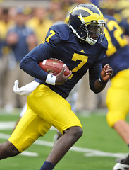
I'm not sure how I feel about the blue collar or ring at the bottom of the sleeves (like the Cam Gordon picture above). Personally, I want it to be just like the home uniforms, plain or not.
January 8th, 2012 at 2:08 PM ^
those sugar bowl jerseys looked retarded. yes, i'm of the older group but i did like the utl jerseys so i'm not completely "get off my lawn". my biggest issue is you can't outline part of the blue with maize (numbers) and then not do it with the stripes. if you are going all blue then lose the outline on the numbers as well. otherwise it's too inconsistent.
January 8th, 2012 at 3:35 PM ^
I too also like the UTL jerseys
January 8th, 2012 at 2:14 PM ^
roadies are better.

January 8th, 2012 at 2:31 PM ^
crap, the cult has spoken...i had an opinion different than the rest so i've been flamebaited.
and furthermore, is this truly db's diabolical plan. "you know, only 90 percent of college teams have stripes on their shoulders. i say we go with stripes then. man, were really gonna stand out!" i suppose it was his idea to add pepperoni to the domino's menu too.
January 8th, 2012 at 2:40 PM ^
personally I like 2 and 4 the best.


