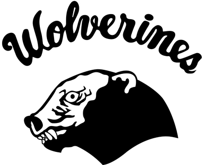
The Wolverine Logo

I posted this question as a comment on another post about a week ago but it was buried.
What are your opionions on the lack of Michigan memorabilia (shirts, hats, etc.) with a Wolverine on them? The only wolverine I ever see these days is the retro one with the stiff upper lip wearing a hat. It seems like through the 70's and 80's, the wolverine was a lot more prevelant on Michigan shirts. What happened!? I, for one, think the wolverine is awesome and should be more widely used.
To give you an example, the wolverine on top of the block M in my icon photo is along the lines of what I'm talking about.
Spin off question.. Do you own a piece of retro Michigan clothing that you still hold dear because of it's uniqueness?
(BTW- This is my first post, so take it easy. Thanks!)
January 28th, 2015 at 10:10 AM ^
The Brand™
January 28th, 2015 at 10:26 AM ^
considering your username and Avatar
January 28th, 2015 at 1:58 PM ^
I'm surprised he still bothers to post here, but at least he has conviction, regardless of how misguided.
January 28th, 2015 at 10:10 AM ^
"stiff upper lip" retro-looking one, although no doubt others like it. The one in your avatar is on my tattoo.
January 28th, 2015 at 11:12 AM ^
January 28th, 2015 at 11:12 AM ^
January 28th, 2015 at 11:14 AM ^
January 28th, 2015 at 11:31 AM ^
You must really care for the retro one, with making a triplicate post.

January 28th, 2015 at 12:30 PM ^
January 28th, 2015 at 1:11 PM ^
the cover makes him look a little thinner than he is described
January 28th, 2015 at 11:38 AM ^
January 30th, 2015 at 11:08 AM ^
I have no Wolverine, but have a tattoo of a University seal that is no longer sanctioned. It was discontinued shortly after a buddy and I got versions of it. (And I like it much better than its replacement anyway, so no regerts)
January 28th, 2015 at 10:12 AM ^
A wolverine mascot is that it can be confused with a lot of other simliar looking animals. For example, the retro wolverine can be confused with a bear. The profile of full wolverine can be confused with a beaver. A wolverine with a stripe(s) can be confused with a skunk.

January 28th, 2015 at 10:12 AM ^
Personally, the wolverine logo they do have looks more like a beaver, muskrat, or very large rat, I'm very happy they don't emphasize that.
Now if they re-did that shadowy animal logo, similar to what we saw in NFL (Lions for example) I'd be willing to give it a run on a sweatshirt or five...
As it stands, that Large M instantly means Michigan to everyone, it would be hard to replace it as a fan favorite.
January 28th, 2015 at 11:56 AM ^

January 28th, 2015 at 10:14 PM ^
January 28th, 2015 at 11:10 AM ^
January 28th, 2015 at 11:57 AM ^
January 28th, 2015 at 10:13 AM ^
There should be more wolverine specific gear. We have the toughest, most insane, animal mascot in all of sports, and you never see it on anything.
I like this one. He looks pissed.

January 28th, 2015 at 10:24 AM ^
That looks awful.
January 28th, 2015 at 10:27 AM ^
Someone on this board one time described a wolverine as something like a sack of fury with teeth and claws--only it was much more eloquently put than that. I've actually searched for it because it was such a great description.
Anyway, yes, the wolverine should always look pissed. Otherwise, it wouldn't be a wolverine.
January 28th, 2015 at 12:45 PM ^
Naturalist Ernest Thompson Seton described the wolverine as "[A] tremendous character . . . a personality of unmeasured force, courage, and achievement so enveloped in a mist of legend, superstition, idolatry, fear, and hatred, that one scarcely knows how to begin or what to accept as fact. Picture a weasel--and most of us can do that, for we have met the little demon of destruction, that small atom of insensate courage, that symbol of slaughter, sleeplessness, and tireless, incredbile activity--picture that scrap of demoniac fury, multiply that mite by some fifty times, and you have the likenes of a wolverine."
January 28th, 2015 at 1:02 PM ^
Somehow I think Harbaugh can really relate to "that...insensate courage, that symbol of slaughter, sleeplessness, and tireless, incredbile activity..."
January 28th, 2015 at 10:29 AM ^
He looks pissed, but the posture is all wrong...
The body language here says "hey, who put me in this corner?"
Whereas I would prefer to see a more aggressive stance like "hey, I just ate your puny buckeye children for breakfast and now I'm coming for your wife!"
Just a thought...
January 28th, 2015 at 10:43 AM ^
they often seem to be posed in a similar fashion. Although that may be because no one is stupid enough to try to take a picture of one in an aggressive posture. They're too busy running for their lives.
January 28th, 2015 at 10:56 AM ^
good point.
January 28th, 2015 at 10:34 AM ^
This is what I'm talking about. I'm not saying we should change the block M logo at all, just that the wolverine should be more involved in general on Michigan gear.
January 28th, 2015 at 11:19 AM ^
I'd be happy with this.
We "ignore" our nickname perhaps more than any other college football program, with the exception of perhaps Georgia Tech.
We don't use it all that often to describe oursleves (we're "Michigan"), and we don't use it in many of our visuals/logos (we use the Block M).
Once in a while I'll hear us called the "Wolverines" on TV and I pause for a second and think "Who?" and then I catch myself, "Oh yeah, that's us."
"Wolverines" is such a unique and kick-ass nickname, we should play it up a little more.
January 28th, 2015 at 11:48 AM ^
January 28th, 2015 at 10:40 PM ^
January 28th, 2015 at 10:45 AM ^
47 Brand brings out t-shirts with this logo from time to time. They never seem to have size Large available when I look which pisses me off. I had a ton of t-shirts and sweatshirts when I was a kid with this logo, but I outgrew all of them and I need to replenish the stock.
January 28th, 2015 at 11:18 AM ^
Other than that, I like it.

January 28th, 2015 at 12:10 PM ^
PO'd wolverine, but I think it would be better if you saw him head-on rather than looking to the side.
Some artistic-type needs to put in some time here.
January 28th, 2015 at 12:41 PM ^
Nice. I need 21 rabies shots in the abdomen after just looking at that thing.
January 28th, 2015 at 1:25 PM ^
Sent from MGoBlog HD for iPhone & iPad
January 28th, 2015 at 10:14 AM ^
A picture of a wolverine turns into 3 wolf moon very quickly.

About the only thing I've seen with an actual wolverine on it that isn't cheesy is the old wolverine logo.
January 28th, 2015 at 12:20 PM ^
Whoa - Dude! I used to have that on my van in like '77 or '78... it could hold a lot of weed smoke on the way to the roller disco on Saturday nights!!!
January 28th, 2015 at 12:39 PM ^
Your van is rolling probable cause.


January 28th, 2015 at 10:25 AM ^
Definitely like those first two. Rarely seen, I almost forgot they existed, but very clean modern looking logos. Don't really care for the 3rd one though, the paw is so common among logos. Thanks for sharing!
January 28th, 2015 at 10:31 AM ^
I don't know, those two are too colorful. I'd rather if we went with something like the UW huskie.

January 28th, 2015 at 10:34 AM ^
Woah now. That's way to modern/minimalistic.
The "get off my lawn" types would throw a hissy fit!
/s
January 28th, 2015 at 3:54 PM ^
...says the guy with the modern/minimalistic helmet avatar!
January 28th, 2015 at 10:58 AM ^
like a dog that wants his belly scratched.
January 28th, 2015 at 1:00 PM ^
Who's a big sweetie... num num num.
January 28th, 2015 at 11:20 AM ^
Half of all college football fans would think the third one is Missouri.
January 28th, 2015 at 10:25 AM ^
all bad