SICK!
Which means Good, right?
Ah, these wacky kids with their nonsensical terms.
Not like back in my day, when we would have said, "That is one Bad logo!"

Since I spent much of my grade school years in Rhode Island, I'm comfortable saying that logo is wicked bad.
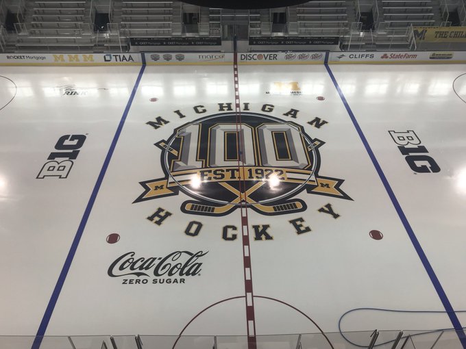
cool logo
more 'michigan', less 100, and no 'coca cola zero' ads and nothing on the boards, either. back in my day we skated on glacier ice with no markings and had to chase the wooly mammoths out of yost before we could play. team 1 or 2....
don't mind me, just shaking my fist at a cloud.
Fixed it for ya!

smart aleck.
you forgot the wooly mammoth though
Now you just need to insert a photo of yourself, armed with a spear and dressed as Barney Rubble, hunting those wooly mammoths!
Any relation to Wooly Booly?
oh sure, you're complaining now...but once we get some 'smile ambassadors' out there you'll be fine.
My dad would say this logo is the Cat’s Meow, with my sports buds I’d call it (deleted for family reading), and the youngsters use Sick! All together, and truth, this logo is phenomenal. It’s actually better than I ever would have wished for.
Hang on . . . just how old are you?
That "cat's meow" of your dad's was popular in the 1920s, maybe 1930s.
That looks really good - the graphic artist that drew it up deserves a day off! But only one day because Coke is there. Coke should not be there. That's probably some leftover from Dave Brandon - what an ass...
Take the Coca Cola logo off and turn that into a hoodie!
But it's zero sugar so not all the calories of regular Coke.
This logo slaps!
That logo Will Smiths!
Shouldn't that logo have been on the ice last season? 2022-23 is the 101st season of Michigan hockey. Let's go Team 101!!
Stop with your fancy math, ya' nerd college boy...
cool
also, cool
WACKADOO!

I am afraid this rendition won’t get nearly the recognition it deserves. Outstanding.
Awesome work there! Looks like I need to upgrade my MS Paint...
grendel, i hate to say it, but a 2500 yr old skeleton just figuratively dunked on you.
(confession: i couldn't even use 'mspaint', so you're still way ahead of me)
Logo looks nice, but the spacing on the H & I in Michigan and the C & K in Hockey are jacked.
The spacing would have looked terrible with the red line if they hadn’t done it this way.
Looks like the designer didn't make allowances for the center ice line.
My designer critic eye also notices the arc that "Michigan" is on doesn't appear to follow the arc of the circle graphic beneath it.
If the designer had just inserted a bit more room on either side of the red center ice line I think it would have improved the letter spacing.
* I'd show my mockup of adjusted letter spacing but I've bumped up against that ridiculously low image limit, and every time I try to delete an image from my archive to free up space, I get this equally ridiculous "... is in use by another application" message.
Which means I'll have to create a new account simply to be able to post new images. Thanks, HUEL. Great work.
100 years is cool, but the logo itself is underwhelming with a 90s clip art/Party City balloon feel to it.
i like it.
and not to go all WD, but there's a t-shirt (with no coke logo, apparently), currently on pre-order.
That is wonderfully done