The State Of Our Open Threads: A Little History With A Hint Of Statistics
In the latest installment of “The State Of Our Open Threads”, someone had asked for some historical perspective on some of the data, and I decided that it would be a good idea to go back through the data on two of the more common words among those tracked – “fuck” and “shit” – which are, incidentally, two of our more indicative words, and see exactly what the history of each could tell us about the last three years of the board on football Saturdays.
The main analysis is for the regular season only, although I do have bowl data. Being that the period was from 2013 to now, I kept the bowl data separate since, well, we didn’t go to one in 2014. That aside, it was interesting to go back through the old data and see what might be gleaned from it that hasn’t already, not to mention see if there were any more interesting metrics that we had not devised yet.
Before we get into some new metrics, the raw data for each word should be examined.
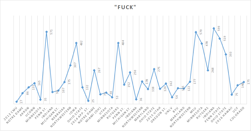
The raw, unadjusted fucks are charted below, beginning from the start of 2013 to now. For purposes of this stab at the analysis, the bowl game data is excluded.
You can see the bulge in 2015, which has a lot more to do with the enthusiasm at the beginning of the Harbaugh era of Michigan football than anything else. As there are fucks of frustration, so there are fucks of elation, and quite a bit of what is going on there can be explained that way. If we scan the last two years of Hoke’s time here, a few games immediately stand out specifically for how angry we got – 2013 Penn State, 2013 Iowa (80% of those fucks were 2nd half fucks), and 2014 Rutgers. Over there, the “fucks” point to what MGoBlog may have deemed watershed moments in the waning days of the previous coaching regime.
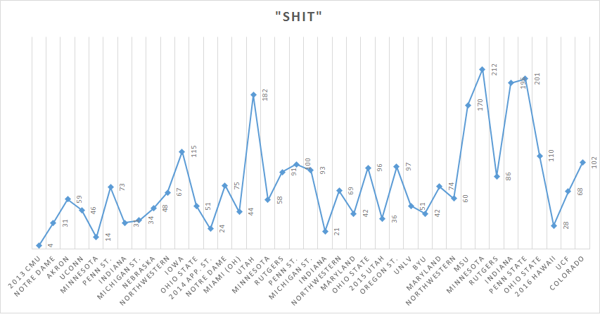
Now, the unfettered shit.
You get a similar story for Harbaugh’s time to date actually, although “shit” tends to be the one we reserve more for plays or calls that do not go our way, and there was enough of that even in the wins in 2015 to explain that. It had an interesting run in 2013 and 2014 too – it was in relatively heavy use in the 2013 Iowa game and then it hit unheard of levels for the 2014 Utah game, a game punctuated by a rain that said without words what a lot of us were feeling.
After a few discussions with people, I began to realize that we need another level of this analysis – the fucks must be tempo adjusted to get a better handle on just how we felt, so there are two ways we can look at this. One is the Fucks Adjusted For Real Time (i.e., approximate airtime in minutes, accounting for those at home), or the FART rate and the other is Fucks Adjusted For Total Plays, which we will call the FAP Rate. They will look similar to the previous “Fuck” graph but perhaps they tell us a few things.
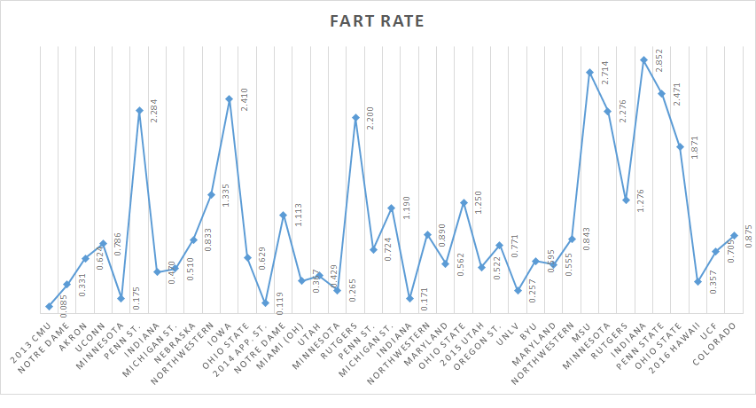
Here’s FART Rate:
So, we do see a few things here – the highest FART rate belongs to 2015 Indiana game, followed closely by the 2015 Michigan State game, both of which contained some hairy moments – I’ll put it politely.
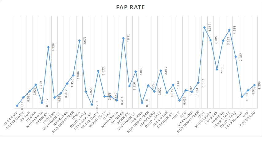
Perhaps FAP Rate says something different:
Similar to FART, but telling you how many fucks on average were tossed into the open thread per offensive and defensive snap, and like FART, showing you a little bit how game length and game speed can affect our fucks.
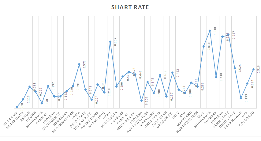
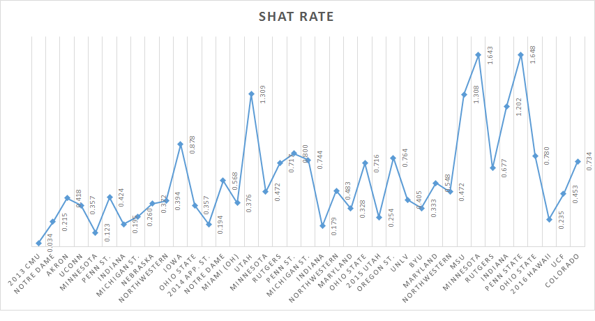
Let’s do the same thing for “shit” using the same data. That will give us “Shits Adjusted For Real Time”, which we will call the SHART rate, and “Shits Adjusted For Total Plays”, or SHAT because that sounds better to me.
So, here’s the SHART rate for this period:
One thing is clear at this point until 2014 Utah, “shit” was not quite the shit on the blog. Clearly, it has seen a majority of its use since that game.
SHAT Rate should probably look similar:
It does. The 2015 Minnesota and Penn State games have the highest SHAT, which I find interesting because at least during the Minnesota game, I am sure I used that word quite a bit.
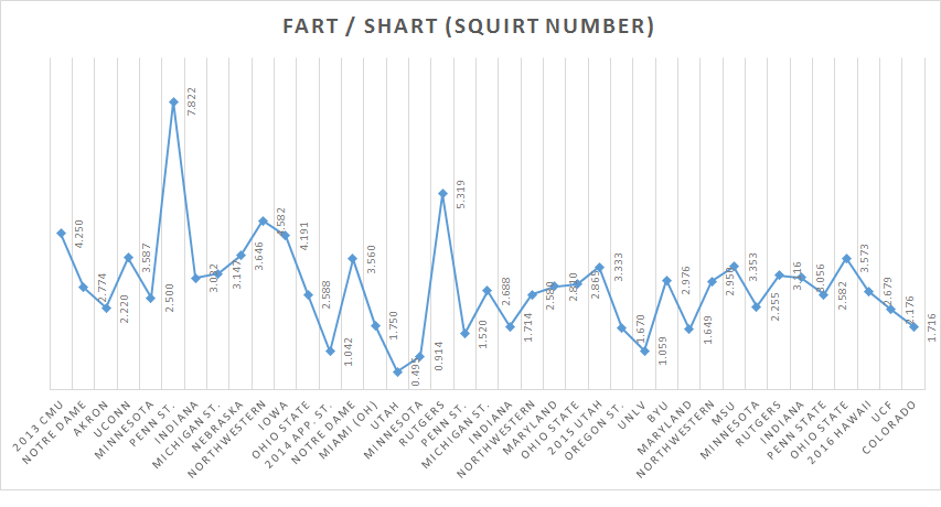
There’s another transformation that we can do here at this point. Let’s look at the FART / SHART combined ratio and see if we can get a good handle on how we were using these words relative to one another in recent years. We can call this the SQUIRT Number for the threads.
Here’s what that looks like:
The highest SQUIRT numbers clearly belong to 2013 Penn State and 2014 Rutgers. The average SQUIRT over this period is about 2.81, so basically for every three fucks, there is a shit. In the two games just mentioned though, there was a tendency to run with fuck rather than get mired in shit and I don’t blame anyone either.
Anyway, this is just a warning that you may see some more analytics on occasion.
September 22nd, 2016 at 6:30 PM ^
In the words of a stunned and disbelieving Jim Brandstatter, "I don't know what to say..."
September 22nd, 2016 at 7:44 PM ^
Fuck yeah Speight!! We have ourselves a damn quarterback!
September 22nd, 2016 at 9:15 PM ^
September 23rd, 2016 at 7:49 AM ^
As stated above by Hotel Putingrad the comments can have a positive or negative direction to them. The area under the curve for the FART, FAP, SHART, SHAP functions during the Hoke regime seems to be dwarfed by that in the Harbs regime. I would posit that if one went through the tedious effort of filtering out the "fucks of elation" for example, that the Hoke tenure would indeed be larger.
Or it could be that Hoke depressed expectations to the point that apathy depressed the entire system. In which case those fucks and shits actually launched could have greater weight attributed to them as they would have to overcome the "why fucking bother" effect. Again which speaks to the vectoral quality of said comments.
Whatever this truly means, the quest for a deeper understanding here continues to be invaluable.
September 23rd, 2016 at 8:04 AM ^
This is by far my favorite kind of analysis. I love the "State of Our Open Threads" reports.
September 23rd, 2016 at 8:47 AM ^
When I tossed a comment into a huge thread with my lowly point total about some historical perspective, I never once thought it would lend itself to something as fantastic as this analysis. Kudos to you good sir and your efforts!
September 23rd, 2016 at 9:37 AM ^
"On mgoblog today?"
Me: "About FART, FAP, SHAT, SHART, and of course SQUIRT (which is simply the FART/SHART ratio)."
Wife: "I'll never understand football..."
September 23rd, 2016 at 4:02 PM ^
I regret that I have but one upvote to give for this diary...

Comments