Pentagram's Explanation of the LOGO

From the designer of the logo - some of the logo's look better in their work - and the abbreviated logo with a different color - but really?
New Work: Big Ten Conference

The Big Ten Conference is the U.S.’ oldest and largest Division I college athletic association. Founded in 1896, the conference is comprised of schools located mainly in the Midwest and includes world-class academic institutions such as Ohio State, Michigan State, Penn State, Purdue, Northwestern, and University of Wisconsin–Madison. Big Ten schools compete at the highest level of NCAA competition in basketball and football, and over the past decade the Big Ten has led all conferences with national titles in different sports including volleyball, track and field, cross country, wrestling, hockey, soccer, tennis and golf. Despite its name, the conference has included 11 member schools since Penn State joined in 1990, and it will add University of Nebraska – Lincoln as its 12th member in July 2011.
Pentagram’s Michael Gericke (a graduate of the University of Wisconsin) and Michael Bierut (husband of 30 years to an Ohio State alumna) have designed the new logo for the conference, announced today. The conference’s previous logo hid an “11” in the negative space around the “T” in “Ten.” The new logo evolved from this use of negative space and is built on the conference’s iconic name without reference to the number of member institutions. “Seeing two numbers at once is clever, but it means redesigning the logo every time the conference expands,” says Bierut. “It was time for something direct and simple.” The resulting logo features contemporary collegiate lettering with an embedded numeral “10” in the word “BIG,” which allows fans to see “BIG” and “10” in a single word.
“The new logo was developed to symbolize the conference’s future, as well as its heritage and tradition of competition,” says Gericke. “Going forward, fans will know The Big Ten will always be the Big Ten.”
“The new Big Ten logo provides a contemporary identifying mark unifying twelve outstanding institutions,” said Big Ten Commissioner James E. Delany. “It conveys some elements from the past while simultaneously introducing new features. We think the new logo is fun and has something for everyone.”


December 14th, 2010 at 9:53 PM ^
Edit. How bout them Cowboys...
December 14th, 2010 at 9:53 PM ^
it's typical boutique firm boondoggling. Their real talent lies in selling& marketing their own products to the boobs who pay top dollar for something anyone with a Mac and an hour or two (to design and then navel-gaze to come up with a "deep" analytical explanation... Pot helps for this) can come up with. Talk about snake oil salesmen, these guys are pros. It's all in the presentation; framing your designs cleverly and pulling the board room into your vision. Unfortunately, seems the general public is actually harder to string along than the B10 commish
December 14th, 2010 at 9:55 PM ^
As someone who's worked in this industry and been in calls selling design work to the UN, this is 10000% true.
December 14th, 2010 at 9:54 PM ^
I admit it looks a little better in collateral. I HATE HATE HATE the color scheme with the carolina blue. YUCK. I also really don't like the serifs on the B. I wish they were shaved by like 20 or 40%.
In general I don't like it. I will probably get used to it, who knows.
The division names are still absolutely, positively unforgivable.
December 14th, 2010 at 10:15 PM ^
color scheme with the carolina blue
is an old Tar Heel.
December 14th, 2010 at 9:57 PM ^
I'm not blaming the designers for the logo. I'd like to think they came up with plenty of different designs and this was the one chosen.
I could be out of line, but I'm blaming whoever in the B1G organization approved it not the people who designed it.
December 15th, 2010 at 1:36 AM ^
You don't blame Mrs. Crabapple's First grade class...
I agree.
December 14th, 2010 at 10:01 PM ^
"We think the new logo is fun and has something for everyone."
Oh yeah? What's in it for me?
December 14th, 2010 at 10:15 PM ^
I really don't get this "has something for everyone" thing. It's BIG TEN in block letters and a 1 instead of an I. What are all the different things that are for all the different people?
I actually don't especially mind the logo, it's the division names that really annoy me. The logo is just extremely simplistic, which is fine as far as I'm concerned but if that's going to be the case why act like it's some incredibly multifaceted thing?
December 15th, 2010 at 9:23 AM ^
After a day, I actually like the logo. I like the fact B1G will become another way to refer to the conference -- it's a joke, but not too much of one, so I don't see it becoming annoying like certain other Internet memes.
I also challenge anyone to find a better color that isn't already in use by a Big Ten school. I personally believe that they should use the same blue they used in the old logo, and I can't understand why they changed it. But if the charge is to find a color not used by a Big Ten school, then periwinkle is not a bad choice.
Finally, all this sturm and drang about the logo is taking away from the real abomination, the division names, which should be the focus of a movement to get them changed to East and West -- I mean, come on, can we please throw a bone to, well, guys like me? Does everything have to have a fancy name? Can't the names just reflect reality, i.e., the reality that Wisconsin plays in the East division and Michigan plays in the West division because Nebraska didn't want to be in a division without either Michigan or Ohio State?
December 14th, 2010 at 10:15 PM ^
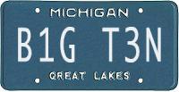
B1G: We will beat you until you're black and baby blue.
December 14th, 2010 at 10:51 PM ^
mobile phone refresh-triggered double-post
December 14th, 2010 at 10:48 PM ^
I really like how much the Maize Rage stands out in that picture of Minnesota and State playing in the Big Ten tournament last year.
December 14th, 2010 at 10:53 PM ^
now THAT'S marketing!
December 14th, 2010 at 10:53 PM ^
After poking around their website, I discovered that Pentagram worked extensively on the extremely successful U.S. bid for the 2018/22 World Cup. Keep up the good work boys!
December 14th, 2010 at 11:24 PM ^
Kind of makes me wonder if they didn't have enough manpower to give this adequate attention.
December 14th, 2010 at 11:24 PM ^
and what really doesn't make sense is that they're trying to put a 10 in it and now we have 12 teams. there should be a number 12 somewhere and the word ten also.
December 15th, 2010 at 1:52 AM ^
personally I think the 11, 12 numbers incorporation is sort of pointless because it will likely change again.
December 14th, 2010 at 11:33 PM ^
December 14th, 2010 at 11:34 PM ^
here we go again...
Please leave.
December 14th, 2010 at 11:36 PM ^
Go tell that to people on the RCMB. It's about to move site's soon, their 2012 is about to happen.
December 15th, 2010 at 12:19 AM ^
ha ha ha ha ha ha ha ha ha
December 14th, 2010 at 11:37 PM ^
December 14th, 2010 at 11:46 PM ^
then the B1G TEN Commish will have no problem if we henceforth refer to him as
J1M D3LANY
December 15th, 2010 at 1:21 AM ^
here's a suggestion for a new new logo:
December 14th, 2010 at 11:50 PM ^
Ready thy Banhammer, and show this feeble-minded Spartan why his city-state no longer exists.
December 14th, 2010 at 11:52 PM ^
December 15th, 2010 at 9:51 AM ^
67-30-5
Michigan: 42 Big Ten Football Championships
MSU: 7, the same number as the University of Chicago who dropped football almost 60 years ago.
December 15th, 2010 at 1:24 AM ^
Why not let him stay? His posts are just dripping with "Spartan Class." I think he is a perfect example of MSU's "high" quality as an educational institution. Besides, I think he is living proof that Romans used Spartans to clean the vomitoriums.
December 14th, 2010 at 11:49 PM ^
December 15th, 2010 at 10:29 AM ^
You've apparently been working on your math skills while expanding your vocabulary. Ditch the ski mask and you'll really be getting somewhere.
December 15th, 2010 at 12:24 AM ^
I have a feeling that when the logos are judged in context (which is what they were designed for: different contexts) they will make more sense.
I remember the last time the Big Ten was "the laughing stock" for being innovative: when Delaney announced the creation of the now $Billion$ BTN. I live in SEC country, and I can assure you that people have an easier time mocking something new than accepting that it may be a more competitive model (even in the face of, you know, economic realities.)
In the end, the logo is meant to be used for branding/marketing; which is why a marketing company created it. Eventually it will come to represent whatever Delaney and the presidents want it to, because they are going to ingrain it into their branding. Let's stop assuming that we fully understand their long-term vision for the branding of the conference.
December 15th, 2010 at 1:04 AM ^
I don't mind "B1G" by itself, but I don't understand...
"B1G"
TEN
I read it as Big Ten Ten because I was told "B1G" is Big Ten.
December 15th, 2010 at 1:19 AM ^
I am a Michigan man unfortunately relegated to living in SEC country. I happen to work with a couple of other Big Ten guys and for the first time in my life it seems that no matter where you came from or who your team is we are all on the same side "THIS SUCKS" I came to work today ashamed that I am from Big Ten country for the first time in my life. No bowl losses or out of conference losses or any other shenanagens can compare to this. I am in utter disbelief that this has happened. Please Big Ten take a mulligan on this one and try again. We will all forgive you if you quickly and completely wipe this from the history books and let us all pretend this never happened.
December 15th, 2010 at 9:16 AM ^
“Seeing two numbers at once is clever, but it means redesigning the logo every time the conference expands,” says Bierut. “It was time for something direct and simple.”
This just means they weren't smart enough to come up with an intelligent design that hides the 12 in the logo. And further explains why it looks like they spent 15 minutes in photoshop making the new logo.

December 15th, 2010 at 9:30 AM ^
"includes world-class academic institutions such as Ohio State, Michigan State, Penn State, Purdue, Northwestern, and University of Wisconsin–Madison."
Talk about unabashed self-bias. First, osu is nowhere near a world-class academic institution. They just came out of the friggin stone age - bunch of neanderthals. Wiscy is just what it's nickname stands for - a booze festival. Think it was coincidence that UM was left off, nope.
Oh, by the way the new Big Ten logo fucking sucks! Seriously, those two idiots just made the entire conference look like fools. Every single media outlet says it's hideous and dumb.
(woke up on wrong side of bed today - sowwy)
December 15th, 2010 at 9:45 AM ^
If the designers feel they need to explain in the press release that the logo is "clever" and "contemporary" then they should realizethey have a problem.
Also, do they feel being married to a 30 yr OSU alumn gives them any addtional credibility?

December 15th, 2010 at 2:50 PM ^
The resulting logo features contemporary collegiate lettering with an embedded numeral “10” in the word “BIG,” which allows fans to see “BIG” and “10” in a single word.
They act as if this is some Earth-shattering revelation. I, personally, think this makes the logo look even stupider. The B10 Ten? Seriously?