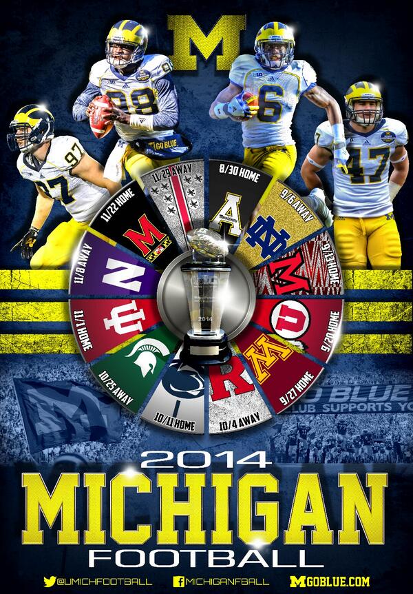
Eh, lame design.
Also, they do these for every sport. They're given out for free at fan day and for other promotional deals.
Some guy did one and posted it on Twitter and it was outstanding.
Actually, I think the official one is better. I don't want to see any buckeye stickers anywhere on a Michigan poster.
Know thy enemy.
I guess I like it because it's creative. Instead of just doing the opponent's logos, the background behind them is the design of their helmets.
That was my very first thought. Why put stickers on the Buckeye helmet? They have to be "earned" and are not on every helmet. Why embrace it on our poster?
... God, I must have issues.
Wheel... of... bad home games!
I like it though.
twitter one is better and easier to read
Back in the day we posted all the sport posters in our house. They've kinda fallen off though - don't like that they are not uniform size and last year's circular basketball poster was just terrible.
Still love picking up field hockey, volleyball, wrestling, swimming etc posters though. They don't adorn the walls of my shitty college house anymore, but rather the lockerroom office at our school
But is it 3D?
but you have to stare at it intently while simultaneously relaxing your eyes
It can get tiresome, granted. But given that the trial is happening right now and that schedule posters just like this one have been discussed at length and entered into evidence, I think it's a relevant point to make.
I still have the 2004 one hanging up. 125 years of Michigan football.
I wish that had been a 1 game special commemoration thing. And then whoever wears 98 gets to have Tom Harmon's badge on it.
Thankfully Gardner and the team don't seem to hate it.
Thats probably Justice Hayes
The WOW experience!


https://pbs.twimg.com/media/BrEEg3rCcAAyHe1.jpg
Only public version I know of. Since it's a poster, I highly doubt a high-res version will be made available.
That one looks nice, but I like the wheel one a bit more.