Welcome To The Successories Conference


aaargh unnecessary comma
When Twitter blew up at noon I figured something inane involving Jim Delany had just happened—this is my default assumption whenever Twitter blows up and has always been right, even when Michael Jackson died—and good lord, inane doesn't even begin to cover it. You know this by now but to remind you that the people in charge of marketing the Big Ten are either very stupid or think you are very stupid, the Big Ten Divisions are called "Legends" and "Leaders."
So. A group of people responsible for turning the Big Ten Network into a spigot of filthy lucre so gushing it can afford to employ Chris Martin is also responsible for making the Big Ten the Successories Conference. They've created division names that signify nothing about the teams inside of them—the only way I can remember that Michigan is in the "Legends" division is that "Leaders" is part of the friggin' fight song and we're not in that division. Their inane names don't just start with the same letter, they start with the same two letters. They are unusable.
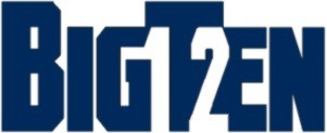
And they've done this with 15 minutes in photoshop:

Note the use of negative space. Also note how stupid it looks.
By comparison, the new Pac-10 logo would look badass on any soccer shirt in the world:

How can the same group of people responsible for creating the BTN be responsible for this? Obviously the visionary bits of the BTN arrangement come from Fox, with Delany and company the lucky nomads who parked their camels in the right bit of desert and now get to call themselves an emirate.
Policy
These division names do not exist. I'm not using them. Michigan is in the West. Ohio State is in the East. Wisconsin has to deal. It is immediately obvious which teams are in the West—the ones mostly in the west. Michigan can be Champions of the West, and no one has to think about how leadership is more about character than authority.
Can we make this a blogosphere-wide insurrection? Please? Everyone just use "East" and "West."
Remember when you'd go in your room and imagine that instead of a broken down tricycle you had a flying unicorn that could take you away from mommy and daddy's screaming? Yeah, this will be like that.
BONUS: someone on the twitters said "I'm pretty sure an ordinary @MGoBlog thread could have produced better logo options," which is true. So do it either in the comments or by email and I'll pull up the best five and we can vote on the Unofficial Big Ten Logo; I hope I can work out a deal with the winner so we can offer it to the conference for free, if only to shame them.
December 13th, 2010 at 3:25 PM ^
to find a common GEOGRAPHIC element
Brian's West becomes "river" - hunting, streams, rivers, etc - feature on all of those school's campuses
Brian's East becomes "valley" - mountains, hills, mining, outdoors
SERIOUSLY I JUST CAME UP WITH THAT WHEN I CLICKED INTO THE REPLY BOX. IT'S 40x BETTER THAN LEADERS AND LEGENDS. I GOT PAID NOTHING. I'M SITTING ON A COUCH IN GYM SHORTS FOR CHRIST'S SAKE.
December 13th, 2010 at 3:33 PM ^
wearing gym shorts helping Christ ?
December 13th, 2010 at 4:04 PM ^
on ChristsHotties.com
all donations go to Him
December 13th, 2010 at 3:28 PM ^
"Three Yards"
"Cloud of Dust"
December 13th, 2010 at 3:31 PM ^
Since I've not read a single positive response to this anywhere, who the hell are they marketing to?! Blind people don't watch football..............they listen.
If Delaney was smart he would have had Kenny Powers unveil this thing and just like he says with those damn "Tube" commercials he could have said, "If you don't like'm.....change your mind!"
December 13th, 2010 at 3:36 PM ^
This logo still sucks in braille.
December 13th, 2010 at 3:36 PM ^
Can this be my submission?
(Really, how hard a fucking choice was this?)
December 13th, 2010 at 3:59 PM ^
I choose this. C'mon JD, we don't need to re-invent the wheel here. Keep it simple and classy. Seriously looks like they just copied USA TODAY as noted above.
December 13th, 2010 at 8:13 PM ^
Now, how funny would it be if someone hacked the bigten.org site and this showed up tomorrow. just kidding. Not my idea. I would never condone such a thing.
December 13th, 2010 at 3:36 PM ^
Assuming he didn't create the graphic at the top of this article, I'd love to see what he came up with.
Q. How might you redesign the Big Ten’s logo if you had the chance again?
A. When they went to 11 [members], I actually gave them a 12 and a 13.
Q. How’d they respond?
A. I think they thought that was humorous at that particular time. … But I would be honored to design a new logo for them. It put me on the map.

December 13th, 2010 at 3:38 PM ^
what?
December 13th, 2010 at 3:43 PM ^
hahaha oops. I'll go back and try and add them.

December 13th, 2010 at 11:26 PM ^
Really, we don't need to hit people over the head with that.
December 14th, 2010 at 2:13 PM ^
I agree. The negative space 11 was subtle and hence OK. Putting in a 12 that isn't next to invisible is just dumb. Just use the words "Big Ten", not "Big 10" and combine it with a decent looking graphic in a decent color. Done.
December 15th, 2010 at 3:27 AM ^
Thought- move the conference, get rid of the 12. Have each school's logo cut out in just white (block M, Hawkeye etc) and have 6 on each side (mainly in Nebraska and Penn). Would show the 12 schools while helping cut out some of the solid blue area on the sides and balance it out.
December 13th, 2010 at 3:38 PM ^
that coming up with a good logo isn't that easy.
My initial reaction was "Printer cartridge cyan for the color? Really?" Just use that same gunmetal gray that the PAC-10 is using and the new logo would be 100% better.
The new division names are pretentious and arrogant. I can only imagine people in the other power conferences, not to mention the Ivy League, rolling their eyes at these contrived names.
Just go with "East and West" or perhaps something slightly more nebulous like "Lakes and Plains" and be done with it.
December 13th, 2010 at 6:20 PM ^
I think this thread proves that people who are wasting time at work can spend $0 and 0 effort creating a logo that is as good (if not better) than paid professionals who worked for months to create what they have now.

December 13th, 2010 at 3:52 PM ^
Conversation from the two guys responsible for designing the new Big 10 logo.
Guy #1: Dude, what day is it?
Guy #2: Uh. It's December 13th. Isn't that date important for some reason.
Guy #1: I feel like we had something to do for that Delany guy.
Guy #2: A logging. A pogo stick.
Guy #1: Oh shit!
Guy #2: What? What?
Guy #1: The new Big Ten logo. We forgot to design the new Big Ten logo. It's due in like 30 minutes.
The doorbell rings. Guy #2 peeks out the peephole.
Guy #2: Shit. It's that Delany guy. He's gonna be pissed.
Guy #1: Quick. Call up that old MS Paint we did for Columbus Feed & Trough and fucking change it to Big Ten.
Guy #2: We'll make the I look like a 1!
Guy #1: Hide the pot too while you're at it.
DELANY enters.
Delany: Is the logo done?
Guy #1: Yes sir.
Delany looks at it.
Delany: It looks like shit.
Guy #2: I think it's got a rustic quality to it.
Delany: Hey, is that pot?
30 minutes later.
Delany: Dudes I fucking got it. Legends for one division and Leaders for another. It's like we're the best conference in the world and like all the other conferences don't have legends and leaders. Or leaders and legends.
Zoltan Mesko: SPACE EMPEROR BLAST!
Mesko incinerates all 3 men and uses 3D space technology to create a logo featuring colors from another planet that are more beautiful than anything we've ever seen. And then announces the divisions are named "Lakes" and "Plains" because his space brain processed the most logical solution.
December 14th, 2010 at 1:27 PM ^
that this scene wins the thread, and that's saying something.
December 13th, 2010 at 3:49 PM ^
December 13th, 2010 at 7:42 PM ^
December 14th, 2010 at 12:37 AM ^
I like this one.... but suggestion... Take the top of the "T" and extend it to the right over the sideways 2. Perhaps having to move the 2 down a bit to create white space. Essentially creating a sideways "12".
December 13th, 2010 at 4:05 PM ^
Are yet another reason why I felt that a pure geographical split would have been completely fine. We would have kept most of the rivalries, Michigan and OSU would have fought for the division title every year in the last regular season game, and we would of had a simple East Division and West Division. The only thing they would of had to work on would have been the Logo.
December 13th, 2010 at 11:12 PM ^
Agree totally. Make the divisions geographically based and call them East and West. Why have Mich and OSU in different division?. They could possibly play last regular game of season and then play the next week in championship game. It would diminish the rivalry game a bit.

December 13th, 2010 at 4:14 PM ^
I took this moderately seriously to see if I could come up with anything, and it wasn't as easy as I thought ... but here are a couple:

December 13th, 2010 at 4:19 PM ^
This one makes the "X" a little more prominent than the "II":

December 13th, 2010 at 4:19 PM ^
If JD was the head of GAP he'd respond tomorrow saying..."just kidding"
http://www.thespec.com/news/business/article/266523--gap-s-logo-returns-to-blue
December 13th, 2010 at 4:27 PM ^
I don't think it's the right color for this but if they insist on the cyan...
December 13th, 2010 at 4:53 PM ^
I like where this one is headed
December 13th, 2010 at 5:02 PM ^
I like this one many times more than Delany's. I actually almost prefer it to my own contribution.
December 13th, 2010 at 5:15 PM ^
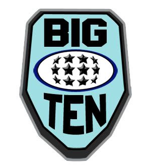
I like using stars to symbolize the number of teams. This thread has already generated 5 ideas that are better than what they gave us and it's been 3 hours.
December 13th, 2010 at 8:19 PM ^
Yes, and just like the American flag, we can add more stars as we add more schools.
December 13th, 2010 at 5:48 PM ^
This is my favorite. I'd tinker with the colors and fonts, but it's a cool shape/concept. I definitely like the idea of using stars to represent schools. (Michigan and OSU, naturally, are the two middle stars.)
December 13th, 2010 at 5:55 PM ^
You can tell I don't do this kind of work In Real Life by the (non)selection of fonts on my computer. :P It's driving me nuts because this one doesn't really work, but going out to find a better font would involve more than 5 minutes, so. Someone else can have at it!
December 13th, 2010 at 4:33 PM ^
I updated mine to include campus locations :

December 13th, 2010 at 11:29 PM ^
Think you need to pull the two lower left stars further to the left. But that's still at least 32,768 times better than the pile of crap they chose.
December 14th, 2010 at 12:43 AM ^
yeah this was pointed out in the other thread too:

December 14th, 2010 at 5:39 PM ^
The stars are off, but the concept is exceptional!!! I've long been a proponent for including the lakes....
At one point I was interested inthe Great Division and hte Lakes division, or Lakes and Plains....and at this points it's better than L&L
December 13th, 2010 at 4:40 PM ^
I'll take half of whatever they paid for the new one.

December 13th, 2010 at 5:08 PM ^
these logo ideas are all turrible.
December 13th, 2010 at 5:16 PM ^
And nonetheless every single one of them is better than the B-1-G logo they gave us. And actually some of them are pretty good.
December 13th, 2010 at 5:19 PM ^
December 13th, 2010 at 5:28 PM ^
I still favor the "Where's Wisconsin?" and "Why is Wisconsin here?" divisions.
December 13th, 2010 at 5:32 PM ^
BOOM! cyan!

Comments