Writers chime in on best college football helmet
 I know old subject. Brought up every year, but this stuff never gets old to me and besides it's off season. Spring Game and recruiting commits not withstanding.
you're an Oklahoma fan or just don't appreciate the aesthetic of the helmet like most reasonable observers do.

Texas helmet is clean, iconic, and steeped in tradition. You may not like the team, but I can't fathom how you don't appreciate the helmet.
I disagree. Texas is my second favorite helmet. It is a clean look and I like the color combination. Oregon's green and yellow helmet is my third favorite.
because it reminds me of the female reproductive system I learned in 7th grade..
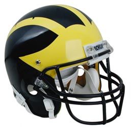
No two colors go together like Maize and Blue. None. Not a single color combination exists in sports that is better than Maize and Blue. Plus almost everyone, even people that don't know sports, can identify Michigan's helmet. Plus how many athletes have come here over the years because of the helmets alone?
April 17th, 2011 at 10:38 PM ^
my fiance just agreed to make blue, maize, and white our wedding colors tonight!
Oh, btw, as of this week I'm getting married!!
April 18th, 2011 at 11:16 AM ^
Sounds like she's a good catch.
Why do they even bother having this discussion still? Michigan's is and always has been the best.
Yeah, I don't get the Texas love either. Orange on white is kind of ugly. It's a nice logo, but honestly I think it would probabl look better with the colors flipped. It looks fine with their orange unis, but when they wear white their uniform is just all white, which is neither cool looking nor intimidating.
FSU probably has my second favorite helmets.
of the basic catalog Spalding helmet, circa 1938.
And we never get enough credit for taking that standard idea, and making it the symbol of a great football program, and then sticking with it, through one uniform fad after another.
The Spalding design did not have three stripes. It just had the two wings. Some teams (including MSU for a time) added one middle stripe. Fritz Crisler came up with the idea of having three stripes, which merged in the back.
Football helmet, Model FH5:

Crisler invented that design in 1935, two years before then.
I don't much buy it. Georgetown U. football archives have this photo of a player named Ray Fusco, who played in 1934. Standard Spalding "winged" design; three stripes; "G" on the front, as with the "S" on the front of Michigan State College's 1930's helmets. Ray Fusco only played one year for Georgetown (1934) and he wore #21:

There has always been more myth than fact surrounding Fritz Crisler's involvement in helmet designs. Crisler can take enough credit for being one of the great football coaches in history, (Biggie Munn was a Crisler assistant; Crisler fathered future coaching careers the way Woody and Bo did) even without helmet designs.
the leather helmet in the front. Then many schools used different colors for the wing and the rest of the helmet. Michigan stuck with the color scheme even after helmets went plastic and there was no reason for the reinforced, thicker leather in the front.
A link to some cool old helmets: http://www.pasttimesports.biz/football.html
Kind of interesting that one of the writers picked Wyoming, which is a nice logo, and always reminds me of one of the better bars in the world, the Million Dollar Cowboy Bar in Jackson.

A sort of funny but true story is that during the 2004 Presidential campaign, Dick and Lynne Cheney were seated near me for one of our October games during a Michigan campaign stop, and I asked him to autograph my ticket stub. And in just trying to make small talk, I asked the Vice President who the Wyoming Cowboys were playing that day. What else do you say to a Wyoming guy? And he kind of panicked, because he obviously didn't know, but didn't want to say. As though a reporter would be recording the answer. I quickly changed the subject.
I agree with maizenblue92.
Worst helmets to me are:
1. Wisconsin with that stupid WordArt "W"
2. tsio
3. Georgia and their knockoff Packers "G"
Does anyone else think Nebraska has a shitty N on their helmet drawn by a first grader?
April 17th, 2011 at 11:31 PM ^
As a Georgia alum...I have to agree. I've never liked our G and the fact that an NFL uses basically the same G. In Georgia's defense, they were the ones who designed the current form of the G that both teams now use. Georgia stole the original packer's G, modified a bit, then the packers liked the modification and used it too. At least thats what they told us when I was a student there.
The more people do these polls, the less people will pick Michigan because people are tired of picking Michigan's helmets year in and year out so when they come up again, people do insane things like pick Wyoming's helmet just to add some spice to the immense boredom of being a college football writer in the off-season
Michigan has the best helmets period. Second place should by default go to Delaware. After that it really doesn't matter. As long as we find little brother, Cheater State and Notre Lame at the bottom of the heap.
I'm probably in the minority here, but I've never understood why the helmets of Penn State and Alabama are considered design classics.
I understand the old-school appeal, but, to me, a single stripe down the middle is non-design in the guise of design. I think you need to do something more than that.
Honestly aside from Michigan what you're looking at is the coolness of a logo or the background color. Because that is what 99% of football helmets are.
April 17th, 2011 at 10:51 PM ^
I can't argue with helmets. Complete uniforms though I would put ND then UM. Fantastic rivalry we have here. #1 & #2 in almost everything.
Looking at a complete uniform I have always really liked Texas' all white road unis. Something about the white on white with just enough color in the helmet and socks... Way better than our road unis.
April 18th, 2011 at 12:05 AM ^
1. Michigan
2. FSU
3.PSU
4.Texas
5. SCLSU Mud Dawgs
April 18th, 2011 at 12:49 AM ^
I'm actually impressed someone mentioned SMU. Always dug that helmet. Very underrated.
April 18th, 2011 at 11:46 AM ^
For me second place has to go to the Navy helmets. The Army and Notre Dame helmets are crap though....:)
April 18th, 2011 at 12:18 PM ^
Navy has cool uniforms for sure. I like the lightning bolts on AF's helmets too. There, I said it.
April 18th, 2011 at 12:46 PM ^
Navy's are quite sharp