MDen new site design up; 2011 gear designs revealed

owns reebok...
Reebok is still around??
Our backup was Avia.
He's the starting catcher for the AL next Tuesday!
Can come out in Kangaroos? Never know when you'll need the little pocket.
They have fitted the NFL for some time
I like certain adidas products, but man, the Michigan gear is subpar IMO - in particular those new hats are just brutal. Say what you will about Nike, but I liked a lot more of their shirt and hat designs.
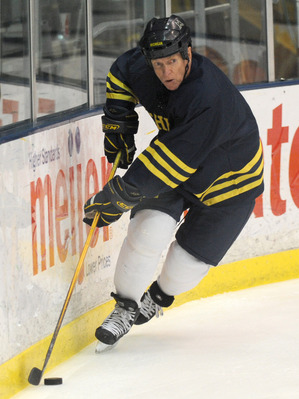
WTF Michigan? Those might be the worst white jerseys hockey has ever had. I always prefered Nike's block M on the whites, but the throwbacks they have had have been excellent...this is pathetic and embarrassing .
Maize Jerseys:
Not bad, I prefere the Rangers style diagonal Michigan and the 90's script Michigan...but this is still not bad. Different shoulder patch too...now just a block M instead of the split M with the hockey sticks.
Blue Jerseys:
This one does not seem to have changed at all...other than maybe the stripe pattern (and the simple block M shoulder patch instead of the split M with hockey sticks), but it is essentially the same. I prefer a model of the football jerseys that are like this but with NO white accents...but that will never happen.
Now I don't think there has been an official announcement about the jerseys, so until then...who knows. (Remember one year the website was modeling diagonal Michigan jerseys for each color)
Agreed on white jerseys. The only team that ever looked good with the bigger block M concept was the Glen Rice era basketball uni's. Those need to be brought back pronto.
The white faux throwbacks from the last couple years were the BEST M hockey uni ever. Period. End of story. they were traditional while still looking sharp and somewhat unique. So is there going to be a number on the front of the jersey? Is it going to be straight blue or blue with maize trim? Bad move adidas/reebok. Bad move. The blue jersey I'm OK with and I think the maize one is OK, but preferred the rangers style as well. And call me a uni snob, but I liked the unique M with hockey sticks crossed patch. it was unique and not being gaudy and matched perfectly in blending the major U logo (the block M) with a sport specific item.
Then again, I still liked our broomball uniforms from the Michigan broomball team in the early 2000's...
Not a fan of alot of the new gear for 2011
but:
gotta get the following
1. Night game jersey ( probably from moes) - 1 or 16 available
2. Michigan Flamingos
3. Woodson mcfarlane figure
I actually prefer Reebok over Adidas.
Why is it that the official retailer of Michigan markets and sells t-shirts labeled as "Yellow and Navy". It's bad enough that adidas can't produce anything in the color maize, they can at least label it as such.
This is the of maize that the athletic deparment should be using as stated in the University's style guide, which while is targeted for printing, a similar hue should be used for unversity licensed products. Here's some research on the history of the Michigan maize.

Compare this to the dayglo colors that adidas uses. Brandon's response to this is of course that the bright colors appeal to the kids. If that's the case, I have some Ocean Pacific t-shirts from the 80's they can buy. And get off my lawn.
IIRC Nike owns the "Michigan Maize" color and has it trademarked I could be wrong but I have heard this in the past.
Granted, I'm not an expert on trademark law, but I don't see how they could trademark a color -- seems like those would all be fair use.
There was no sudden change in pantone numbers with Michigan's adidas contract. We've been moving steadily in the direction of a brighter and brighter maize for a couple of decades if not more. It looks better on television and in photography.
I'm as much of a traditionalist as anybody who isn't already buried in Forest Hill Cemetary; but I like the brighter "maize."
For once I agree with Section 1.
The "hilighter yellow" what some of you (generally older) folks complain about has been around since before Adidas.
Really, there was a point - 80's maybe - where we got to an ugly gold color. Since then we've reverted back to a more yellow color.
In fact, the actual, original "maize" was a very light, almost faded shade of yellow. It was not at all the orange that many "traditionalists" complain we should still have.
I, for one, think having a bright, more noticable and aesthically pleasing shade of maize is a good thing.
The main point I wanted to make is the use of yellow and navy as the description of the item, when our colors are maize and blue. Maybe they should change the lyrics of Varsity to "March on to victory for Michigan, And the Neon Yellow and Navy Blue".
I completely disagree about highlighter yellow, it's garish. And no, I'm "generally older".
"The Yellow and Blue"?

needs to go to work on this crap and get the M back where it belongs
1. Nike (no procombat)
and
2. WJR am 760 radio. I can only get game coverage off Canada radio am 800 (sucks).
Thank you sir
Why did they have to mess with the maize hockey jersey?! I also prefered the Rangers style diagonal Michigan. The thing I hate the most is getting rid of the hockey sticks on the block M shoulder patch.
Hopefully the quality of these jersey's are better than previously. I bought the white jersey last year and it was paper thin compared to the old Nike ones. Back in the days (before the NHL signed with Reebok) even the CCM replica jersey's were top notch... made in Canada. Now we pay the same price and have to settle for an inferior product made in Indonesia.
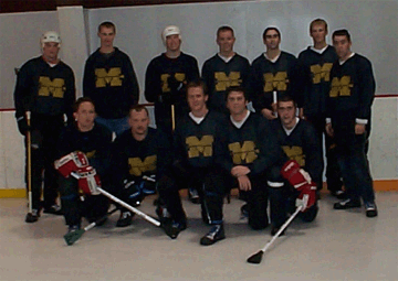
What was the story on the jersey that ol' Red had for last summer's hockey Showcase? Old game jersey? Practice jersey? I lose track of all the permutations of the hockey unis.
They wore these jerseys a long time ago...and for a GLI (it was a anniversary year for the GLI). Red and others where these for the old alumni game each summer...
no white accents on blue Michigan (any sport) jerseys = bad ass
no white accents on blue Michigan (any sport) jerseys = bad ass
That design looks a lot like Red's old playing days as a collegian...
I think in those days, "Whites" were worn at home:

or maize (insert any school's alternate jersey color here) alternates...
the NHL seriously needs to go back to wearing white jerseys at home
I gotta get back to Yost...
I agree about the NHL uni convention with whites on the road. I've never gotten used to that.
For whatever reason, the Over-55 alumni teams always use those permutations of the Michigan hockey jerseys. It was like that pre-Adidas, too. The jerseys for the alumni games are always provided by a different manufacturer.
As for when they were worn last, the blue jerseys in that style were worn for the 1994 Great Lakes Invitational.
Get out the torches and pitchforks! The block 'M' on that maize jersey looks like stained glass!
/quilting stich
It's like Adidas pulls this crap just to piss off the fans. Those hockey jerseys are horrendous.
The under the lights blue polo, track jacket, and hoodie are all pretty nice. So theres some positive thinking for the board.
this has to be the worst year ever of michigan gear i can remember
and yes
that white and yellow hockey jersey and the hats this year are the worst i have ever seen !
I bet they made the notre dame stuff real nice for those idiots !
Need to go back to Nike, for real !
when does this contract with adidas end
the sooner the better
Ah what the offseason creates...the Michigan Fashion Blog...
Adidas just ruined the best jersey Michigan Hockey has had since the script-Michigan maize unis from the early-mid 90's. That white jersey was top notch. Now it looks like... Wal-Mart.
This is just too much.
It's all what you're used to. When I first started following hockey in the early 60s, the NHL convention was dark colors at home, whites on the road. Whenever it was reversed, I thought it looked wrong, and still do.
what is the big surprised? Especially when they are owned by Adidas...
still blinding people. Amazing.
the block M on the white jerseys it totally unncessary and it's pretty stupid looking. it would look way better with an M that matches the ICHIGAN
While I tend to agree with you, the "logo" is very similar in style to U-M's pre-Fab Five basketball jerseys, which, unless I'm mistaken, remains a very popular uniform in the eyes of most fans.
