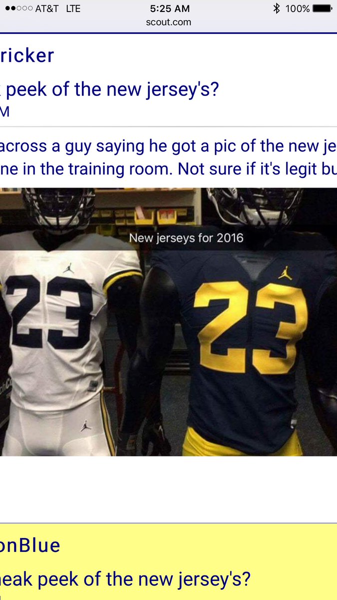
Jumpman Football uniforms (PHOTO)

I woke up to a nice surprise this morning. Someone tweeted this and it was brought to my attention.
ORIGINAL TWEET:
@mgoblog @michiganinsider @umichWD @SamWebb77 pic.twitter.com/NzWfGbhPVn
— Justin E Harkelroad (@jharkelroad1) July 29, 2016
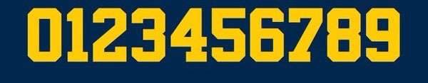
The font we're using is NBA Bulls. The first change to the font in almost 50 years. The classic #2 worn by Woodson is gone.
Sent from MGoBlog HD for iPhone & iPad
That's because some people have weird man crushes on the wolverine devoter guy.
Rightfully so.
I'm with you. Something seems off about it. I do like this version of Maize better. Looks closer to the 90s Maize. I would like to see the block M somewhere. Always like it when they put one on the top of the thigh on left side on pants and then on shoulders or something.
The number font change only changes the #2, which is changed to the same font of the #2 Jordan wore with the Bulls. I don't really mind the change.
For not reading every single comment on this thread before replying to yours. As far as Michigan traditions go, I think the block 2 font is pretty far down the list. The picture of a jersey similar to this leaked weeks if not months ago showing the same #2 as these pictures do. I don't think this was anything unexpected. If these are the jerseys, they look pretty solid, I really don't care much about a single number looking a little different than it previously did.
but that 2 is in Woodson's and Desmond's numbers...it carries some Michigan tradition with it.
The number carries the tradition, not the font.
this. all of this. so much of this.
with the rest of the number fonts. 5, 6, 8, and 9 are all similar constructs to 2 in how the number is built, yet this font makes it unique and out of place. It might look ok with the 7, but doesn't match the rest. The rest of the numbers look good and blocky.
I also think the size of the numbers looks slightly too big. Maybe a reduction by 10-20%.
didn't jump high enough?
Also, there's no B1G logo, so I'm calling BS on it being the final version. Surprised WD didn't catch that, unless he was just testing us.
WIll be on the pants, you can see the edge of what is likely the M on the white pants, and potentially a small one on the back around the collar.
Sent from MGoBlog HD for iPhone & iPad
Looks slick. This appears to be the same jersey that was in the background of a pic months ago.
Without me retweeting it, I would've been as no one knew about this until then. I almost didn't do it but was talked into it.
I'm just glad my brand of psicosis is strong for me to be included in that tweet as if I matter like the others in that tweet do.
Tell us first, tweet to the world later.
He needs a new logo!

that font doesn't capture his rich history and tradition!
change the white lettering to some random yellow. Firstt yellow you see. Wolverine Marginally Interested would never bother to pick a proper maize.
Sent from MGoBlog HD for iPhone & iPad
They obviously look very similar to the Adidas jersey last year, and the number font could be different to help make it different without changing it.
Numbers font - I really like it
Sent from MGoBlog HD for iPhone & iPad
I'm ok with the font as well
Looking big picture, if the #2 is the only thing we're changing in the entire jersey I think it's great. No piping. No stupid collar.
Are we allowed to move the B1G logo to the back shoulder/collar of the jersey? If so, these are perfect. Hoping the maize paints get the block M, but other than that, I perfer the clean jersey to a cramped one. Shout out to jharkelroad1.
Something tells me these were not supposed to be leaked.
Sent from MGoBlog HD for iPhone & iPad
Maybe I'm just not Wolverine Devotee enough...but I don't see the difference in "#2's" between that picture and this:

Sent from MGoBlog HD for iPhone & iPad
You must not be good at those games where you have to find the 10 differences between pictures. The new "2" has a noticeable slant in the middle, where the old one does not.
see it at first either, but once you notice it the change is very striking.
Ahh, yes. The angle in the middle. Totally missed that. To that I say, meh. I don't think anyone will notice that unless you literally put the two on top of each other. IMO a very minimal change.
In that case, let's hope 1997 Charles Woodson doesn't tackle 2016 Drake Johnson in Michigan Stadium this year, or else it could turn into a full-fledged fashion competition.
wondering if that is actually Dennis Norfleet posing in those uniforms.