Equipment: Michigan to sport adidas "Shockwave" socks on the road

Slow day on the board if you aren't wrapped in "LeBron: The Musical Circus".
I've known this for awhile now so I figured I'd post it just as a minor equipment update.
This season, Michigan as well as the other adidas schools will sport the new adidas Shockwave socks.
Here is the verification from the same adidas catalog that I found last year's Team Speed socks in-
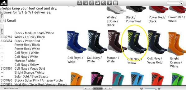
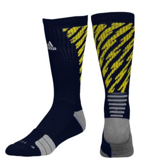
Better look at the front and back of the Shockwave socks.
These are the Team Speed socks Michigan wore last year in road games. Somewhat similar to what they wore in the Cowboys Classic in 2012-

I've noticed that adidas 2014-15 player gear and equipment theme has to do with electricity.
For example, here is the Aftershock hoodie.

adidas/M-Den also did release new fan gear today.
I love the printed foil visor on this shirt even though Hoke doesn't seem to allow visors.


And here is the official t-shirt/hoodie design for all sports at Michigan in 2014-15. Very little changed and I'm not very happy about it because I hated last year's design.

WARNING: 100% subjective post below.
I think that helmet/visor t-shirt is the most Wal-Mart Wolverine thing I've ever seen.*
"Respect the Maize and Blue"
Does anyone actually buy these cheesy (non-Michigan) slogan shirts?
I like the maize pullover/jacket thing. The Maize is probably something I'd only wear to UM games, though. I'd like the blue one if it had the block M instead of the weird football helmet logo. I always hated that logo.
Ditto what you said on the team shirts. The font is weirder this year too. I understand that as a t-shirt but find it weird anyone would have a hoodie like it.
Of course, because of the obscene prices I probably would never buy any of it. Still rocking nice, free adidas gear I got as a student.
*I don't use Wal-Mart Wolverine as a derogatory term for non-alum fans. I use it as a term for stupid, tactless fans that may or may not be alums.
I didn't like the helmet thing at first when it came out in 2012. But they've figured out that Michigan's helmet has wings over time.
The foil is just something I've never seen done on a Michigan shirt. And I like it. The only thing I wish they did was color in the white on the helmet to Blue.
But yeah, I don't know why adidas can't just be normal and do shirt designs like they did for 2011-12 - 2012-13. Below was the Michigan Football shirt for that time period and it was simple and not dumb looking. Except for the person wearing the shirt. (me)


I said new stuff. Not stuff that's been available since MDen opened.


Adidas has been making the plain Michigan stuff since the beginning.
Yup, I've always thought most Michigan stuff, and even most sporting apparal in general, was cheesy unless it was just a simple logo or word. "Michigan, Block M, go blue, hail....Detroit Tigers, Old English D and so on". I must say, putting a shiny reflective foil on the shirt takes it to a whole new level of cheesy.
assumedly all those hiroglyphics mean something. enquiring minds want to know....
Yep. Champion makes some nice M gear. That's more my style.
If I'm noticing the socks we've got bigger problems than the socks.
Any word on what the jock straps look like this year?
Yes, but only for the State game:

Search? This is one of many in my library.
He purposely didnt say public image library.
#HomePhotoCollection-ed

admit to this having been a selfie.
you may as well admit to stuffing said jockstrap with Adidas Shockwave socks.
This is one of those threads that you know Wolverine Devotee started before you click on it. Nothing good ever comes after "Slow day ...".
If Adidas spent less time marketing crap and more time studying physics, we wouldn't have such ridiculous depictions of a shock wave.
man.
Screw socks, let's just wear corduroys. Everyone in favor of corduroys? Good.
The chunky cords or the thin ones?
Definitely chunky cords, should help the O-line look like they weigh more.
I'd drape myself in it, if I could.
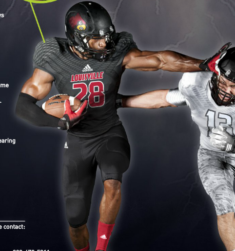
Michigan is already wearing the Shockweb TechFit jerseys in practice. I highly doubt they are ever worn in a game because people would lose their minds. Not pictured in the Funchess photo, but the adidas logo above the jersey number is white on the home jerseys for all adidas schools who decide to go with these.
What has a decent chance of happening is the team wearing Shockwave undershirts (for lack of a better term). We've seen Michigan have graphics on the biceps of their 'shirts the past two years.
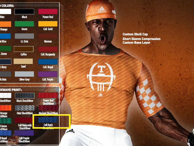
I put a the box around the Navy color we could see. There are less crazy options when it comes to these like a solid Navy which seems more realistc.
I get I'm a nerd with the equipment and whatnot. But the evolution of Michigan's uniforms is kind of interesting to me.
I think Michigan could swing getting Adidas to use maize fabric for the logo on our jersey. It is time for a new jersey cycle, after all.
Why does everything have to be shockwaves or bumblebee stripes? What's wrong with plain maize and blue and white? Get off my lawn.
Because then you wouldn't need to buy new ones every year. Duh.
Chris Berman (singing): San Diego super Chargers, San Diego CHARGERS!
So our socks look like something the Chargers should wear. Meh, they're socks.
I love the old 80s style powder blue Chargers stuff.
Michigan under adidas: Followers of the rest.
I don't really care about the uniforms or shirts or whatever themselves - it's just annoying that we are now doing whatever 20 other adidas schools are doing.
Adidas should stick to what they're good at, mainly Deutscher Fussball Bund.
Perhaps the only minute consolation here is that, in the row beneath the pair of socks bearing our colors, there is a pair that basically has the same color scheme as the title sequence of "Miami Vice", and somewhere there is a team that might very well - and perhaps literally - run with those socks. Not that it was a bad show - I watched it - but it is definitely...well...no one will NOT notice them. Otherwise, I am again bewildered with Adidas.
Adidas sucks.
Fin.