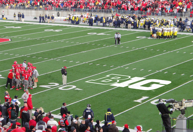
A Defense of the New B1G Logo

I know there have been quite a few critics of the new Big Ten logo around here. I thought some might find this defense of the logo interesting. I personally thing the B1G is much better than the BIG TEN variant.
Why Do College Sports Fans Hate The Big Ten's Smart New Logo?
December 27th, 2010 at 9:35 PM ^
no well-designed identity needs a defense
December 27th, 2010 at 11:29 PM ^
...and the negative space in the “G” hints at “0.”This author doesn't seem to know what negative space is, does she? Overall kind of a lame article because most of the criticisms she addresses are straw men. But one point I do agree with is that it's not necessarily bad for the new logo to be so simplistic. Personally I find it neither especially great nor bad, but completely functional, which is fine with me.
December 28th, 2010 at 1:30 AM ^
too bad you got pushed to page 2.
i wonder if the blogger thinks the 0 is in the negative space inside the G because it's so obvious to a designer that the letter G does not look like the numeral 0...
December 28th, 2010 at 1:54 AM ^
All I want is someone from the Big Ten office to go home and ask someone they trust if their decision is good or not, for instance:
Does this logo look like something hastily thrown together in MS Word in five minutes?
Do these conference names sound cool or make sense?
Oh shit I'm not going to be fired, am I?
December 28th, 2010 at 8:29 AM ^
It is clean, crisp and destined to be a classic.
The criticisms that it is "too simple" or looks "like it only took five minutes to create" do not hold much water. Making something "look easy" (whether it's designing a logo or dunking a basketball) is usually more indicative of the skill of the individual than the difficulty of the task. Pentagram knows what they are doing and, in time, this logo will likely be a non-issue.
December 28th, 2010 at 9:50 AM ^
I'm not the biggest fan of the 1 as an I (except in the little logo, which I love), but I could see myself growing to like it. I think the baby blue was chosen since no team in the B1G uses it as their school color, which I think is a wise decision. I also like the division names, but that seems to be universally loathed.
December 28th, 2010 at 5:24 PM ^
I absolutely hate "B1G". Until they change it, I'm going to call our conference the "bee one gee" conference. There. That'll show 'em, gosh darn it.
December 28th, 2010 at 7:29 PM ^
just terrible
December 28th, 2010 at 7:28 PM ^
December 28th, 2010 at 7:30 PM ^
to have a cool logo.