Jersey unveil to be at 1pm on 8/2, Woodson in attendance

Michigan x Jordan: Forged For Greatness.
That's the name of the August 2 jersey unveil event that will be at the Ford Piquette Avenue Plant in Detroit.
The thing will begin at 1pm and is media-only, though I'm sure they'll be streaming it.
Woodson & Woodley will both be in attendance.
www.maizenbrew.com/2016/7/28/12310226/nike-u-m-will-unveil-football-jer…
MGoJohnStamos noticed something interesting on an edit posted by Kai-Leon Herbert yesterday.
Look at the collar of the jersey here. You can tell something has been edited/cropped out. Also convenient how the numbers are covered up.

Now look at the jersey that was spotted in the locker room months ago that had a new font that was similar to the Chicago Bulls and also features the same collar.

That collar in the first photo is the Nike Flywire collar. So possibly, that means the jersey that has been floating around for awhile could be the real deal or very close to it.
The Jumpman being on the chest with a Flywire collar and potentially a logo at the point of the Flywire like all the other Nike schools have.
That jersey in the second pitcure has an adidas logo on the right chest from what I can tell.
How much money do you have budgeted for this released WD? $1,000?
You're getting warm.
You're going to have to treat this like a gambling addict treats a casino. Take out however much cash you are willing to spend and leave the cards behind.
I've got a plan. I've been planning this for over a year.
Just trying to help, plans are great but when you are an addict and you see something you want and have access to a credit line plans can go right out the door. You've got a probleme WD (not actually a problem) recognize it and keep yourself safe.
We should start an MGoFanGearAddictsAnonymous chapter and organize an intervention post haste.
We have. It posts as Wolverine Devotee.
(Do Not Look At My Avatar).
When do we start?
Sent from MGoBlog HD for iPhone & iPad
Here is my plan.
Go online. Buy several things. Profit.
Is it an evil plan?
Everyone has a plan until they get punched in the mouth.
Too blurry for me to tell definitively on the actual logo, but the jersey number font with the number 2 has been matched to the Chicago Bulls font in previous threads (Google Jordan in his 23 jersey). It does not match the Adidas number font (Google Jourdan Lewis).
So that means you're saying Adidas redesigned the Michigan uniform with a new number font for games they will never play in the closing months before the school leaves them for Nike? And they chose a font that Michael Jordan wore?
Or, is the image too blurry to decipher between a triangle-shaped Adidas logo and a triangle-shaped Jumpman logo?
Also, mannequin is wearing Nike shoes. That is undoubtedly a swoosh. No chance either school would allow that. Whomever got to outfit the mannequin would have done the entire mannequin.
It doesn't look like an adidas logo to me. It looks like a bigger Jumpman.
I think the Jumpman is gonna be bigger than people are expecting.
That would be bad. We are the University of Michigan....not Jordan. The jumpman should be nowhere near as big as the Block M.
Now get off my lawn.....
Sounds like a good rule of thumb. How big is the Block M on Michigan's jersey?
Sent from MGoBlog HD for iPhone & iPad
Somebody put Nike shoes on this mannequin which is also wearing a not-Adidas jersey. This is as far as I can take you. You'll have to deduce the rest.
To aid in your problem solving, consider that Michigan players were wearing Nike cleats (not Jordans) at the IMG practice.
Not when they're signed with Jordan and supposedly started us on the path to Jordan for Football.
Sent from MGoBlog HD for iPhone & iPad
Sent from MGoBlog HD for iPhone & iPad
Sent from MGoBlog HD for iPhone & iPad
Sent from MGoBlog HD for iPhone & iPad
Sent from MGoBlog HD for iPhone & iPad
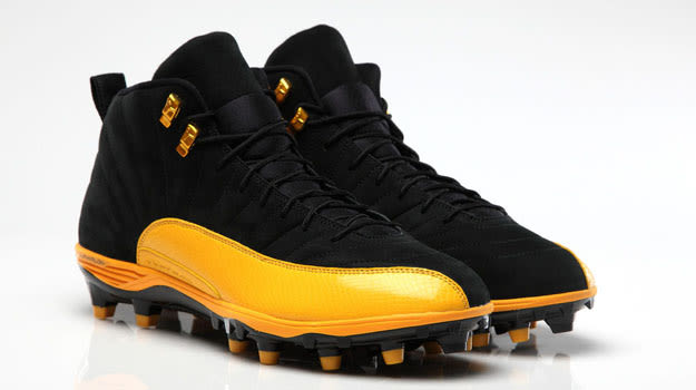
Woodleys PE

Sent from MGoBlog HD for iPhone & iPad
Sent from MGoBlog HD for iPhone & iPad
Not that I would attend, but I'm sure a lot of fans would. Why make it media only?
Sent from MGoBlog HD for iPhone & iPad
Maybe WD secretly works for Nike and is going to be reaping large commissions from the sales of all of this Michigan apparel?
Sent from MGoBlog HD for iPhone & iPad
Definitely count me in the "fan" camp. I think he is great. Maybe I should have put the /s tag on my comments.
You heard it here first.
Nike will be one of his subsidiaries.
from his own purchases.
I appreciate the info, but have to admit that when someone can recognize what version collar a shirt has (Nike Flywire), that person's interests are very different from mine. LOL!!
I am going to be quite unhappy if they change the (basically perfect) number font. I'm already not pleased with the B1G logo, though that's not that much of a bump from having a manufacturer logo on the jersey.
Basically the optimal uniform will have the same number font, a quality blue jersey, minimal extras, a small block M on the pant hip (that's my preference, anyway, though I understand not everybody agrees) and the maize we wore in the early 00s before things started to drift.
Anything else will be substandard. We have a perfect uniform.
That said, I am ok with some limited experimentation on the road jerseys. My preference is a jersey similar to what we got starting in 1997; the maize piping and maize dart jerseys from the late Nike and early-mid Adidas eras were substandard. I would also enjoy a continuation of the white pants, perhaps in rotation with the maize pants on the road.
with a black belt, of course.
Something like this
The cropped out part will have a block M and the the jumpman logo will replace the swoosh.
Sent from MGoBlog HD for iPhone & iPad
I really hope the Jumpman logo is center collar.
You were quoted by Olbermann on ESPN as the source when Keith declared Brand-on the 2nd Worstest Person of the Day.
This is the Chicago Bulls typeface.

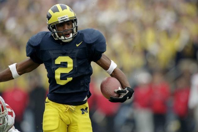
As far as I can tell, only the number 2 is different between the traditional Michigan font and the Chicago Bulls/Jumpman font.
We have actually seen the Jumpman-style 2 on a Michigan jersey before.
It is a "varsity" typeface with the 1, 4, and 7 all serifed -- same as Michigan.

I prefer the Charles Woodson 2 to the Bulls 2 but it's not a huge deal.

I like the Bulls lettering, if that will affect our wordmark.

They look pretty close anyway.
I think the difference is almost entirely about the number 2.
Good analysis, though I disagree with some of your conclusions. The bulls number font uses serifs in similar ways, but it is not quite as slim and efficient as Michigan's in my opinion. And FWIW that fuzzy mannequin picture does not seem to have letters that are as slim as either Michigan's old font or the font you have in your post. Much wider, ungainly, ugly. It might not be a thing at all, of course.
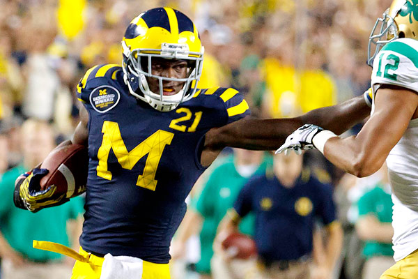
Since the 2 is the number of one of our most iconic players and part of the number (21) in another one of our most iconic players, I consider it a pretty big deal.
Good write-up, though. We will have to see.