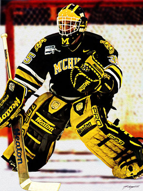
UM Hockey Jersey designs for 2012-13.

I know a lot of people were hating on those big chill jerseys, but I'm a huge fan. Love the wolverine picture.
It looks like a rat...I'm ok with the road jersey but the Big Chill jersey I was hoping would be one and done.
I would get at least two of those, however they will have the CCHA patch on them and I don't think I would like that on there for only one year until they switch over to Big Ten. I'll wait until next year.
I really dislike the block M being part of MICHIGAN on the blue ones. One or the other would look much better.
Agreed. I thought it was a bad change on the whites this past season and I'm disappointed that it's continuing on that new set of blues. Without the block M, those are the tits.
I have yet to hear someone say that they like them. It's baffling that they incorporated the design into the away jerseys as well now. You take away the block M and both jerseys are perfect. It's so frustrating.
but I do still think the block M looks dumb when it's put in 'MICHIGAN'. I much prefer the classic text or the diagonal text
I like boh of them!
I'm not a fan, particularly of the new maize jerseys. They were nice as a one-off; they're not so nice as a regular outfit. I'll probably grow into the throwback road jerseys, but I still prefer the maize-and-white stripe pattern we're moving away from.
I don't mind the GLI throwbacks at all, as a throwback. That's a very specific era they're throwing back to and I think it might look cool.
I'm just not a fan of changing the uniforms all the time. This is Michigan, we ought to have a uniform, and there should be a script "Michigan" on the maize jersey.
Get off my lawn.
Personally I think these were sharp and looked great! Reminded me of our old Nike ones too! 
Michigan Hockey, the Maize Jersey is the first thing I picture. I love them.
I'm a fan of both!
I like the wolverine- in person it looks less rat-like than a small picture on your screen.
I haven't seen the jersey up close, but it looks like a rat on the screen.
If you go through the photo gallery, they won't be wearing the winged helmet at the GLI in order to complete the throwback 1970s look.
UGH. I have to say it but I hate them both. I didn't have an issue with the white one we wore at home sometimes but keep the block M the way it is!!! I'm sick of this changing from tradition shit. I loved the simple styles before like what we wore this year. I never liked the Big Chill jersey either it does look like a rat not a Wolverine. I'm giving a thumbs down on these I'm sorry. I'll stick with my maize diagonal MICHIGAN jersey till I see something better than this. The best Michigan hockey jersey made was the maize jersey with Michigan in cursive baseball lettering style on the front with the university shield patches on the shoulders. Those were the best. I agree about the block M with the curved MICHIGAN on the front.
My favorite blue jerseys. Always looked good especially on Turco.
I think it would be awesome if they brought those back as throwbacks. Maybe in the future they can have a game against State where we both wear those jerseys. I'm hoping that this style is available at the auction Monday, because it's the only style I don't have.
I like having jersey's differing in more than color, I don't like the bold, block M on the beginning of "Michigan", it makes it look unbalanced. I think the Big Chill jerseys are ugly, wolverines are not at all pretty animals, there is a reason Michigan doesn't put the little Wolverines on everything. They're great animals, but not at all aesthetically pleasing (yes, I think jerseys should be aesthetically pleasing, especially when you're gifted good colors to work with, like Michigan is). I understand and actually will go so far as to agree with putting them on Big Chill jerseys, because I know they're basically straight out of player-Red-era Michigan hockey, but not as an every weekend thing. Ideally, for me, the three would be the diagonal "Michigan", the block "M" and the script "Michigan". But it is what it is. I'm no fancy designer or marketer or athetic director, so all I have is my own opinion.
Unbalanced is really the best word to describe it.
I hate the block M in the home and aways, but I love the GLI jerseys. If you're going to go with a block M on a jersey, make it stand alone like that. Don't try to put the out of place block M with the rest of "MICHIGAN." It looks terrible. The alternate/Big Chill redux jerseys just don't do it for me. Still, I'm not going to complain about it like I will about the home/aways.
"said Dave Brandon, the Donald R. Shepherd Director of Athletics"
HUH?
i guess it could be worse. it could be the Arby's Beef and Chedder Director of Athletics...
i'm glad they got rid of the block M jersey. it just never really looked like a hockey jersey.
whoa, man. for somebody that shares likeness in avatars, we are totally not on the same page. the big block M is awesome.

add maize collar and block M to word "MICHIGAN" to alumni game jersey and BAM! new away jersey. i actually like them except for that i don't like block M incorporated into the word "MICHIGAN." it looks better the way it is on the alumni jerseys. i really like the simple three maize stripes though.
they look more like throwbacks than the throwbacks. they remind me of the anniversary jerseys buffalo had been wearing (which were absolutely amazing in every way, in case you didn't know)

i generally agree with brian though, i think the 08-09 lineup was the best:

although, i did dig the mid-90's script michigan if only for winning national titles while wearing it.

i'm not sure what it is about the block M ones that i don't like. maybe all the white and piping etc? i actually think Red's alumni jersey is pretty slick looking. i guess i'm just a minimalist..
I'm sorry but that is an awful Wolverine. I hope they don't incorporate that logo into more jerseys.
This is third straight year that Michigan will have different jersey designs.
It's really starting to anger me. Pick a design, and STICK TO IT.
Good way to make money, but I'm really not interested in buying any since they have the CCHA patch, and that league will not exist after the season.
I'll wait to buy a road jersey in 2013-14.
The alternate jersey is a throwback to the 1945 jersey, which featured that "awful Wolverine."
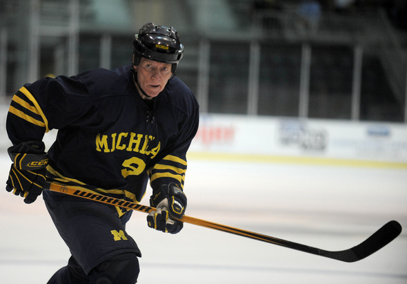
BTW, it's worth seeing that pic just for the expression on Ted Greer's face.