

I wasn't in favor when I first heard about it, but this might just change my mind: Very solid, traditional look, without the bells & whistles - no junking it up with unnecessary designs. Like others have mentioned, an aerial view would be very helpful. But from this angle, it looks pretty good.
That looks so damn good. Can't believe it took this long.
Looks OK, nothing to get excited about.
Awesome!!!!\
well, noticing the font change would be easy if you gave a shot from above.
Look. I don't love it or ah even like it. I also doubt it will matter to me much at all.
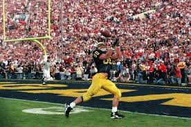
Brings back memories of one of my favorite Michigan moments: Tuman's game-winning TD in the Rose Bowl for the NC:
I'll take more of that please.
This was so incredibly needed and looks 12,000x better. I loved be stadium but thought the previous endzones looked awful and outdated.