A guide to the Valiant numbers (updated)

I hope this is diary-worthy. It took some time! Angelique has published a story about Hackett’s interest in reviving the old 4 and what inspired him to do so, here: Detroit News
Design inspiration for the Michigan numerals was fashioned after the typography found on Michigan’s football uniforms from the mid-1930s and worn by the likes of Gerald Ford. The collegiate style* features unique serifs and angles that reference Michigan’s proud history, while remaining true to the Valiant font.


Great work!
I edited this out, but for sticklers here's a comment on the 1946 team photo. It features Bump Elliot (#42) wearing an angled 2 along with a non-serif 4.
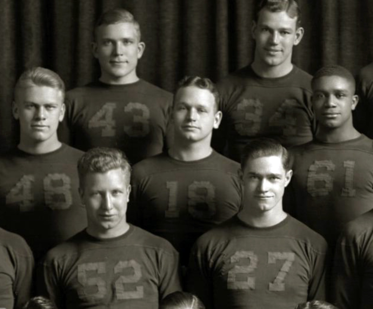
Notice the 5 and the 2 in the Ford-Ward crop from 1934. The 5 still has the middle-serif thing I tried to point out in the diary, while the 2 is just a basic 2.
The next year, 1935, they bring back the serif at the top of the 5 and bottom of the 2, but drop the middle-serif thing in the 5, making them upside-down mirror images of one another:
that 1930 '9' is whack. All the 1930 numbers look a little odd, like someone cut them out free hand with a pair of scissors.
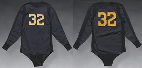
They don't really match the ones on the back, which are bigger, brighter, more detailed, and better-proportioned. It's as if the jerseys were made with numbers on the back, but then Michigan had to make their own numbers to sew onto the front.
Different material, too, as you can see from difference in how the front and back numbers aged in the two jerseys shown (both from eBay, but likely authentic -- the 1931 jersey had provenance back to the player's family).
The 9, like the 6 and the 3, and even the 2, are great. I can understand why they didn't bring the funky heavy serifs back for those numbers, but it's still awesome.
*All the 1930 numbers look a little odd, like someone cut them out free hand with a pair of scissors.*
They did.
They were also eating dandelions.
They made their children live with strangers.
They were robbing banks.
They were jumping off tall buildings.
And they kept their valuables in a hankerchief tied to a stick.
It was the Great Depression.
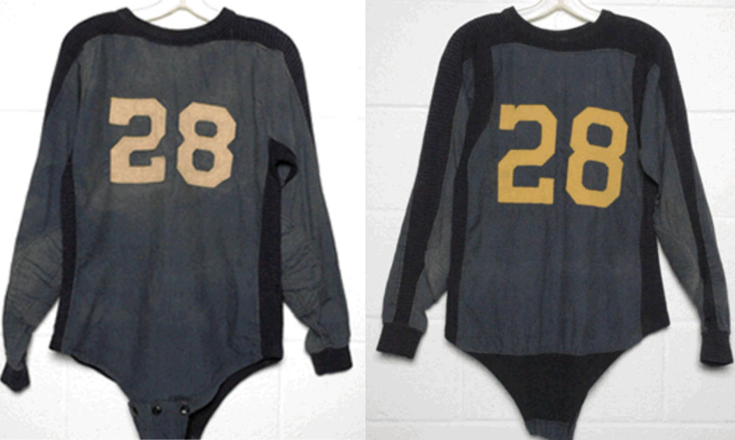
Maybe the jerseys should be onesies again. Nike, get on it!
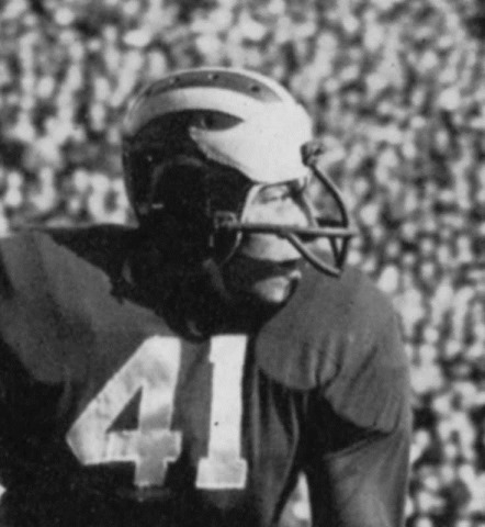
Is it just me, or does #85 look a bit like this guy?
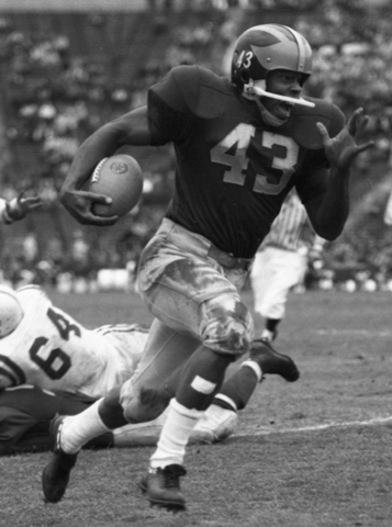
How badass is that Ron Kramer picture? You can almost feel the texture on the jerseys.
very interesting. thanks for the research.
August 9th, 2016 at 11:59 PM ^
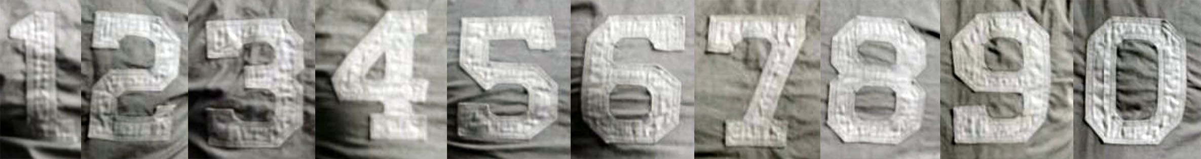
shows that the new font is missing something from a sublety in some of the old fonts - the interior spaces are not squares/rectangles, but are octagons - there are small 45 degree edges cutting the 4 corners. The 8, 0, 3, top of the 9, bottom of the 6, top of the 2, and the bottom of the 5 demonstrate this feature.
In addition, there are hints of external octagons in some aspects with small 45 degree notches - the tops of the 2 and the 6 before they meet the serif, the middle of the 5, and the bottom of the 9 before it meets the serif.
The 1934 team picture shows that most of those octagons were present back then, but as you note, not on spot on the 6 or the 9 where the crossbar meets the vertical with 90 degree angles instead.
Comments