
February 2nd, 2016 at 3:38 PM ^
it's fail was predestined.
It's the whole corporate committee checkbox mentality.
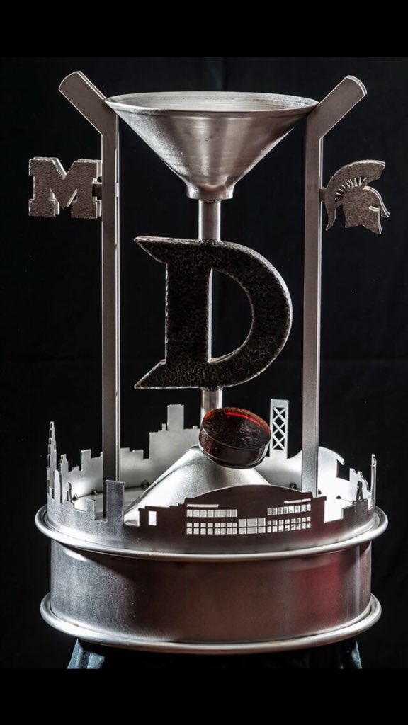
1. vague (& blatant) auto industry components to celebrate Detroit's historical "grit".
2. Symetrical. God-forbid the artwork doesn't match the couch upholstery.
3. City Skyline, because you know the guy paying for all of this is a Detroit developer right?
4. Officially sanctioned, university-approved logos. No split M, just the right touch of butch Spartan helmet eye-slit. etc.
5. Hockey sticks :-/ . . . AND a puck! Not just any puck, but a red puck, because you know it's the red wings new arena.
6. and finally an iron D, because we're all just too stupid to know where this game is going to be played and what this city refer's to itself as.
Nothing that could offend, over-excite, or cause an iota of self interpretation.
it's a scuptural paint-by-numbers project.
Honestly, I think it would look just as nice if it were a paper mache image of Dave Brandon's head. It looks like it could have come straight from his marketing team.
I'm sure plastic replicas of it will be sold at Toys R Us.
February 2nd, 2016 at 3:19 PM ^
D is slang for penis so if they call it the iron D trophy there might be some misunderstanding and people who like to make jokes might make a joke about the trophy being a metal penis or something. maybe.
February 2nd, 2016 at 3:22 PM ^
Sent from MGoBlog HD for iPhone & iPad

February 2nd, 2016 at 5:39 PM ^
February 2nd, 2016 at 5:50 PM ^
Why is there a red cup at the base of a double sided martini glass? Red Wings? It looks like a petri dish of congealed blood.
February 2nd, 2016 at 5:54 PM ^
You know, this sounds like it comes from one of those late-night martial arts movies, something like "The Legend of the Iron D."
(Imagine typical dubbing out-of-sync with lip movement.)
"You too ... can have ... Iron D! ... like me ... if you train ... long ... and hard!"