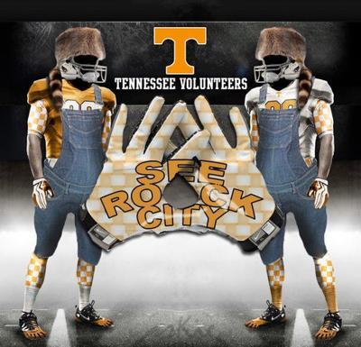
OT-Check out Tennessee's new alternative uniformz


August 15th, 2013 at 4:19 PM ^
7/10 - not a game changer but a credit to Adidas for not going with, say, orange and white checkered patterns.
August 15th, 2013 at 4:40 PM ^
August 15th, 2013 at 4:49 PM ^
You do see the sleeves on the undershirt, right? They could not help themselves.
August 15th, 2013 at 4:58 PM ^
I THOUGHT THOSE WERE STRIPES
Revised score: 6/10.
August 15th, 2013 at 4:20 PM ^
August 15th, 2013 at 4:57 PM ^
No creamsicle
August 15th, 2013 at 4:21 PM ^
Looks more like Syracuse than Tennessee.
August 16th, 2013 at 3:27 AM ^
August 15th, 2013 at 4:21 PM ^
Love them.
August 15th, 2013 at 4:22 PM ^
Whatever it takes to sell tickets. Have they sold out a game yet?
August 15th, 2013 at 4:23 PM ^
August 15th, 2013 at 4:25 PM ^
Not a bad looking uniform, but they have zero to do with Tennessee. It's like if MSU were to wear bronze or something stupid like that......
August 15th, 2013 at 6:07 PM ^
August 15th, 2013 at 9:52 PM ^
We have 7 teams that wear red.
August 23rd, 2013 at 7:30 PM ^
No rule for anyone other than Little Brother. They wanted in, badly, and the Big Nine had leverage.
August 15th, 2013 at 4:24 PM ^
I think they look pretty good actually.
August 15th, 2013 at 4:24 PM ^
yeah they are pretty sweet looking, but is blue one of their colors? Is this kind of like us sporting some orange uniforms as our alternates. Just seems a little weird.
August 15th, 2013 at 4:26 PM ^
blue or gray??
August 15th, 2013 at 4:36 PM ^
August 15th, 2013 at 4:36 PM ^
Maybe they're trying to do something in that vain after merging the two AD's? Or maybe they just think the blue looks pretty, which is probably a lot more likely.
Edit: Or the guys above are right and it isn't blue at all, this is all some of the fun of uniformz.
August 15th, 2013 at 4:26 PM ^
August 15th, 2013 at 10:03 PM ^
Nothing to be sad about, it's just a dick.
August 15th, 2013 at 4:29 PM ^
I've heard about these some today. I was told it looks more grey in real life than that. If they don't, its not so good.
August 15th, 2013 at 4:33 PM ^
The unis are gray and surprisingly nice. For once Adidas didn't swing for the fences
August 15th, 2013 at 6:54 PM ^
August 16th, 2013 at 3:28 AM ^
August 15th, 2013 at 4:37 PM ^
August 15th, 2013 at 4:41 PM ^
although I was secretly hoping for these...
August 15th, 2013 at 5:12 PM ^
August 16th, 2013 at 12:07 AM ^
will want 'em.
August 16th, 2013 at 12:02 AM ^
August 15th, 2013 at 4:41 PM ^
August 15th, 2013 at 6:18 PM ^
August 15th, 2013 at 4:43 PM ^
My eyes hurt.
August 15th, 2013 at 4:46 PM ^
it shows the color a little better. 
August 15th, 2013 at 4:50 PM ^
I guess they're going for "2009 cool."
August 15th, 2013 at 4:51 PM ^
You know, those actually aren't bad at all as Adidas alternates go - it doesn't make up for the damage Adidas has done to my optic nerves over time, but this does help.
SBNation had an amusing remark on these actually, talking about how the last alternate uniform was the 2009 Halloween game versus South Carolina, which was victory, but alas, a Lane Kiffin-coached victory. Therefore, no black in the uniform this time.
Here's the release video from Adidas:
August 15th, 2013 at 5:00 PM ^
They are quite alternative - sorta remind me of the R.E.M. Monster album cover.
August 15th, 2013 at 5:02 PM ^
pretty good
so many little logo though, very nascar
August 15th, 2013 at 5:10 PM ^
Free advertising for Tennesse. They should thank you. That bluish color is not orange/white. What gives? Don't really care.
August 15th, 2013 at 5:14 PM ^
Not bad as far as these things go, I guess. Does Tennessee have the uniform history that makes the occasional alternate not a crime against tradition?
I do wish Adidas would stop trying to make the undershirt sleeves as a part of the uniform's look happen. The uniform would be much better without the stupid checkered pattern on the sleeves, or sleeves at all, really.
August 15th, 2013 at 5:35 PM ^
August 15th, 2013 at 5:36 PM ^
August 15th, 2013 at 5:41 PM ^
however, they do not look like the University of Tennessee football team and there in lies the problem.
August 15th, 2013 at 5:50 PM ^
Gray isn't one of their colors. The state nickname is the pumpkin patch, not the parking lot.
If they had never started playing sports until this year and chose gray, orange, and white as their school colors then this would be a decent look.
August 15th, 2013 at 5:51 PM ^
The upper part of the jersey reminds me of the condom that's sitting in my trash can right now.
That aside, it sux that we dumped Uniformz just when Adidas was starting to get good (or better, at least) at this.
August 15th, 2013 at 5:56 PM ^
Alright, I guess. Probably could have used more whit on the uniform so that the helmet doesn't stick out so much.
August 15th, 2013 at 5:59 PM ^
but hey the kidz on the recruiting trail will love it so it's all good.
I think it's time Nike upped the ante and developed a uniform that's based on tattoos.
August 15th, 2013 at 6:11 PM ^