Nike seems to be colorblind when it comes to uniforms

Lakers and Longhorns fans seem to be echoing a similar sentiment that us Michigan fans did when our beloved Maize became bipolar alternating between highlighter yellow and Iowa gold. Saw one guy call the Lakers' jerseys "Michigan jerseys with a Laker logo" lol.
vs.
@_delconte @TexasFootball @CoachTomHerman @yolanda_royston Would love it if you looked into it. Not the burnt orange I or any other Texas fan are use to seeing. Thank you & Hookem ?? #MakeBurntOrangeGreatAgain lol pic.twitter.com/SFmfFVHtJh
— Isaac Soto (@isaacsoto10) July 22, 2018
Ok @_delconte what is going on with our beloved Burnt Orange? Why are we getting brighter and brighter? Some clarity would be much appreciated for us @TexasExes. Let’s put the Burnt back in Orange. After all... #ThisIsTexas pic.twitter.com/IEfQYwQyga
— Grant Pinkerton (@GPinks) July 19, 2018
Okay I have no clue how to embed tweets on this new site. Took me a solid 15 minutes to even upload the pictures in the OP.
Apparently it is possible to further regress when it comes to user accessibility in 2018 when even high schoolers can design more convenient blogging and forum websites.
At least the site doesn't crash anymore I guess... SMH
I haven’t double-posted since 3.0 was released. Is it possible they made the “save” button less sensitive or more responsive to the first click?
Maize and Blue is such a better color scheme than yellow and purple. That’s obvious, of course. I wonder how Pelinka snuck that by Magic.
I find that I am more likely to not post instead of double post. It is easy to click the Reply button again instead of scrolling down to the Save button. Oh well - that's my story and I'm sticking to it.
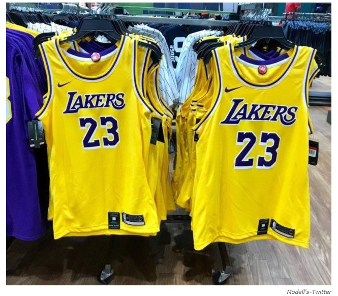
The talk about Texas uniforms has been floating around, and allegedly it's an issue with the filtration used for the pictures. We'll see. Wouldn't be surprised if these (quite bright) Lakers jerseys are suffering from some similar issue, particularly since that's not even a publicity photo but rather a snapshot from stock hanging at a store.
It would be wise to withhold judgment until the facts are in.
Also, I'm not a huge fan of the current maize, but: 1. The university was HEAVILY involved in the selection of the current color. 2. It's better than the initial dark Iowa yellow that was used in the last year of Adidas.
I'd hold off on blaming Nike just yet. Their track record isn't perfect (they biffed the color of the Arkansas football uniforms 15 or so years ago, and it took a year for them to get the look right for the Philadelphia Eagles green jerseys) but it's not like Adidas and Under Armor haven't had their own significant issues here.
Adidas didn't have any problems. I was raised to cheer for the "Highlighter yellow and Blue" with large rips in my clothes. Didn't every other Michigan fan?
the solution is simple: they just need some xtramelanin to make it right.
(couldn't resist)
Nike biffed the Eagles color so bad that they didn’t master the color until halfway through the season, forcing the Eagles to wear black at home for several games.
I do think the Amarillo looks very sharp in contrast to the blue. The highlighter popped especially on the pants but looked awful on the helmet (remember in 2014 when the helmet was Iowa yellow and the rest of the uniform still highlighter?)
What always baffles me is how long it takes for these problems to be fixed. How can you trot out a uniform with a helmet completely a different color than the same intended color on the uniform? MSU was victim of this for years where the glossy green they used on their helmet was much brighter than the green on the uniform. After 5 years of that they finally fixed the problem by going to a satin finish. It amazes me how poor the quality control is in the design department of these major apparel companies
The yellow for the Laker uniforms is bright, highlighter yellow, both in that picture and on the court. My boss is a huge LA fan and complains about this quite often; I told about Adidas' bastardization of Michigan's maize and we were both confused as to how these companies can just get it so wrong.
it was addidas that gave us highlighter yellow.
Nope, it was Nike that started with the highlighter yellow and Adidas continued this color.
I was under the impression it was Adidas, because allegedly Nike own the rights to the proper color palette for Maize. There was a big discussion on this blog years ago about that.
Yeah, so I think Nike had the rights to proper color, but couldn't call it "maize" because adidas called their ridiculous highlighter yellow "maize"
This is basically wrong.
Nike made a color that was brighter than our tradition maize, but adidas took it to a new level. Nike has now gone to their "amarillo" which is the color they're currently using and more similar to our traditional maize
Amarillo Maize
Here you go.
1. Nike doesn't have the right to a color. That's a myth that has been destroyed.
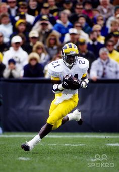
2. That picture of Desmond Howard is nowhere near color accurate, and neither is the description of yellows being associated with certain manufacturers.
Just to prove my point on how you can't necessarily trust photographs to give you an accurate representation of color:
Wait. I thought debates about the correct maize were not allowed until August 1st.
At any rate, the 'correct' maize was the Nike uniform from the 1990s and 2000s.
When Adidas arrived...it was way off.
Nike/Jumpman is better but still not 100% 'correct.'
Wait, I thought they weren't allowed until we beat MSU and OSU...
I'll see myself out.
I wish they could just meet in the middle between those two.
I didn’t like the yellow on the football unis but on the basketball unis I thought it looked pretty good
I actually am color blind. What is the issue? They all look pretty much the same yellow to me.
The issue is they are not.
The maize on the football uniforms is perfect imo. It was adidas who really screwed up the maize color and made it highlighter color. I do wish the maize on the basketball jerseys was more dark, but I don't mind it too much. But I do see where Lakers fans are upset as that yellow is wayyy too bright
Maybe it is the bright yellow, but the purple doesn't look right either. It looks more blue.
Maybe they asked Moe Wagner to approve the new colors!
Both colors are off. But I think the brightness of the yellow makes the camera kinda distort the color of the purple
I refuse to take this thread seriously until and unless WD weighs in with his expertise on uniformz and colour codez.
It's 2018
I posted about this last year and it's irksome to see that Nike apparently still can't get it right even after every Laker fan worth her salt pointed out loudly and often that the yellow jerseys were wrongly banana-colored.
I'll refrain from going full blast until the official new Laker jerseys debut on July 30th - I'm additionally concerned by leaks that seem to indicate that the purple jerseys have gold numbers with white trim which they've never done - the white numbers pop so much better on the purple jerseys.
Part of the problem with the gold being lemon yellow probably stems from the material being thinner so that might artifically make the "gold" look lighter than it should be.
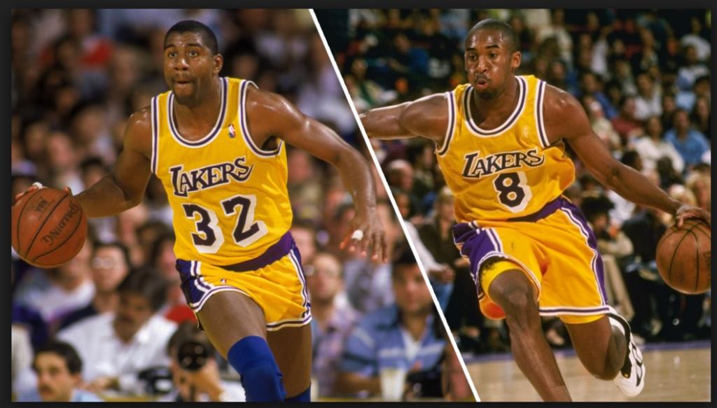
All that said, I do think a lot of the Laker fans are sharpening their pitchforks prematurely - if you ever watched them during the 80's their colors weren't even consistent then: the shirts and jerseys often looked slightly mismatched, and the purple usually looked blue on TVs back then.
Jerseys going from that shiney material like the 90s and 2000s going to thinner material definitely has had an impact on how colors look.
It's Forum Blue!
I just wants Harb's blues to match on the sideline. Hate it when his hat, sweatshirt and/or jacket are three different shades of blue/black.
Just looks sloppy when it could look awesome.