Michigan Rugby jerseys now at MDen

By all means, neg away. I realize this isn't OT season but people have been asking for these for a long, long time on here whenever there is a Michigan Rugby thread.
Rhino has finally gotten the license to sell Michigan jerseys to the public. Here's the home and roads.
http://mden.com/product/Rhino_Rugby_University_of_Michigan_Rugby__Repli…


http://mden.com/product/Rhino_Rugby_University_of_Michigan__Replica_Awa…
Since Michigan has signed with Rhino, they also get balls. You can get those at Rhino's site. A full size or mini.

http://usa.rhinorugby.com/rhino-rugby-michigan-wolverines-fullsize-rugb…

http://usa.rhinorugby.com/rhino-rugby-michigan-wolverines-full-size-rug…
November 17th, 2015 at 12:58 PM ^
Sent from MGoBlog HD for iPhone & iPad
November 17th, 2015 at 12:58 PM ^
Sent from MGoBlog HD for iPhone & iPad
November 17th, 2015 at 12:59 PM ^
Those are pretty cool
November 17th, 2015 at 12:59 PM ^
WD pajamas
November 17th, 2015 at 1:01 PM ^
November 17th, 2015 at 1:02 PM ^
...on the right sleeve?
November 17th, 2015 at 1:04 PM ^
Yep.
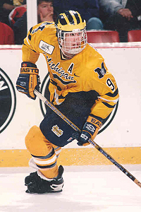
I sure miss this split M.
November 17th, 2015 at 1:29 PM ^
Yuck. That split M is horrendously horrendous.
November 17th, 2015 at 1:33 PM ^
Wrong.

November 17th, 2015 at 8:18 PM ^
back when they sold real hockey jerseys not just replicas. mine even has a fighting strap.
November 17th, 2015 at 2:59 PM ^
Sent from MGoBlog HD for iPhone & iPad
November 17th, 2015 at 1:02 PM ^
Damn. Those are actually slick.
November 17th, 2015 at 1:03 PM ^
Not a fan of the split M. Lose that and the jersey is beautiful.
November 17th, 2015 at 1:14 PM ^
Sent from MGoBlog HD for iPhone & iPad
November 17th, 2015 at 1:14 PM ^
Sent from MGoBlog HD for iPhone & iPad
November 17th, 2015 at 1:19 PM ^
The split M was around for a long time. While I perfer the simple block M, the split M will always have a special place in my heart. I love seeing it on cars, worn out, torn, and faded because it's been on there for 20 years.
/You don't see me standing on your lawn, do you?
November 17th, 2015 at 1:23 PM ^
November 17th, 2015 at 1:51 PM ^
For me, the split M has always a had the look of cheap knockoff to me. I don't know if it is the font or what, but I have never liked it.
November 17th, 2015 at 1:09 PM ^
I gotta say, those Maize & Blue stripes are pretty fantastic on the home jersey. Not a big rugby fan (just haven't watched enough to have a handle on it yet), but those look awesome.
November 17th, 2015 at 1:22 PM ^
Okay, yeah, I love the Maize and Blue striped ones.
November 17th, 2015 at 1:31 PM ^
Yeah. I'd like to have one of those, too, mate. $55, though. Yeesh. It's amazing how much the price of clothing rises when a team's logo is slapped on it.
November 17th, 2015 at 1:23 PM ^
November 17th, 2015 at 1:23 PM ^
Sent from MGoBlog HD for iPhone & iPad
November 17th, 2015 at 1:40 PM ^
Well those look great
November 17th, 2015 at 1:53 PM ^
November 17th, 2015 at 2:27 PM ^
Yes, and they're pretty good. Not Penn State or Cal good, but they're very competitive with other clubs in the area.
November 17th, 2015 at 2:05 PM ^
November 17th, 2015 at 2:44 PM ^
IT'S A RUGBY JERSEY
November 17th, 2015 at 2:11 PM ^
Really enjoyed watching the Penn Mutual 7's playoffs. Hey, can you get your own number on the back? I'm a no. 11 (left winger, it fits me ha ha)
November 17th, 2015 at 2:22 PM ^
November 17th, 2015 at 3:06 PM ^
Sent from MGoBlog HD for iPhone & iPad
November 17th, 2015 at 3:46 PM ^
Where would I wear this?
November 17th, 2015 at 4:07 PM ^
Where WOULDN'T I wear this?
When the girlfriend wants to go out on New Year's Eve, I'll say, "OK by me, honey. I already know what I'm wearing."
November 17th, 2015 at 4:32 PM ^
Wow, Harbaugh has changed the tide on the rivalry. Hell, rugby fans are starting to believe him.
November 17th, 2015 at 5:24 PM ^
November 17th, 2015 at 6:46 PM ^
As a former rugby player I am loving these. Simply awesome.