Equipment: POTENTIALLY Michigan's new font?

I'm likely going to get killed for this being an excessive equipment thread, but there are some big changes coming this summer and it's the offseason.
MGoJohnStamos pointed this out to me this morning.
Remember that leaked photo a week ago that had a mannequin in the background wearing what appeared to be a Jumpman Michigan jersey? It had a wonky new font that freaked some people out because of the big change to the #2.
Well. Take a look at this-
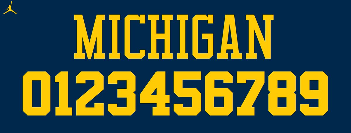
This is the font of the Chicago Bulls with a pallet in Maize and Blue. The font Michael Jordan obviously once wore.
Now look at the #23 on the mannequin in the photo

They look completely identical.
The Bulls typeface is as close to Michigan's current font, Superstar M54, as we're going to get if Nike wants to make a change. They aren't that much different.
Superstar M54

The radical changes are the #2 and the wordmark being amplified in the Bulls font. Everything else is pretty much the same, with some small change here and there. The M54 is a little more sleek and defined.
What are your thoughts on this?
Which font do you prefer? The current one or potentially the new one?
I prefer this thread to not exist
Yet here you are, commenting in it...
ZING, nailed me
March 30th, 2016 at 10:06 PM ^
"I wish this thread did not exist"
"Then why are you commenting on it"
...to let you know that he wished this thread didn't exist?
March 30th, 2016 at 10:23 PM ^
March 30th, 2016 at 10:56 PM ^
http://www.nbclosangeles.com/news/local/koala-mauled-p-22-believed-moun…
Douche-baggery exists among cougers (and among killer koalas, too)
Stating what "I prefer" does not equate to me taking a stance on the normative question of whether or not this thread should exist.
Also, commenting on a comment that you don't like, just to tell that comment not to comment on something they don't like is perfectly hypocritical. Let me know if you need help with that definition as well.
March 31st, 2016 at 10:55 PM ^
Let me know if you need help getting down off your high horse. Instead of just tearing down someone trying to have a discussion about something that actually relates to Michigan, maybe you'd be more interested in the OT threads about Brady Hoke's weight loss
I'd say it's the "M", nothing like a block M.
The 2 doesnt bother me. The M definately does though.
The 2 doesnt bother me. The M definately does though.
It's that you acknowledged you'll get killed. You foresaw it, so here it is, starting now.
But I don't really mind the font. At least it's not cursive.
Sent from MGoBlog HD for iPhone & iPad
I feel the same way...when people comment about out double-posts.
As long as they don't make the lettering all skinny, and the Block M is still, well, a block, then I'm cool. The change in the 2 is fine, I likely wouldn't have noticed if not pointed out.
Sent from MGoBlog HD for iPhone & iPad
Alex: "WD and Excessive Equipment."
MGoBlogJeopardy question: 'What is NOT likely to be found under the heading 'That's what she said.' "
I'll take Anal Bum Covers for 500 Trebek
I was going to make a similar comment, as long as Harbaugh is our coach and we have Maize and Blue colors and we keep our helmets, do I really care that much about the particular font for the numerals - no.
Just do not put those horrible tire tracks on the uniforms that the MBB lived with, uggh!

DubyaDee, you gonna remake those boindas?
Sent from MGoBlog HD for iPhone & iPad
This is why I kind of didn't want the Jumpman uniforms, I had a feeling that he would change something up dramatically. Why can't we just have the iconic, simple Nike uniforms?..


Funny that you posted UNC.
UNC actually has the Bulls font.
Exactly my point, Jumpman for UNC would work. But I just don't get Jordan/Michigan it just doesn't add up
Sent from MGoBlog HD for iPhone & iPad
100% agree.
Sent from MGoBlog HD for iPhone & iPad
1,000,000% agree.
Fuck Jumpman. It's not Michigan. It's goddamn Tarheel.
Agreed +1. Or how about Desmond stretching for the TD....

That is OUR MICHIGAN version of jumpman.
I don't care about the font, but I really don't want a basketball logo on our iconic football jersey.
I would love Jumpman unequivocally if they made one simple, cosmetic change to the logo:
Use the silhouette of Charles Woodson intercepting MSU in 1997.
It's not like it would even be that much of a stretch. Woodson has been associated with Nike and Jumpman for pretty much his entire career.
It wouldn't look good
I think it would look great to have a football "Jumpman" on a football jersey. But to each their own.