
As long as they don't start drawing up a new clown suit for us to wear every week, I'm very cool with that
Next you are going to tell me teams other than Oregon wear Nike..psh
Won't UNC want to do this? I can't imagine Jordan wouldn't want the same for his alma mater.
Sent from MGoBlog HD for iPhone & iPad
Well, nothing has ripped yet. So that's good.
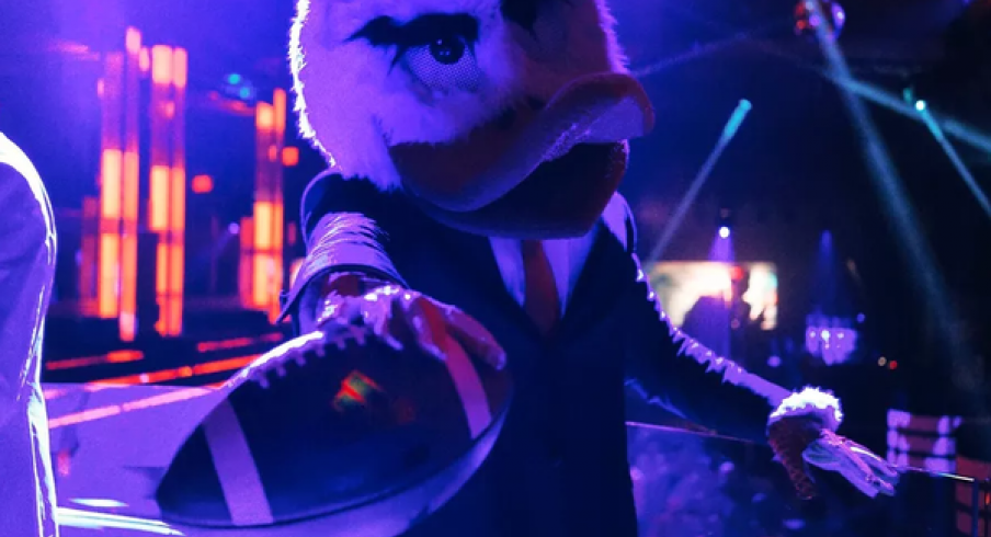
I beleive Adidas had three ripped jerseys in their introductory press conference alone.
I hope we never leave Nike as A) not sure the MGoBlog servers could handle all the angst and new apparel threads, and B) just want to see WD happy.
Thumbs up for me so far. Complete 360 from my thoughts a few days ago. Ready and looking forward for the New Era for Michigan Football!! All 31 varsity teams look outstanding A++

That was young Brent Rambo's reaction back in 1994 upon hearing U-M had signed a $1 million/year deal with Nike.
And here he was after hearing about U-M's current $169 million deal with Nike:

540.
August 2nd, 2016 at 10:43 PM ^

the first, but by this time next year i bet there will be at least two others.
August 2nd, 2016 at 10:47 PM ^
Yeah but no one else can ever claim to be the first.
Tearaway jerseys in football aren't such a bad thing. If your opponent can't bring you down by your jersey, that's a competitive edge.
Tearaway jerseys in basketball are another matter.
Just glad that the blue is finally the right shade of blue. That bugged me more than the maize to be honest. The maize also looks right (like the 90s/00s maize). I'm a happy camper.
Well I think that you think too much.
August 2nd, 2016 at 10:49 PM ^
You've been upvoted 4 times on this comment. I hope one day we get the font on the 4 right.
I'm so happy I could cry
Feels like the 90's again! I'm lovng it.
I also can't wait for our first Pro-Combat alternate unis and the subsequent "Oh noes! What have they done?!" meltdown.
Absolutely love the football uniforms. The other teams' (i.e. non-football, non-basketball) jerseys are also all really conservative. This is, broadly speaking, good. Don't particularly like the new 2 or 4, cool history or otherwise, but I'll get over it if the jerseys stay classy and don't rip.


I haven't really looked hard at the new fan gear yet so no feels on it yet.
The soccer unis look really clean. I wonder if they are going to get the Nike line of cleats or have a shot at getting the Neymar Jordan cleats.
August 3rd, 2016 at 11:20 AM ^
Good question. The press photos have regular Nikes, I think, but if the football team is getting Jordan cleats, why not soccer?
Personally I'm looking forward to the matte helmets, I've always been a fan and never understood why paint needs to be shiny--especially paint that is gonna get bashed and scuffed. Matte looks cool to me. I'm open to being proven wrong and if we play worse with matte then I'm all for going back but my intuition tells me we're going to be much better with matte this year than we were last year with shiny. Other than that I think the unis look nice and clean and understated which is how I like them. We'll look good winning on the field.
I've always been a Nike guy, starting to warm up to Under Armor but Michigan/Nike is perfection
August 2nd, 2016 at 10:13 PM ^
Sent from MGoBlog HD for iPhone & iPad
No one would throw a big party for adidas gear.
Sent from MGoBlog HD for iPhone & iPad
Di you buy enough where you can go a whole week wearing all new Nike/Jordan gear?
Also any idea when the Jerseys/Trainers are available for sale?
No one?


But I wonder how many hours O'Korn and Speight will throw to receivers today.
First, another time with this correction:
The new maize, as photographed and as actually existed on the field last year, is not the "old" maize. It is not only darker than the Adidas shade of "sun" yellow but also considerably darker than the maize worn by the football team in the 80s, 90s, and 00s. It is basically Iowa yellow now, perhaps even darker--a startling innovation, since Michigan maize has been brighter than Iowa yellow at the very least since the Harbaugh era and probably much longer.
I personally don't like darker maize at all. 2003 maize forever.
But, that said, this movement started before Nike got here, so I can't blame them for it, and many of my worries about the Nike switch have so far been handled well. I've had a couple of days to deal with the font issue and I am now content with it, even if I do wish the old 2 were still around. I like the accessories. Most of the non-revenue sport uniforms are fine. The shoes and accessories look cool.
I am bearish about the hockey uniforms, which matter to me. But then I've had issues with all of the Adidas uniforms, too. The basketball uniforms cannot possibly be worse than the Adidas monstrosities last year.
In general, it appears that Nike has done a good job of producing looks that are neither boring nor outlandish and that fit the Michigan image well. Nike, like all companies, has some hits and some misses; I am pleased with what I've seen so far.
August 2nd, 2016 at 11:35 PM ^
I was worried about the maize too but it appears Nike has fixed Adidas' fuck up from last year. The maize you see appears darker than what it actually is because you are looking at computer generated graphics. Check out the new helmets which look sharp as hell.


The jerseys are clean and simple. The quality is top notch. I think the blue and the maize are spot on. The hemlets with the blue matte look amazing. They knocked it out of the park.

Overhyped. But looks really nice so far.