MGoShirt Alert – Day One

Submitted by Six Zero on

“THE ABILITY TO DESTROY A PLANET IS INSIGNIFICANT
NEXT TO THE POWER OF… THE FORCIER!"

This is the first entry of the 2009 MGoShirt Alert , a design project that
will enable MgoBlog readers to vote for upcoming designs in the brand spankin’ new MGoBlogStore.  To reach the store, click here.  To read
more about exactly what MGoShirt Alert is and will be about, click here.

MGoShirt 1 - The Forcier

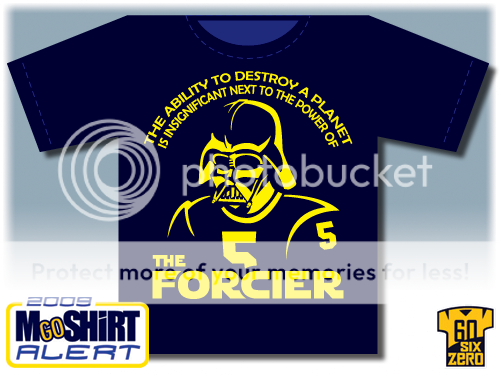
For our first entry, I simply HAD to go with the current tagline of MGoBlog—a shout-out to the poise and talent of our new quarterback, not to mention the nigh-insurmountable pressure that we’ve all placed on his young shoulders.  While quite simple in style, this shirt actually evolved quite a bit before settling on this final design.  This final rendition hopefully captures the essence of the joke while clearly identifying one single player on our team.  Unless, of course, you presume that  it’s Vlad Emilien… but that’s another story for another post.

So, time to vote!  What do you guys think?

pollcode.com free polls
What do you think of MgoShirt #1?
Five Stars Four Stars Three Stars Two Stars One Star   


***** Five Stars:  I MUST OWN THIS SHIRT RIGHT NOW!

**** Four Stars:  Looks good—you just missed touching the GO BLUE banner!

*** Three Stars:  Not bad—but does it come in Zoltan??  (PS- NO, it doesn’t.)

** Two Stars:  Meh.

* One Star:  I wouldn’t wish this shirt on Mark Dantonio’s pet turtle.  Yikes.

Keep in mind that the design will not actually appear this large on an actual shirt-- I made all designs occupy most of the shirt space just to give everyone as good a view of the art as possible.  That shirt graphic is also probably not anatomically accurate in the first place.

So place your votes, ladies and gentlemen, and feel free to add any comments below.  I’m not likely to change the design unless Brian himself steps in on behalf of the community, but certainly anyone can feel free to speak your mind.  I’ll be revealing another shirt tomorrow, and one every day for the next three weeks (not counting the weekends), so I’ll see you all tomorrow for another exciting round of – MGoShirt Alert!!


Comments

Farnn

August 10th, 2009 at 10:23 AM ^

Looks good, but I think I want to hold off on voting til I can see a few more of them, or maybe til the end and look at them side by side. Edit: Probably should ask how long voting will stay open.

MichMike86

August 10th, 2009 at 10:43 AM ^

It's hard to rate something when it stands alone. This one is pretty awesome but what if the rest are that much better? I don't want to rate one high and later feel like I made a mistake. This is pretty bad ass though. Let the debate begin!

tk47

August 10th, 2009 at 10:23 AM ^

I love the design, but I guess if something goes awry with Tate (e.g. he gets hurt), I'll probably burn this thing and curse myself for jinxing us again.

Carl Spackler

August 10th, 2009 at 10:31 AM ^

Meh. Kind of dorky. would only appeal to a limited population. hopefully this isn't the "homerun" shirt to kick off the line.

Rizzo

August 10th, 2009 at 10:44 AM ^

Love the Vader pictorial reference; however, the top line quote seems to make it a bit too busy. It's a good design, but I probably wouldn't wear it. 3* Definitely looking forward the next few weeks of unveiling.

formerlyanonymous

August 10th, 2009 at 10:44 AM ^

Potentially stupid question leading to other potentially stupid questions:
  • Will the writing really take up that much of the front of the shirt?
  • Will it be shrunk to fit just the chest?
  • Is this the back to a front that has a small one line thing about mgoshirt?

OldManUfer

August 10th, 2009 at 10:49 AM ^

= NCAA compliance issue? Otherwise I like the design but worry, as taboo as it might be, that Tate could lose his luster in the eyes of some fans this year. You know the breed of which I speak. Visually, did you give any thought to putting the wings on the helmet? You might need a license, but it would be awesome.

Smurfette

August 10th, 2009 at 5:35 PM ^

I second that concurrence. Because the shirts are available to the public for purchase it’s kind of a blaring sign stating, “We’re making money off of copyrighted material!” Just in general that is a rather busy design. For those of us that will be ordering a size Small it will probably have to cover side-seam to side-seam to fit all of that info in any recognizable form. That is unless you wanted to include a downsized version of the design to go on some ladies-sized t-shirts…

Seth

August 10th, 2009 at 11:09 AM ^

Better question: how did you get pollcode to work in the Diaries? I've been having the hardest time with that for the uniform bracket.

Six Zero

August 10th, 2009 at 1:43 PM ^

I pretty much had to sacrifice a sheep. To Timothy Berners-Lee. Actually it seems to constantly want to wipe unwanted code out of the 'plain text editor.' It took several stabs to get it to stay in-- had to edit this post a few times after I saved it just to get it right.

MGoAndy

August 10th, 2009 at 11:11 AM ^

Nerdy, but that's what makes it cool. I'd need a better idea of how much space the words take up at the top to push it to BWC territory.

CleverMichigan…

August 10th, 2009 at 11:14 AM ^

and then I saw this Not bad—but does it come in Zoltan? and lol'd like a 13-year-old boy and was about to make a "In Mother Russia" joke but for the good of us all I stopped myself because this is a family blag and deep down I'm a respectable lady.

Flood

August 10th, 2009 at 11:34 AM ^

This whole series seems really polished and cool, I'm thoroughly impressed. The shirt is obviously not going to appeal to everyone, but it is presented well and will be a good bar with which to judge the coming designs.

wolverine1987

August 10th, 2009 at 11:37 AM ^

I know this stuff is difficult to conceive and execute, and then subjecting it to public opinion is even tougher. So I appreciate it as I'm sure do we all. Having said that, 3* for me. I think it's too busy and a bit too literal with the picture. I would humbly suggest reducing the picture element to merely the Vader helmet with the M stripes, no shoulders, body, or #5. People know its a Forcier reference and and a M helmet with our stripes is enough to get it across. And lastly i'd reduce the size of the type overall, (sounds like you've already contemplated that) especially the Forcier type in comparison to the rest--it kind of spells out the "joke" in a "get it?" kind of way to me.

Koyote

August 10th, 2009 at 11:45 AM ^

I like it. The only thing is I really have no standard of comparison here. Although I rated it a 4 now, I might realistically rate it a 5 or 3 when other shirts come out. But standing on it's own, I gave it a solid 4. Will there be a second voting once all the shirt designs are released?

V-Link

August 10th, 2009 at 11:49 AM ^

With a phrase that long, why not put it on the back in the same fading into the distance font like the opening credits of the 6 movies? It enhances the theme of the shirt.

BlueBulls

August 10th, 2009 at 12:10 PM ^

I think that the front could look better without as much writing. Others had said that as well. My idea is to put the tag line on the back between the shoulder blades. That way you get to appreciate the idea and the graphic, then the tag line can be appreciated on its own. It's funny enough/has enough substance that it would be better alone and not cluttering the front. Maybe an idea for the other shirt to come. All in all, a good shirt, can't wait to see what else you come up with. EDIT: Also I agree with other posters, you could get around the name and number issues if you just have the DV head with a winged helmet. Thereby making it a little less busy and getting around the student/NCAA issues.

ChrisR013

August 10th, 2009 at 12:31 PM ^

It's funny, creative, and polished but can see it being made fun of on a consistent basis. On another note, just from a consumers standpoint, I'd be worried about purchasing something focused on an unproven freshman (please, please, please let my worries be unsubstantiated).

Brodie

August 10th, 2009 at 12:58 PM ^

Not a fan of it being focused one player who may not even be the star some are hoping for. And the shirt is blatant copyright infringement, if Lucas Arts should ever get a hold of it MGoStore would be in trouble.

pontoon

August 10th, 2009 at 1:06 PM ^

I like it but wonder if you could incorporate the winged helmet on vader somehow. I live in the south and having to explain the t-shirt to every other person will probably get very annoying, so I'm not sure how often I'd wear it.