Rumormongering: ND At Night, Maize That's Actually Maize

A couple of not-very-important bits of information I've gotten from sources I consider reliable follow.
![michiganx-large[1]](https://mgoblog.com/sites/mgoblog.com/files/images/UV_14F9B/michiganx-large1.jpg "michiganx-large[1]")
the last one ended well
Night night night night. I'm hearing next year's game at Notre Dame will be at night. Given Michigan's stated desire for a night game per year and the Big Ten's prohibition against having them in November, we could see a large number of M-ND matchups from here on out in primetime.
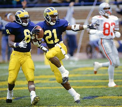
![howard1[1]](https://mgoblog.com/sites/mgoblog.com/files/images/UV_14F9B/howard11.jpg "howard1[1]")
Maize is not BRIGHT BRIGHT yellow.
An increased focus on making things look reasonable. A reader who would know and I trust when talking about these matters tells me the athletic department is placing an increased focus on making maize actually, you know, maize.
This comes after years of increasing highlighter-yellow creep. Anyone who's surveyed a student section and been able to pick out the 10% who still wear shirts that would not blind a donkey knows how alarming the color drift has become in recent years.
This will "take years to happen." Even so, it's a welcome development. Uniform guru Steve Sapardanis liked the brighter yellow last August, FWIW. I prefer the darker shade.
BONUS: If you care and know what the Pantone colors are, they are Blue 282 and Maize 116. If someone can convert those into hexadecimal I will move the primary colors here to Officially Official colors until such point as copyright-drunk lawyers sue me. I confess that I eyeballed them way back when.
[Note for superheroes with the power of pedantry: there will have to be a few different shades of whatever I use for internet purposes.]
February 8th, 2012 at 12:26 PM ^
Any more talk about a night game at home for us next season? Those lights seem awfully expensive to only fully utilize every other year for ND.
Plus it was an absolute blast!
February 8th, 2012 at 12:41 PM ^
They'll use the lights for the Winter Classic, if that makes you feel better about their per use cost....although that's technically 2013, so touche, 2012.
February 8th, 2012 at 1:23 PM ^
Many of the 3:30 games require lights as do some of the 2nd halves of the late November games, regardless of the time the game starts, if it is cloudy.
February 8th, 2012 at 2:11 PM ^
They were used for ND and the second halves of both the Purdue and Nebraska games. May have been used in the second half of OSU as well, I can't remember off the top of my head.
Either way they will get used multiple times during each football season.
February 8th, 2012 at 12:27 PM ^
actual maize? this will make my closet relevant again and may even prevent my fiance from saying "that shirt is so old. why can't you buy a new one." three cheers for wearing the same shirts for 20 years!
February 8th, 2012 at 12:39 PM ^
And a +1 to you, sir!
Yeah, washing on gentle cycle and hanging on a clothesline to dry, my shirts from 15-20 years ago all look pretty good. Always nice to keep those freebie MBNA shirts looking good, as well as my "donations to the local frats" shirts looking good. My fave is the "Desmond, You Da Man" t, with 21 on the back.
February 8th, 2012 at 1:17 PM ^
are you the guy from west coast customs that does all the upholstry work?
February 8th, 2012 at 11:19 PM ^
Ish seemed so much happier in the early, MTV episodes. He doesn't see eye-to-eye with the owner, Ryan, in the latest ones, and Ish seems internally conflicted. Heavy stuff going on at WCC. Then again, working for that owner guy for all of those years would make me hate my job as well.
February 8th, 2012 at 12:33 PM ^
at least, according to Photoshop's color picker in RGB:
MAIZE: ffcc00
BLUE: 002147
February 8th, 2012 at 12:33 PM ^
i love that all of the alleged conversions disagree with one another. easy indeed.
February 8th, 2012 at 12:36 PM ^
Depends on the application, its Pantone library interpretation, and the color mode of the document as well, not to mention the settings of whatever eyedropper or tool is being used to sample the color in the first place. Not surprised to see multiple results.
February 8th, 2012 at 12:46 PM ^
"Easy" meaning that a quick google search yielded a conversion of every pantone color to its hex value.
February 8th, 2012 at 12:36 PM ^
there are actually 2 116s on that page. I used the less butterscotchy one. Not sure what the "x2" means. Time for SixZero to educate.
February 8th, 2012 at 12:57 PM ^
that Pantone issues one single numerical value for each color instance. That is incorrect.
Pantone actually is the proprietor of numerous color specification systems, varying from printing inks, digital lab mixing, textiles and even plastics color management. In the print world alone, there are many depending on the type of color separation and/or generation being used, not to mention a brand new system (Pantone GOE) created to essentially replace all of the others that will take years for industries to align themselves with.
In terms of more pedestrian usage, and in Brian's case right here, we're talking about the ubiquitous Pantone Management System (literally called PMS, srsly) that has become something of a more common knowledge. But even so, there are PMS systems for Solid Coated ink, Solid Uncoated, Solid Matte, Solid to Process, Solid to Process Europe, Process Coated, Process Uncoated, Pastel Coated, Pastel Uncoated, Metallic Coated, and various Color Bridge variations as well.
(sigh)
In terms of these multiple values (x2), we're probably looking at Solid Coated vs. Solid Uncoated, which is kind of ridiculous because we're online talking about color systems used to manage and mix ink base combinations and ratios. But because it's the industry standard, it's the most basic language we are all fluent in in the industry.
Mind you, I'm no authority here-- I've always been more of a CMYK guy than a spot color guru.
The real problem is the English language. There are less than a hundred words to describe color and at least three times as many common color 'ideas' that humans can recognize. I'll tell all of you to close your eyes and imagine the color BLUE, and chances are only 2 out of, say, 25 are thinking the same thing. We need more words-- 'blue' can mean anything.
February 9th, 2012 at 9:18 AM ^
Using conversion from the Pantone Solid Coated library:

February 8th, 2012 at 12:31 PM ^
I don't dislike the highlighter yellow look, its just that maize is better. I had noticed the change but didn't realize how drastic it was until I saw the two pics in the OP side by side.
February 8th, 2012 at 12:48 PM ^
I love that you called Brian "the OP" haha
This OP posts a lot of content on the main page. What an attention whore.
[edit: turns out I misread that you said 'in the OP'. I still plan to call Brian "OP" from now on.]
February 8th, 2012 at 1:06 PM ^
man, how does this "Brian" dude always get his shit bumped to the front. He must know the mods.
February 8th, 2012 at 2:13 PM ^
The pictures are misleading. First of all, we don't know what the original picture looked like, as here is a copy of the same thing:
It looks much more like the current "maize." Who knows which picture is correct, if either? The other thing is that I'm pretty sure the maize on the jerseys for UTL was a little brighter and a little more pastel than what we wore for other games in 2011.
The maize on the jerseys definitely used to be more orangish, but I don't think the pictures at the top of the OPs post are a fair indicator of that.
February 8th, 2012 at 2:37 PM ^
Having been to the '91 Notre Dame game (same season and unis), I can tell you that this picture is much closer to the "truth" than the one on the front page. That one is a poor copy of a poor copy somewhere along the line.
February 8th, 2012 at 12:32 PM ^
Do the Steve and Barry's sweatshirt/hoodie count as maize-er maize? (FWIW, I call this color "butterscotch" as it relates to the day-glo/highlighter "maize" of the 21st century.) 2 for $20 was quite the stealio.
Who to blame? Nike? Look at the endzones at Ohio Stadium...sure as sh*t ain't "scarlet."
February 8th, 2012 at 12:46 PM ^
I miss Steve and Barry's oh so much. Not only were their shirts cheap, but I thought they looked by far the coolest. Unfortunately mine have either fallen apart or have terrible pit stains, but I loved that they had a bunch of shirts in cool faded colors (faded maize, faded green and red with white letters) and without nike or adidas logos on them.
Not sure if I got it at Steve and Barry's or Ulrichs, but my all time favorite was a faded green Columbia long sleeve shirt with "University of Michigan and the seal in white letters. I've searched far and wide and haven't been able to find another. Would gladly pay $50 for another.
February 8th, 2012 at 1:49 PM ^
I loved how Steve & Barry's would have these nonsensical sales ("Buy 1 get 2 free!") that were riddled with asterisks and exceptions.
February 8th, 2012 at 1:18 PM ^
TV is who's to blame. Plain and simple. They tweaked the colors slightly, and then a little more, and then a little more to look better on TV. HD changed the game again, and everybody's catching up to make their stuff look the best on TV.
February 8th, 2012 at 2:11 PM ^
Disappointing, but in this marketer-driven culture, why not...
February 8th, 2012 at 12:33 PM ^
Maize is whatever color Michigan is wearing.
February 8th, 2012 at 12:34 PM ^
MVictors did a nice comparison of the maize of yesterday vs the maize of today. Though there are slight differences in the maize color from year to year, the biggest difference is in the photos taken due to lighting etc.
February 8th, 2012 at 12:34 PM ^
February 8th, 2012 at 12:41 PM ^
That is incorrect. The correct way to phrase that would be "selling out to corporations has changed our color white!!!oneoneone!"
/s
Good catch Jinxed
February 8th, 2012 at 12:42 PM ^
All photographic and other evidence of those should be confiscated and then destroyed immediately.
As for color, I welcome the return of maize, though my maize may of course not be your maize.
February 8th, 2012 at 12:38 PM ^
Blue - 002147
Maize (alternative from above) - FCD116
*Thought I was being helpful, beat to the punch
February 8th, 2012 at 12:36 PM ^
I know I'll draw the ire of a lot of traditionalists (our fearless leader included) but I really like the "electric yellow" we have now. While it is not the traditional maize, it does look a lot cleaner and "pops" especially on HD.
February 8th, 2012 at 12:55 PM ^
I'm glad someone besides me likes it. I personally love it which probably the reason why I've ended up with so many "maize" shirts rather than blue in my closet lately.
February 8th, 2012 at 12:58 PM ^
I agree. I felt like using the brighter shade was a nice way to compromise and look a little more modern without going overboard.
February 8th, 2012 at 1:35 PM ^
I agree completely. I respect the maize tradition and grew up watching AC and the others but the bright yellow is much more appealing to me.
February 8th, 2012 at 2:10 PM ^
I too, prefer the brighter color - if only because it reduces the comparisons to "school bus color." So many stores when I was in school (including Ulrichs) had AWFUL orange-yellow shades that were absolutely terrible.
At least now the school bus variation is an obvious knock-off.
February 8th, 2012 at 2:39 PM ^
is you don't like the "butterscotch" or "cheddar" maize?
Is "maize" going to become a fashion cycle, where every 20 years or so, the color will revert to another eras color? So in 12-20 years, highlighter/electric yellow will be "maize" again on unis and t-shirts?
February 8th, 2012 at 1:52 PM ^
Yeah, I didn't like it at first, but it grew on me. It's a clean, sharp look in my opinion.
February 8th, 2012 at 5:35 PM ^
February 9th, 2012 at 6:58 PM ^
received my first uniform in '87...now many moons ago. And the print was on a heavyweight champion sweatshirt and it was more like the bright maize of today's uniforms.. I've always prefered that over the orangish color. By my senior year we had switched to a cheaper Russel brand in '92 and it was more like the orange in the OP photo of Desmond's pants. As a few others have said, maize to me is whatever the team is wearing, but if I get a vote, I like the brighter version..seeing the 'wave of maize' pompoms at the ND game...that was aMAIZEing
February 8th, 2012 at 12:39 PM ^
maize - FFCD09
blue - 1E3261
February 8th, 2012 at 12:48 PM ^
I've had 002654 as the blue and fcd116 as the yellow for years as the pantone colors you mentioned.
|
Here's what it looks like
|
Edit: dammit, site doesn't allow the background colors to trump the settings.
February 8th, 2012 at 12:39 PM ^
Maize 116 is FECB00
Blue 282 is 002147
February 9th, 2012 at 9:20 AM ^
I get this...
February 8th, 2012 at 12:45 PM ^
I prefer the darker shade as well
February 8th, 2012 at 12:46 PM ^
Maize is #F7B50C
Blue is #002654
But as we're seeing, it's not that clear cut.
February 8th, 2012 at 12:46 PM ^
Blue: #002147
Maize: #ffcb00
Comments