OT- MSU new Jerseys

Sorry if this has been posted I couldn't find it anywhere.
MSU is suppose to show their new jerseys today at 3:15.
I am betting they will be ugly as hell.
http://bleacherreport.com/articles/382697-michigan-state-announces-that…
Mod Edit:
From The Only Colors
 Basketball and Hockey are both there as well. I agree that these are huge steps down from the previous years. I liked the old versions. The tails on the script look ridiculous.
Basketball and Hockey are both there as well. I agree that these are huge steps down from the previous years. I liked the old versions. The tails on the script look ridiculous.
I'm not sure which jersey is the biggest step down. State had some very solid if not very good jerseys the last few years. If I were a State fan, I could live with the hockey jerseys, but I'd demand a switch back on football and basketball. The color tone change is fine, but script and design are major regression.
it's the basketball jerseys. the football ones just look cloddy/rugby/ugly throwback. the basketball jerseys are just plain awful. i will admit i thought their jerseys last year were pretty great. they looked sleek, the state was a nice font, etc. these are god awful
Students and Fans: "Noooooooooooo!"
State: "OK, OK, we'll change it."
State: "Hey everyone, these are our new uniforms!!!"
Students and Fans: "Nooooooooooooo!!!!"
State: "Shit."
I really don't miss Nike.
Stupid. One of the things I love about Michigan is that our jerseys, at least our home ones, will never change much.
the football jerseys are terrible. the basketball arent as bad, but i think basketball jerseys are harder to screw up.
i don't get changes like this at all - what game are you going to say "man, i feel like this is the right occasion for the pants with the writing on the back and the larger knee thing" or "the crowd is gonna go nuts when we come out with the jerseys with the grey outlines around the numbers and white shoulder things!!!"
I notice that the article doesn't actually specify which green is the true home and which is the alt.
I wonder if they even know themselves-- they may very well gauge the reception of each from fans and alumni before settling on one before the other.
I'd also wager that they end up dropping one of the pants by the end of next season.
I really hope the white shoulders are alternate. They look ridiculous and should be buried never to see the light of day again.
is part of the jail cell inspection process so it shouldn't be all that traumatic/new/unexpected
edit: Dah, day late, buck short
Dantonio is still a douche.
Those new unis are so rad.
That State of Michigan State University is like a whole completely new institution.
I have seen the error of my ways.
I'll take back every unkind word I've ever said about Little Brother now.
[/snark]
Surprised they didn't just dump the colors and roll with Gerard Butler's face on a teal background.....
I think the jailbird joke thing is over done, but I had to...
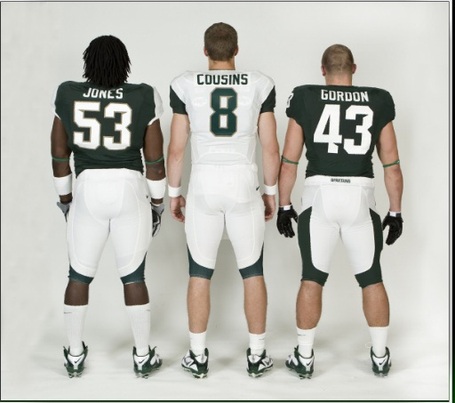
So Cousins won't be wearing a helmet this year? I guess I'm good with that.
of a story I heard about what happened in the 80s when the Bengals introduced new uniforms and helmets with the tiger stripe pattern on them.
Forrest Gregg was the coach at the time, and he called a team meeting to introduce the new gear. As it was unveiled, he told the team:
"These are our new uniforms. You're not allowed to laugh at them."
This should give Spartans and Ducks plenty to talk about in case they end up sharing a cell. I approve.
That they could put athletic department wide and start some tradition, as I said earlier. These jerseys are not, in anyway, going to start a tradition. But it uses fad fonts, schemes, basically everything. And no one appears to like the fad look they have to them.
I mean, the basketball jerseys could be really good if they used a better font, the scheme is fine and everything, but that font is just terrible.
Worst for them, the football jerseys reinforce their stereotype of updating them every few years, only to see them look out dated in a bad way a few years later. Seeing these, I don't see anyway these are a lasting look, at least not for decades or anything. Or at least we can all hope...
God, Nike uniforms are soooo 20th Century.
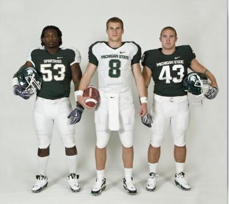
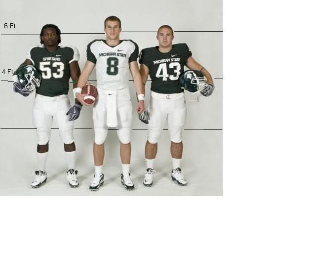
Haha, I like the "Spartans" tramp-stamp on the far right home uniform pants.
than I am keen to gawk at right now. Otherwise. . . a big yawn, no? They are just another team we will pound to dust this year as Cousins fails to make the transition from good to great.
(P.S. Dear Lord gimme a secondary to back this braggin' up.)
Certainly not a day to remember for years.
The guy on the right looks like he's wearing ass-less chaps. Perhaps they are going for the Broke Back Spartan look?
...says this about the hockey unis:

In case the title of this post [Congratulations, Everyone: Those $9.99 Jerseys You Bought at Steve And Barry's 5 Years Ago Now Look More Authentic Than You Ever Could Have Imagined] doesn't betray my feelings clearly enough: these are awful. Awful, awful, awful. My God, they're abominable. Particularly the white hockey jersey, which really looks like something you'd pick up at Meijer....and I quite agree. These are just god awful.
that Easter bonnet, though.
I don't think the hockey jerseys are so bad, except for the recent stupid trend of putting words and numbers across the front like the Dallas Stars do. That spot is for a logo. I really don't understand why you would put "MICHIGAN STATE" across the hockey jersey where it doesn't belong and then put "SPARTANS" across the front of the basketball jersey where "MICHIGAN STATE" belongs. At least put "MSU" on the front of the hockey jersey instead of writing the whole thing out.
Really hate the shoulder stuff on the football unis. That's just awful. What is it with MSU and shoulder weirdness? Even my then-93-year-old grandmother was making fun of those pinstripes they wore in the Smoker era. Said they reminded her of her mom's old dresses that went out of fashion a hundred years ago. This is better than that, but not by much.
I don't think the hockey jerseys are so bad, except for the recent stupid trend of putting words and numbers across the front like the Dallas Stars do.


WORDS AND NUMBERS.

Never liked that either. Lettering + numbers = basketball jersey, as I see it.
Wow. Red wore a version of that sweater. It is in a display case at Yost and has always been one of my favorites. I was pumped when it was introduced as the home sweater a couple years ago. My wife bought me one for Christmas that year and had the 9s added.
Do these pants make me look fat?
 When I checked out the voting on the "Only Colors," 75% did NOT like the new duds.
Great focus group testing...
When I checked out the voting on the "Only Colors," 75% did NOT like the new duds.
Great focus group testing...
When I checked out the voting on the "Only Colors," 75% did NOT like the new duds.
Great focus group testing...Are they trying to look like Wayne State with that green and gold trim?
That's not "gold", dammit! It's "bronze". Says so right in the press release!
April 24th, 2010 at 12:10 AM ^
Hideous.