(OT) - Videoz: FSU Unveils New Uniforms [Edit: Washington too!] [Edit the Edit!: Syracuse too!]

http://www.seminoles.com/sports/m-footbl/spec-rel/041114aac.html
http://www.gohuskies.com/ViewArticle.dbml?DB_OEM_ID=30200&ATCLID=209469…
http://www.cuse.com/news/2014/4/16/_0416145028.aspx#.U1V6hqROXct
Not sure why the embeds aren't working in the OP, they're below.
Note sure why it didn't embed before...

WHen the biggest thing that jumps out at me is the large-font numbers, then that's a sign that the design hasn't gone overboard w/ the frilly trim.
And, in an exception to my usual preferences, I actually like the arrows/other thing on the wide neck border and sleeves (where a stripe would normally go).
to the Esquimaux! Still, fairly nice but for the odd-looking numbers.
now those are some really sharp unis. I would like to see Michigan upgrade and add a little flair as well. Their collars are pretty awesome.
question here is: Does Red Lightning approve?
Should have used garnet facemasks with them though.
Still amazing to me how FSU didn't really get on the college football map nationally until 1979. Before that they sure did suck.

"Get off my lawn"

I was really hoping that this was a Ferris thread when I clicked on it.
Nope, still think these are one of the more "ugly" uniforms in football.
Craig Sager loved them.

Yeah, those garnet helmets are pretty awesome.
Why eff with the brand like that?
I dislike the white UW helmet, but ok. Then they decided to remove the two center stripes also (white helmet only?). C'mong.
I also don't like the "new age" numerals on the UW uniforms. Dumb.

April 22nd, 2014 at 10:41 AM ^
They look especially snazzy while being smoked by Wheatly.
Save us from 27 year old marketing grads selling their latest creations by claiming that a change is "more authentic" than the authentic uniform;
Preserve us from those who ask us to believe that every new color on the uniform is a color in the school's tradition, even though the new color isn't even close to the color they are talking about;
Protect us from 48 second hype videos featuring running animals and any mention of the terms 'New Era" or "New Look";
Deliver us from the temptation of paying our hard earned cash for this years "once in a lifetime" alternate jersey.
Grant that all those who disagree with me may get off my lawn.
In the name of the Schembechler, the Crisler and Holy Yost, Amen.
That white helmet is clean. The white-purple-white was my favorite combo.
THIS POST HAS BEEN UP FOR ALMOST TWO HOURS AND THE TITLE STILL SAYS UNEILS.
SOCIETY HAS GONE DOWN THE CRAPPER
THANKS OBAMA
Why are you still yelling?
Gold helmets are their thing. Never liked their purple helmets much. Don't get the white ones either.
The bored white dude in the front row of the FSU meeting who keeps looking around the room.
Honestly, my absolute favorite uniform in all of college football outside of ours is Washington's purple jerseys with gold pants and helmets. Stunning combo. And yeah, the block numbers please - the #1 thing that makes a football uniform ugly is ugly numbers.
But nope: gotta have sicccckkkkkkk black unis because INTIMIDATION.
April 22nd, 2014 at 10:53 AM ^
Ah, Syracuse: still one of the all-time contenders in Own Fan Trolling - because when the colors of your biggest rivals are gray and blue, a gray uniform is exactly the thing to make everyone happy.
Also, those things suck shit.
+1 for suck shit...?
'Cuse has rivals? Are you referring to Georgetown? It took me a little while to even come up with that, because I was thinking football and I have no idea who Syracuse's football rivals are.
Also, the grey Syracuse uni on the left reminds me of what Nike did for Boise State a couple of years ago. Are they out of ideas already?
Yes, Georgetown.....a couple years ago when the Nike overlords decided that gray uniforms would be The New Trend, Syracuse got on board with it and it went over like a fart in church with their fans because they hate Georgetown.
And yes, Boise State definitely comes to mind too, though it helps they share colors with Syracuse for the most part.
April 22nd, 2014 at 11:17 AM ^
For basketball it's Georgetown, though I hope we never play those clowns again. Let them fester and die as a mid-major.
For football, traditionally Penn State was our biggest rival until Paterno started asking for 2-for-1's after we knocked them off and ruined a few seasons and they joined the Big Ten and that all died. BC became a bigger rival in the 90's until they went to the ACC - we'll see if it gets rekindled. Also, shitt on pitt.
The "platinum" jerseys were the same color for every school selected and yes, they were pretty much universally hated.
Also, the new uniforms are a dumpsterfire.
Gold helmet/purple jersey/gold pants looks good except I'm not sure about that triangle in the upper left corner of the number. It looks like a pull tab. White helmet/white pants doesn't have enough gold, it looks like something Northwestern could wear. Black anything is stupid because it isn't one of their colors.
April 22nd, 2014 at 10:56 AM ^
Their previous gold pants with the stripe were much better. They've gone the unexplicable Notre Dame route of gold pants that are not really gold and don't match the helmet or anything else on the uni.
I dont know why every school still insists on a big reveal for their moderately different alternate or new uniforms. No one cares anymore because people are releasing new uniformz every week.


Ho' jeeze.
April 21st, 2014 at 10:19 PM ^
.... so they have that going for them.
FSU's aren't bad. I don't care for UW or Syracuse's
April 22nd, 2014 at 11:19 AM ^
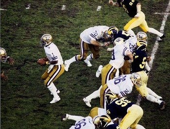
The most beautiful uniform SU has ever worn:
