MGOBLOG 3.0 Voting Question/Issue ?

So every now and again when I go into a thread it appears that some post have already been down-voted or up-voted by me - the way i can tell is the thumbs up or thumbs down is blue instead of white, indicating that I have "voted". Unless I've been sleepwalking and creeping on Mgoblog these votes are not coming from me. Has anyone else been experiencing this issue?
I cannot even see the thumbs up or thumbs down buttons.
Perhaps now you can? You're up to 500 points
JBDaddy above has 600+ points and stated he couldn't see them. I don't think its a 500 point cut-off thing.
I'm a very frequent board reader and a very infrequent poster, so I'm gunna have to do some work to get over this 500 threshold.
I’m in the same boat, but don’t really care any more about the point threshold than this blog cares about my opinion.
Hmm...I actually thought that New Coke didn't taste that bad.
Mobile viewing is pretty terrible, each comment takes up way too much space with tons of wasted space. Also it seems board posts with few comments may sink to the bottom of the MGoBoard and be missed. I liked the chronological order of posts as opposed to posts with the most recent response. Better yet, let that be chosen by each user. Anyway I'm underwhelmed and without an app my usage has dropped significantly.
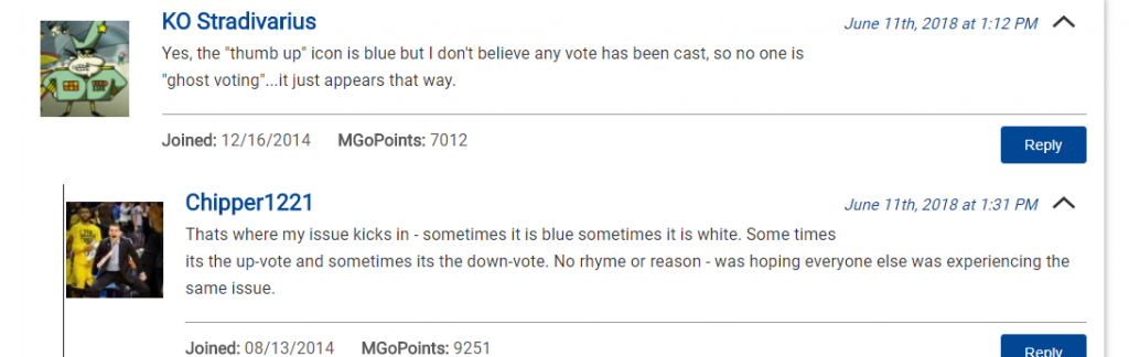
Yes, some of the comments in this thread are blue, some are white, and this is the first time I've opened it. Also, the site seems to do an inconsistent job of saving which comments I've up/down voted if I leave a post and come back to it later. Weirdness...
I'm sure they know the issues more than we do and are diligently striving to address them.
/ambiguouslysarcastic?
Summarizing what I've read through in this thread:
1) voting indicators (blue filled thumbs) change upon refreshing
2) the threshold to vote is now 500
3) the second row of icons on the main page (the previous posts) are unnecessary since only a couple posts per day are added.
4) can't tell who posted to the board before opening it. This would have been a disaster when maizen was going nuts, and also it's bad for future trolls.
I think the 500 pts is a guess - and a guess that is a bit low. JBDaddy commented about not seeing thumbs and they're at 627 or so. Maybe it's 750?
There have been a number of references to mgotrusted users at >500 points. That was what I based it off of.
Good catch on jbdaddy. Any update from him or anyone else just above the 500 point threshold?
One of those references may have been from me - I've sort of become a single-issue poster since the update removed my voting privileges.
I do know that taut (over 800 MGoPoints) can vote, so the threshold is likely in that 620-820 range. 750 just seems like the neatest number to me within that range.
Seth just posted it on the main page as well.
Hmm, I can vote on my iPhone but not on my MAC.
Sometimes I play with adding my own stylesheets to a site with the Chrome extension "User Javascript and CSS" ( https://chrome.google.com/webstore/detail/user-javascript-and-css/nbhcbdghjpllgmfilhnhkllmkecfmpld?hl=en )
If anyone else wants to have a go, here's a good start...
#block-frontpagelogoheader {height: auto}
#block-frontpagelogoheader .field--name-body.field--type-text-with-summary.field__item {height:75px}
#block-views-block-account-view-block-1{display:none}
#block-leaderboarddisplayconfig{margin:0}
#block-frontpagelogoheader{display:none}
.content-wrapper{padding:0}
.layout-main{margin-top:0;margin-bottom:0}
body{line-height: 130%}
.node__links{padding:0}
h1, .heading-a{margin:0;line-height:auto;font-size:auto;}
.layout-container {margin: 0; 5%}
.thread-wrapper{margin:0;padding: 15px}
.block .content{margin: 10px 3%}
#sidebar-second{float:right;margin-right: -30%;}
.layout-main-wrapper{max-width:auto}
.layout-sidebar-second .main-content {margin: 0}
.layout-one-sidebar .main-content {margin: 0;width:95%}
.views-row + .child{margin-top:10px;margin-left:20px}
.child{border-top:0;border-color:#333;padding-left:2px}.four-story-panel-region{display:none}
.views-row{position:relative}
.view-primary-articles .views-row .views-field-title-comment-count {position:absolute;top:0;background:#fff;width:100%;display:block;left:0;padding:1%}
What it ends up looking like... I like the titles at the top of homepage articles, and I got rid of the 4-story section because frankly, I'm here so often I won't miss anything.

And I messed with the reply indentation/borders/padding...
Yes. Get this man PO (Purchase Order) immediately to make these improvements...
What would you use to reduce the username font size - hell, it's already bolded - and increase the post body font size?
Updated:
#block-frontpagelogoheader {height: auto}
#block-frontpagelogoheader .field--name-body.field--type-text-with-summary.field__item {height:75px}
#block-views-block-account-view-block-1{display:none}
#block-leaderboarddisplayconfig{margin:0}
#block-frontpagelogoheader{display:none}
.content-wrapper{padding:0}
.layout-main{margin-top:0;margin-bottom:0}
body{line-height: 130%}
.node__links{padding:0}
h1, .heading-a{margin:0;line-height:auto;font-size:auto;}
.layout-container {margin: 0 5%}
.thread-wrapper{margin:0;padding: 15px}
.block .content{margin: 10px 3%}
#sidebar-second{float:right}
.layout-main-wrapper{max-width:100%;margin:0 2%;}
.layout-sidebar-second .main-content {margin: 0}
.layout-one-sidebar .main-content {margin: 0;width:70%}
.views-row + .child{margin-top:10px;margin-left:20px}
.child{border-top:0;border-color:#333;padding-left:4px}
.four-story-panel-region{display:none}
.views-row{position:relative}
.view-primary-articles .views-row .views-field-title-comment-count {position:absolute;top:0;background:#fff;width:100%;display:block;left:0;padding:1%}
.comment__author{font-size:inherit}
.node__content{font-size:1.5em;line-height:1.3em;padding:0 1%;}
I can't see my point total unless I click on my profile.
This new site is a little disappointing.
So many complaints with the new site.
Too many clicks to get to Mgoboard. Can’t vote on op. Can’t see users points to see who’s a troll. Got the blocked IP msg ordering me to change password after logging in once. Weird blue thumbs up when I haven’t clicked the thumb. Too much white space. Sorting by newest post first won’t save. When I go to tap the left corner bar to access dropdown, it moves and I end up clicking the home story. All I can remember as I view the blog much less with all of the issues.
Consolidating separate comments here
If you use Chrome, you can get this extension:
- User Javascript and CSS" ( https://chrome.google.com/webstore/detail/user-javascript-and-css/nbhcbdghjpllgmfilhnhkllmkecfmpld?hl=en )
In that extension, you can create custom javascript and css for any site. I have created (imho) helpful tweaks for mgoblog you can copy.
Javascript:
function getAuthor(t) {
var loadHolder = jQuery('<div></div>');
var s = jQuery(t).find('a').attr('href');
var c = jQuery(t).find('.views-field-comment-count .field-content').html();loadHolder.load(s, function(data) {
jQuery(t).find('.views-field-comment-count .field-content').html(jQuery(data).find('.node__meta a.username').html() + " - " + c);
});
}jQuery(document).ready(
function(){
jQuery('#block-views-block-duplicate-of-mgoboard-block-1 .views-row').each(function(i) {
getAuthor(this);
});
});
CSS
#block-frontpagelogoheader {height: auto}
#block-frontpagelogoheader .field--name-body.field--type-text-with-summary.field__item {height:75px}
#block-views-block-account-view-block-1{display:none}
#block-leaderboarddisplayconfig{margin:0}
#block-frontpagelogoheader{display:none}
.content-wrapper{padding:0}
.layout-main{margin-top:0;margin-bottom:0}
body{line-height: 130%}
.node__links{padding:0}
h1, .heading-a{margin:0;line-height:auto;font-size:auto}
.layout-container {margin: 0 5%}
.thread-wrapper{margin:0;padding: 15px}
.block .content{margin: 10px 3%}
#sidebar-second{float:right}
.layout-main-wrapper{max-width:100%;margin:0 2%;}
.layout-sidebar-second .main-content {margin: 0}
.layout-one-sidebar .main-content {margin: 0;width:70%}
.views-row + .child{margin-top:10px;margin-left:20px}
.child{border-top:0;border-color:#333;padding-left:4px}.four-story-panel-region{display:none}
.views-row{position:relative}
.view-primary-articles .views-row .views-field-title-comment-count {position:absolute;top:0;background:#fff;width:100%;display:block;left:0;padding:1%}.comment__author{font-size:inherit}
.node__content{font-size:1.5em;line-height:1.3em;padding:0 1%;}
The CSS gets rid of the really tall header & 4-panel content on the homepage, moving the actual content up to the top.
It also reformats comments and replies.
The Javascript updates the Message Board article list on the right-column to add Author names before the reply count, like the Diaries section above.
Hey JBDaddy, if you happen to see this, I just want to say THANK YOU for this. I added the JS and CSS and tweaked it myself a bit, and now the site looks way better. It's not perfect but better than what it was before.
FYI, I changed the following. My CSS knowledge is 0 so I just guessed at what I needed to change until the site reflected what I wanted.
heading margin to 1 since at 0 it was overlapping with the "submitted by" line.
content font size to 1, because 1.5 was too big for me (obviously personal preference)
removed the blocks on the header, since it doesn't bother me that much, and it goes away when I scroll down anyway
Vive la différence! Glad it got you headed in the right direction.