

September 9th, 2013 at 6:14 PM ^

How hard is this, really?
September 9th, 2013 at 6:25 PM ^
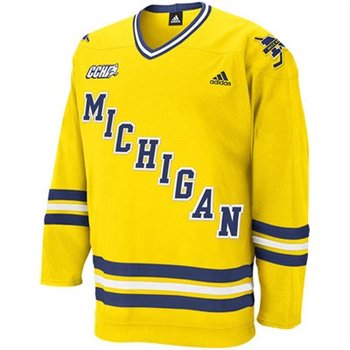
Came into here just to say this. There's nothing better than the cursive font, and if for some reason that's impossible, then go with these
September 9th, 2013 at 6:40 PM ^
Have to disagree - I don't like that one at all. I think it looks cheap, like a NY Rangers knockoff. The cursive one is a little better, but the Block M one is the best. That's who we are. We should stick with this year's design.
September 9th, 2013 at 6:43 PM ^
Maize Script Michigan=National Championships.
Sweater don't lie.
September 9th, 2013 at 6:49 PM ^
Well, if that's the key, then we should go back to the arched MICHIGAN ones from the 1950s - we were a dynasty in those.

September 9th, 2013 at 8:46 PM ^
HEY GET THEM TACKY CURLY-FRY-SHILLIN OUTDOOR-HOCKEY-PLAYIN JERZEYZ OFF MY LAWN HOW HARD IS IT TO GET SOME REAL TRADITION AROUND HERE
September 9th, 2013 at 7:18 PM ^
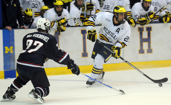
My favorite hockey jersey I own by far. 2010-11 is when they dumped the shiny material and had traditional hockey jersey material. One year deal sadly.
September 9th, 2013 at 6:23 PM ^
I think they look great. I'm no super traditionalist, but I think that cursive "Michigan" is awful and reminds me of my little league baseball t-shirts. The simple block M across the jersey is great, and I love the little block M on the shorts(?) like the football uniforms.
September 9th, 2013 at 6:31 PM ^
I like the big block "M." That's the correct way to go on the hockey sweaters, I think.
That mid '90s cursive was awful--you can barely tell that it says "Michigan" in that picture.
September 10th, 2013 at 2:43 PM ^
FYI, the cursive "Michigan" was in use well before the 90's. It was used at various times in the 70's and 80's on yellow and white jersey's. For me, the maize one from the 90's will always be my favorite... mostly because of all the great memories they had while wearing that one... Mike Legg's lacrosse goal against Minny, Morrison's OT winner for the 1st title in 30+ years, Langfeld's OT winner in the 1998 title game.
September 9th, 2013 at 6:34 PM ^
Those other two.... yikes, we're not an nhl team, we're Michigan fergodsakes.
September 9th, 2013 at 6:40 PM ^
knew who the OP of the thread was going to be

September 10th, 2013 at 8:27 AM ^
This should be the front of our jerseys. Screw all that cursive, block M, NY Rangers BS!
This is Michigan! Fergodsakes. We should be at the front of the pack when it comes to innovation. The first ever GIF jersey!
September 9th, 2013 at 8:30 PM ^
September 9th, 2013 at 6:43 PM ^
I actually like the GLI alternates.
September 9th, 2013 at 6:49 PM ^
They were more than alright.
I was a huge fan of the white Red-era 60s throwback design, until they made the M a Block M. Just looked asymmetrical and wrong.
September 9th, 2013 at 7:16 PM ^
The trend adidas/Reebok is setting trying to replicate the old basketball jerseys with the block M as the M in Michigan, onto modern day jerseys is disturbing.
Enough is enough. I miss these ones from 2008-09 - 2010-11
September 9th, 2013 at 8:34 PM ^
Are we sure this is them changing something? As I understand it, we started winning with the GLI alternates and decided to just ride that wave out. Athletes are nothing if not superstitious, especially in hockey.