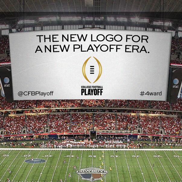
College Football Playoff Logo chosen

They have closed the voting on the College Football Playoff logo design, and the one they are calling the "Golden Football" won. Sorry, no spiked footballs. Source link
Sorry if already posted, I did do a search and didn't see this on here, most recent post I could find was the one encouraging voting on it from a couple days ago.
So what's the verdict? Are we happy with the logo? Or is it just as bland as the name for the playoff itself?
So what do people prefer as a name for a college football playoff, besides College Football Playoff? Be thankful it isn't MURICA'S FOOTBALL EXTRAVAGANZA or some sponsors choice.
I agree, it seems people are never happy. If the name were longer or more descriptive or contained a sponsor, people would complain that it should be simpler. When it's simple, people complain it's not imaginative enough. Same thing with the logo.
March Madness is just called "The NCAA Men's Basketball Tournament" and that doesn't seem to be a problem. Then nicknames start to form organically (like The Dance or March Madness or Final Four).
I don't see why a simple name with a simple logo is such an issue.
And now after posting that, it dawns on me that maybe whoever is in charge of this knows that people would complain no matter what was chosen, so they put as little effort in as possible. Which is actually genius.
Per the site where the voting took place, this was the official description:
"Representing the ascent of teams to the playoffs, two gold brackets surround a 'virtual' football, and allude to the championship trophy."
For some reason, and it might be the nerd in me, I will now always think of NCAA headquarters as Isengard and this is their Eye Of Sauron. Thanks, College Football Playoff.
Significantly better than BCS for naming. Logo is nothing special but at least it doesn't say Chick-fil-A on the damn thing.
The winner gets to stick their P in the golden V. Nice trophy I must say. To make the trophy more PC they should also make mention of anal.
April 30th, 2013 at 10:00 PM ^
Good . That's the one I voted for.
Too bad we're just replacing the words "computers" with "selection committee". There will still be huge problems. Until we go to 8, this is just a minor update to the BCS.
It'll be a true playoff/tournament when conference champions get auto-bids. Every other sport in the NCAA works that way. Even the 3 divisions below FBS Football.
represent the four teams. Inside a vagina.
Two golden crescents and four hash marks. Will the Burger King napkin this design was submitted to the NCAA on be kept for posterity?
Eye of Sauron? Anybody? Sauron CoFoPoff?
I like it...less is more.
April 30th, 2013 at 10:05 PM ^
This is clearly simply an homage to some great American history.

that too, looks like a vagina.
April 30th, 2013 at 10:10 PM ^
perhaps I'm on mgoblog too much when my reaction while opening this post was "Oooh I hope it's the one with the vagina."
So hot.
I know we like to critize everything, but I think the logo is fine. The name is bland, but bland is better than tacky (e.g. "Leaders and Legends").
of the logos being considered. It is basic, and CFP is also refreshingly descriptive and base. The other logo contenders were busy and ugly. I really like the logo, and for some reason I can't stop looking at it...