
It's fine. It's not great, but it's better than a piece of wood with a plaque on it, which is what most NCAA trophies are.
Paul Bunyan with a hockey stick resting his foot atop a brown jug?
Isn't that pretty similar to what the other B1G conference championship trophies look like?
Honestly, I don't see what the big deal is.
I think that's pretty damn awesome actually. Skate blades and such. LINE EM UP!
Delaney designed this after watching the Hunger Games. The prototype was called "District 6" in honor of the six founding members.
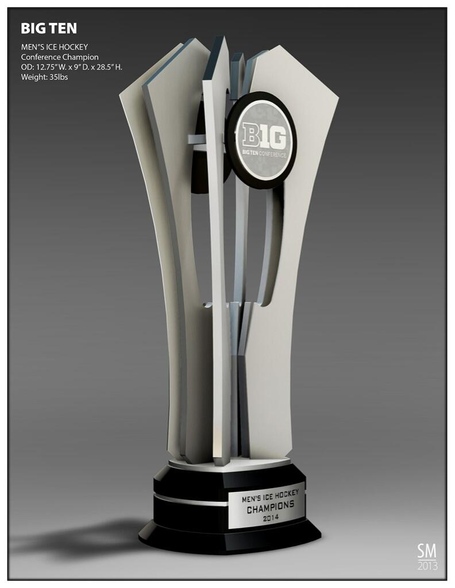
35 lbs...not bad.
Several of the alternatives or suggestions presented above are classic (in a non-classic/classy trophy kinda way).
called the Mason Cup. I'd never hear the end of it from all the Spartan slappies around me. . .
...who conveniently forget/have no idea that MSU was actually Mason's third successful CCHA gig...
I think it's fine. There isn't some obscure set of unwritten aesthetic hockey rules that requires all trophies to look like the Stanley Cup. Frankly, a higher priority should be a trophy that a team is able to pass between players and skate around a rink with. Some trophies (that skating hockey player, for example) just aren't good for it.
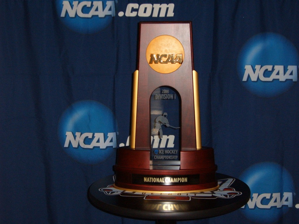
Pop quiz: What does the NCAA hockey trophy look like? You know, the ultimate goal every year? Hint: It's not like the Stanley Cup.
What if they had made a trophy with a giant silver leaf on the back so poorly anchored that it actually flapped around when moved?
That would produce this:

Frankly, I appreciate that they're not pretending to have decades of tradition that don't exist. It's not insulting and it's not ugly. I'll take it.
This is WAY worse than Legends and Leaders.
That's a good looking trophy.
Meh. It's not bad. It's also not nearly as good as say The Slab of Bacon that Minnesota and Wisconsin used to play for.
I'd say that's pretty darn good. It doesn't blow me away, but it's also not just a big Velveeta logo on a stand so that's a plus
I like it. Sure, it may not be cup-like, but it looks fine to me.
It's not a day on MGoBlog unless someone finds something aesthetic to complain about (trophies, uniforms, etc.)
...was inspired by someone playing the "claw" vending machine and grabbing a hockey puck as a prize:

I like it.
I've certainly seen worse. It has a classy look to it I think - not overdone.
Could have been a lot worse. Maybe a new trophy will be introduced in a few years once there is some tradition in the conference.
So basically what you're saying is Michigan needs to leave behind a 5-gallon plastic Powerade jug at the Xcel Center after we win the conference tournament...
Challenge: Accepted
Nothing wrong with that trophy at all. It's stylish, and has a distinct look to it. In 10 years it will also become iconic. It's not like it's a fake lumber jack that someone called Paul.
Iowa corn's CyHawk trophy.
It's just boring & uninspired. Which can be a good thing.
New Low??? I figured for sure they were going to name it the Ron Mason cup again...
But, its just a trophy..
maybe the guy at the trohpy store can put a little hockey guy on there!!!
Dave Brandon will have the team wear next year.
I think that trophy is only good for one thing: a promo from The Rock.
(Sorry, no embed)