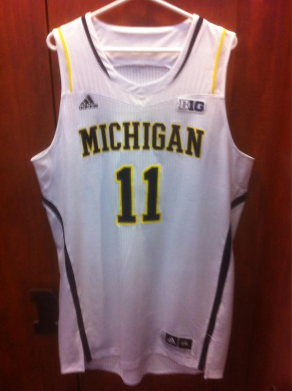
M Basketball has new jerseys
Just released to the team. As more pictures become available I'll add to the OP. Just home unis so far.
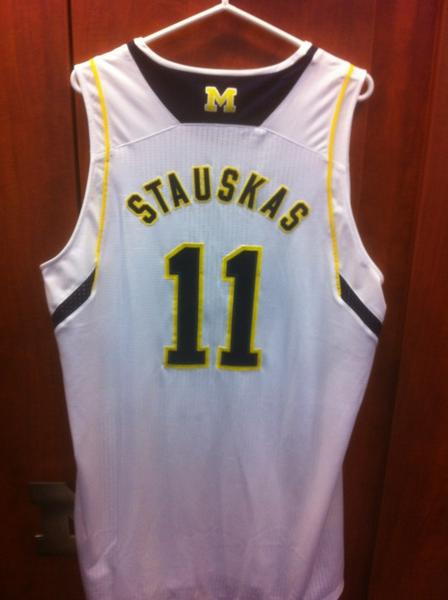
(H/T to Stauskas's twitter and Ace for retweeting it)
October 1st, 2012 at 3:25 PM ^
Why? Why oh why do they change designs every two seasons?
Already don't like the shorts. The oversized M on the back is uneeded. Should have left them alone, they were perfect last year. Here are the home shorts.

October 1st, 2012 at 3:52 PM ^
Aren't you the guy that loves all the alternate jerseys/gloves/etc. for football? I'm surprised you're against these.
October 1st, 2012 at 4:23 PM ^
and I am not convinced that those are the actual shorts yet.
October 1st, 2012 at 5:08 PM ^
October 1st, 2012 at 10:04 PM ^
October 1st, 2012 at 3:26 PM ^
Are they trying to find the one uniform that every fan can agree sucks? They may have accomplished their goal...
October 1st, 2012 at 3:38 PM ^
I am a fan, and they're fine. I wish Maize wasn't highlighter yellow, but I don't think they suck. Not my favorites, but suck? No.
October 1st, 2012 at 3:45 PM ^
Can we agree that the B10 logo sucks? I think that's what sends it over the "busy" ledge for me.
October 1st, 2012 at 3:52 PM ^
I agree, and I don't like having the Adidas logo up there either, but unfortunately it seems to be beyond our control.
I find it strange that college sports allows the most obtrusive placement of apparel manufacturer logos. None of the four pro sports allow them on the front of their jerseys.
October 1st, 2012 at 3:52 PM ^
The B1G logo sucks, but everything else is ok.
October 1st, 2012 at 3:27 PM ^
I don't mind it.
October 1st, 2012 at 3:29 PM ^
These are ok. People are going to bitch about them to no end anyway.
October 1st, 2012 at 3:31 PM ^
There are three sure things in life: death, taxes, and Michigan fans complaining about uniforms.
October 1st, 2012 at 3:33 PM ^
I don't think they're terrible when you consider them in a vaccuum.
But the fact that they add crap to what were clean, classic, perfect (IMO) uniforms is what annoys me.
October 1st, 2012 at 3:35 PM ^
I love MOST of what adidas has done. Branding hockey with Reebok, the home Legacy jerseys, Sugar Bowl and Cowboy Classic uniforms.
But I don't care for this.
October 1st, 2012 at 3:54 PM ^
Didn't you post a thread about how you hated the Cowboy Classic jerseys?
October 1st, 2012 at 4:50 PM ^
That definitely was not me. The only jersey I didn't like was the Road Legacies, and I actually own one (for collecting purposes). I loved the Cowboys Classic unis.
October 1st, 2012 at 4:22 PM ^
It's sad to walk into any local sports stores and see throngs of MSU gear everywhere - whether it be sweatshirts, jackets, sweatpants, shirts, etc. - and I'm talking nice Nike stuff, not that Meijer brand crap. Meanwhile, it always seems like the Michigan gear is relegated to something about the size of a sale rack, and there's 2 basic Adidas shirts surrounded by some off-brand "Wal-Mart" stuff. Even the MDen catalog has a seemingly limited apparel collection compared to yesteryear. The Adidas stuff looks too chinsey, IMO.
October 1st, 2012 at 3:30 PM ^
We use to have one the classiest and best selling uniforms in college basketball. Why wasn't that good enough? Adidas would put piping on the Mona Lisa if they could.
October 1st, 2012 at 3:33 PM ^
I probably won't buy one but they are acceptable team wear.
October 1st, 2012 at 3:35 PM ^
Double post.
October 1st, 2012 at 3:33 PM ^
No visceral response on my part. They will become much sexier in my eyes though, if worn by a B1G championship team.
October 1st, 2012 at 3:35 PM ^
Hard to form an opinion without seeing them actually being worn.
October 1st, 2012 at 3:35 PM ^
They could wear maize garbage bags, as long as they win games in them.
October 1st, 2012 at 3:37 PM ^
I don't get why the shoulders are different? Maybe it just looks weird on a hanger as opposed to a person, but it just looks odd especially where the B1G patch is.
October 1st, 2012 at 6:51 PM ^
it just looks awkward, especially as the solid white cuts off just barely above the logo and changes to a textured, sort of ribbed look.
these jerseys look like a manufacturing mistake
October 1st, 2012 at 3:41 PM ^
Every time I buy a jersey it's a throwback within 6 months
October 1st, 2012 at 3:41 PM ^
Not a big fan of the shorts at all. White jersey is passable IMO.
October 1st, 2012 at 3:41 PM ^
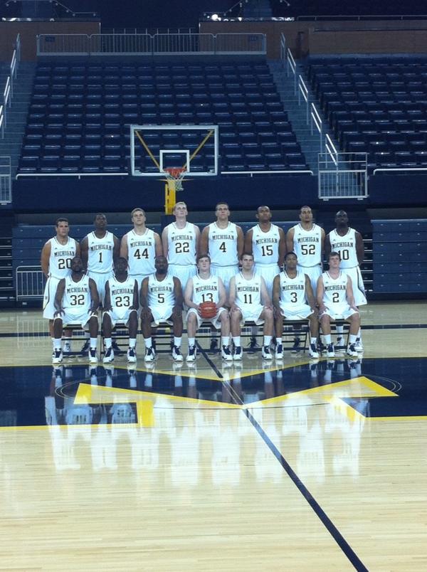
They really don't look that bad to me, but I'm no uniform fanatic:

Team picture from Picture Day:
October 1st, 2012 at 3:51 PM ^
McGary looks like a beast. That is one big kid.
October 1st, 2012 at 3:52 PM ^
Most uniforms look bad on a hanger, IMO. I like the amount of white we're seeing on these uniforms and the Sugar Bowl jersey (the football away jersey is a step in the right direction, but not as good). The less busy the better; white jerseys should be white, maize should be maize and blue should be blue.
October 1st, 2012 at 3:53 PM ^
They look much better when being worn than alone.
October 1st, 2012 at 3:57 PM ^
It looks like McLimans has put on some weight. He looks less like a giant bird now.
October 1st, 2012 at 4:05 PM ^
October 1st, 2012 at 4:17 PM ^
Vogrich is looking a little.....doughy?
October 1st, 2012 at 4:34 PM ^
Looking at them in action (well, in practice), they look pretty decent overall, in my opinion. Like others, I am not huge on the Big Ten logo, and seeming pixelated fade on the shorts would be something I could live without, but overall not a bad design.
October 1st, 2012 at 4:51 PM ^
I see SIZE in the back row. And lots of it.
October 1st, 2012 at 3:44 PM ^
I'm not in love with the shorts, but the jersey looks fine.
October 1st, 2012 at 3:49 PM ^
October 1st, 2012 at 3:51 PM ^
sure loves them some piping.
October 1st, 2012 at 4:00 PM ^
When are student tickets available for pick up?
October 1st, 2012 at 4:20 PM ^
Not for another month probably. Last year, we weren't able to get them until pretty close to the first game. You should get an email when they are available for pick up.
October 1st, 2012 at 4:49 PM ^
I received an email a few weeks ago, and the athletic department is doing basketball tickets differently this year for students. Your basketball tickets will be on your m-card, so to get in the game they'll just scan your m-card opposed to you having to bring your m-card and a ticket to the game.
October 1st, 2012 at 4:05 PM ^
They remind me of high school jerseys or something. The shorts are awful. Bring back the fab 5 shorts...those were baller shorts. Big Block M on both sides. They were the most popular shorts that I can remember...well prolly with UNC.
October 1st, 2012 at 4:07 PM ^
October 1st, 2012 at 4:14 PM ^
Jerseys look pretty good, not sure if the blue panel at the neck is necessary, speckling on the shorts looks unquestionably ugly.
October 1st, 2012 at 4:17 PM ^
To me jersey's are like the referees working a game I have a strong rooting interest in. Win and they're lovely. Lose and they suck.
October 1st, 2012 at 4:31 PM ^
October 1st, 2012 at 4:49 PM ^
We should thank our lucky stars that they aren't any worse. Too many bells and whistles but it's all relatively subtle. Some of the stuff that's trendy now is useful for inducing nausea and little else.
October 1st, 2012 at 5:09 PM ^
The piping coming down the shoulders looks kinda like a sports bra when combined with the texture change.