The look of Legends patches, other official team gear (complaints)

My friend Matt and I got into a bit of a facebook convo on the current look and I figured I'd share in case anybody still wants to hash these things out. Matt's in the yellow box.
Ok, a little rant here. While I was originally a fan of the concept, I now have to say that the Legends Jersey / Patch Idea is not working for me for several reasons.
1. The patch looks like one I would put on a kindergartner on a field trip so they don't get lost. I wouldn't mind the shield design with the legend's initials suggested in a post on mgoblog over the summer -- attached a screen-shot. (left)
Agree. But I feel like I'm howling at the moon whenever I bitch about it so I've stopped.
2. What happens in a situation such as Jake Ryan if he becomes a legend in his own right. Do you have two names on the jersey.
That's the sucky part but not TOO sucky. I mean...we still remember Steven [EDIT: Derrick -- wow that was ironic] Alexander and David Terrell and Braylon Edwards pretty well despite them wearing Anthony Carter's number.
3. With the new Big Ten Patch the Adidas logo (it should be on the sleeve not above the numbers -- see below for more) and the legends patch the jersey looks like a John Daly golf shirt or a nascar fire-suit.
Brandon needs to consult with a graphic designer rather than slapping something together from JoAnn fabrics.
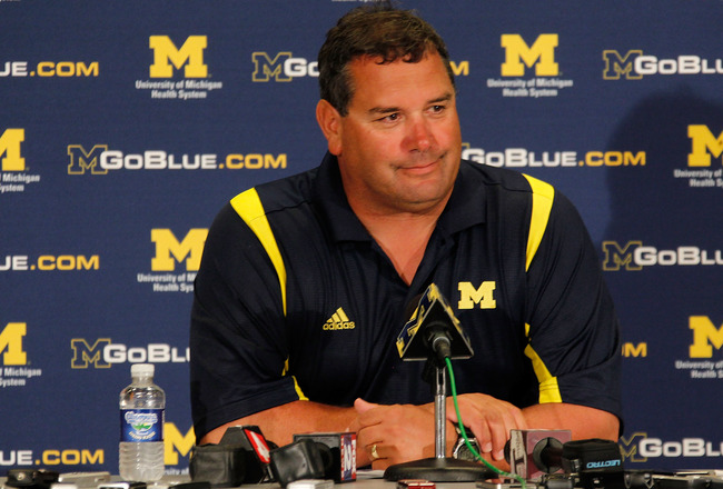
David Brandon calls this a "Wow" experience. Imagine what happens when they need to add the Rose Bowl logo to this.
I hate the polo shirts with the Adidas logo on right side and the M on the other. I am buying a Michigan shirt made by the company. The company shouldn't take as prominent a position -- maybe I am being a little too picky.

The official team gear has looked goofy and logo-dominated, with the possible exception of Carr's gray hoodies, since they first realized the coach can act as a de facto garment model. This (coaches as mannequins) goes back even before the Nike contract:
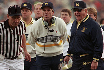
Actually I would buy that white sweatshirt today.
The reason they look particularly crappy today comes from two things: 1) Adidas is still at heart a soccer company that specializes in things that look best on European men, and 2) The type of fan who will buy whatever the coach is wearing because the coach is wearing it is the kind of guy who would otherwise be wearing a $100 shirt with his golf club's logo on it. No athletic department would pass up an opportunity to market their in-house golf shirts, especially not to reach the demographic who thinks "Space, Bitches" is remarkably clever (eg me).
September 17th, 2012 at 1:55 PM ^
Derrick Alexander, no?
September 17th, 2012 at 1:57 PM ^
Steven Alexander. HALOL.
September 17th, 2012 at 2:03 PM ^
I remember Jason Alexander
September 17th, 2012 at 2:05 PM ^
Not as good as Bacari Alexander.
September 17th, 2012 at 2:28 PM ^
He obviously meant Shaun Alexander.
September 17th, 2012 at 2:43 PM ^
UPSET!!!
September 17th, 2012 at 3:19 PM ^
"The Jimmy" epsiode. One of my absolute favorites!
September 17th, 2012 at 1:59 PM ^
No love for #1 Tyrese Buttermilk?
September 17th, 2012 at 2:02 PM ^
When your greatest Michigan moment is NOT catching a pass to stop the clock and allow the winning touchdown to be thrown to Mercury Hayes, then the amount of love you get allocated is bound to be limited.
September 17th, 2012 at 1:58 PM ^
September 17th, 2012 at 2:04 PM ^
What do the Band Legends patches look like? Please advice.
September 17th, 2012 at 4:46 PM ^
How's 7th grade treating you so far? Enjoying it yet? Made any new friends?
September 17th, 2012 at 2:04 PM ^
Adidas is still at heart a soccer company that specializes in things that look best on European men.
Well, if you are operating under this premise, then you undoubtedly recognize your hypocrisy in whining about product placement / branding when you are comparing Michigan polo shirts with anything worn by a soccer player in any European soccer league.
September 17th, 2012 at 8:35 PM ^
Umm... what? You're logic is escaping me.
He is making two points: adidas with soccer styles and adidas focusing on logos. Then you say he's being hypocritical because soccer jerseys also have logos?
How is that hypocritical?
September 17th, 2012 at 2:08 PM ^
I believe that Coach Carr is wearing a sweater, not a sweatshirt. I'm also pretty sure that he's holding a leather-bound copy of Kipling's "If" behind his back.
September 17th, 2012 at 2:11 PM ^
I see what you mean about the "Nascar fire suit." It's a bit much on the front, considering they already have two giant undecorated shoulders to work with. Just imagine this with helmet stickers and a twitter #hashtag
September 17th, 2012 at 4:17 PM ^
Both patches in that photo look like crap. Add in the Adidas and block M and the Nascar reference is right on.
Dave Brandon: Please simplify the patch!
September 17th, 2012 at 2:11 PM ^
Either put the legends patch on the back of the jersey above the player name (where the small "M" is now), or re-design the patch and incorporate the player reference into the numbers on the sleeves. Put a circle around the sleeve numbers with the Legend player name in there or something. The patch clutters the jersey too much.
September 17th, 2012 at 2:21 PM ^
I like the idea of somehow putting it on the sleeve. It would there, but it wouldn't say I AM WEARING A PATCH.
September 17th, 2012 at 3:13 PM ^
love the idea of using the sleeve. perhaps putting just the last name above the sleeve number, to give it a "mini-jersey" look. looking at the mgobanner above, the space above denard's sleeve number is perfect for a last name.
September 17th, 2012 at 2:14 PM ^
I agree with most of those comments, but the shirt company logo opposite the block M is not going away if we get Nike or UnderArmour, as you'll see Troll Saban and Rangoon modeling below:


September 17th, 2012 at 2:40 PM ^
Thats very true. However, I will say that both the Nike and Under Armour logo's seem more subtle than the Adidas logo.
September 17th, 2012 at 2:29 PM ^
For some reason we didn't offer Shuan Alexander 9even though were were reportedly his first choice). Believing instead that (if memory serves) that the services of Ed Davis would be sufficient.
September 17th, 2012 at 3:08 PM ^
Ed Davis graduated before Alexander started college. Davis was here in the early '90s and Alexander was at Alabama from 1996-99.
My recollection on Alexander is that we did recruit him and were in his final two, but he picked the Tide. Something like that - they mentioned it during the 2000 Orange Bowl telecast.
September 17th, 2012 at 2:54 PM ^
I think the patches look stupid. What's next? Wearing a sash like a damn girl scout to hold all these souvenirs?
In fact, the whole legends thing is rather dumb. This is Michigan, we know who the legends are because they accomplished legendary feats and we were watching. We don't need to honor them with silly trinkets.
Good grief this is some dumb shit.
September 17th, 2012 at 2:59 PM ^
September 17th, 2012 at 2:59 PM ^
Well, we're waiting....
September 17th, 2012 at 3:04 PM ^
Yes, yes, yes,yes then can we do something about those helmets.
September 17th, 2012 at 3:07 PM ^
I have a #21 jersey and would like to add the legends patch. Anyone know anything?
September 17th, 2012 at 3:13 PM ^
The patch is just too large and busy, it may have fit on a 90's jersey but with todays trend towards jerseys becoming as tight as a 2nd skin it just ends up squashed in there.
The above proposal regarding the sleeves is a neat concept.
Sometimes it just floors me when crowd sourced ideas are so much better than what some consultant got paid big bucks to do.
September 17th, 2012 at 3:18 PM ^
like crap too, to tell the truth. It's all about the filthy lucre, and you gotta throw new stuff out there, especially if you want to get the repeat custom. Keeping it simple ought to be the rule with an iconic look like M's, but that doesn't sell soap.
September 17th, 2012 at 5:29 PM ^
I disagree about the Bo and Lloyd clothing looking like crap. That stuff looks WAY better than the shit Adidas gives us, and it's not even close. That stuff is vintage and awesome.
September 17th, 2012 at 4:17 PM ^
September 17th, 2012 at 4:34 PM ^
I think helmet stickers would look great with the Sugar Bowl uniform. Commence meltdown in 5 . . . 4 . . . 3 . . . 2 . . . 1 . . .
September 17th, 2012 at 5:23 PM ^
Bring back Nike.
September 17th, 2012 at 5:34 PM ^
when are they going to do the charles woodson legends jersey. i already think that one has been long overdue and we have only done 3.
September 17th, 2012 at 7:17 PM ^
I think they're going to go through the retired numbers first. Also, if Woodson hasn't graduated, he may have to finish his studies first.
September 17th, 2012 at 5:44 PM ^
"1) Adidas is still at heart a soccer company that specializes in things that look best on European men"
I think that statement is as hilarious as it is absurd.
September 17th, 2012 at 6:34 PM ^
Adidas is still at heart a soccer company that specializes in things that look best on European menNo.
September 17th, 2012 at 6:44 PM ^
I'm not entirely thrilled with the legends patch. I love the idea of honoring former players, but I also loved the fact that #1 was an honor without having a patch on it. I couldn't wait to see who was going to get it. Now its like the #1 jersey has lost its luster. As far as adidas, I was unhappy with that move from the start. I know the maize has been an issue for a lot of us as well. I just like the swoosh better and Nike's maize in the 90s is way better than the yellow that adidas calls maize. On some tv's it can come off looking neon. Brandon needs to visit this board more often when he wants to make these changes!