Hockey Uniforms Breeding Like Tribbles

Michigan's just done their annual slight tweaks to the hockey jersey, but they fed 'em after midnight and now they're getting kind of ugly and multiplying at an alarming rate. Michigan announced no fewer than five(!) different jerseys this fall.
The white home jersey have miraculously stayed the same; the road jerseys are now blue duplicates of the home:

Still not a fan of that out-of-place looking block M, but oh well. In marked contrast to the increasingly bepatched football jerseys, these are very clean. It could be worse.
Speaking of…

The fugly Big Chill jerseys with the rabid hamster on them are back. I blame these things for the bumblebee Michigan State uniforms, BTW, and they are dead to me.
The fourth and fifth jerseys are for the GLI and I'm not sure how I feel about them until I see them.

There's also a version of these with the colors inverted. Note the lack of wings on the helmet. UPDATE: false alarm.
The operative theory here appears to be "if we put out five jerseys everyone will want to buy at least one." Next week they'll announce special NCAA tourney editions of all of these. They're identical, but when you put them someone shoots you in the heart. No sale! I only like that once a year!
For the record, my favorite iteration is from the 2008-2009 season:
![images[2]](https://mgoblog.com/sites/mgoblog.com/files/images/Hockey-Uniforms-Breeding-Like_B9EF/images2.jpg "images[2]")
I preferred the white and maize. Very classic looking, both of them. Though the Maize is kind of a Rangers ripoff, I'm okay with that. I'm hoping they come back around to something they like soon, as my jersey is so old it's got the university crest on the shoulders and was hand-knit by twelve-year-olds. Twelve-year-old Americans! Can I get a Triangle Shirtwaist shout-out up in here? No? Oh, okay.
Carry on.
For the tribbles reference.
Tell Scotty to transport the whole kit 'n kaboodle of 'em to the Klingons.
What? The Triangle Shirtwaist tragedy was one of the saddest moments in American history and Mgoblog is using it to joke about hockey jerseys?
Titanic, Abe Lincoln and Boston Massacre jokes also too soon.
Cain killing Abel
Abel was wearing a Buckeye t-shirt. I don't hold nuthin' against Cain. :-)
I think I have the exact same jersey as Brian. It's a good conversation starter with the kids at Yost: "Yes, I really did order this from a catalog. Yes, my parents wrote a check for it." Then they call you "sir".
Same here: the old Nike ones with the seal on the shoulder. I don't remember Nike changing that uniform very often though. Can anyone remember if Nike made a new batch of uniforms every year like Adidas seems to do?
They did not, though Nike and Adidas should not be confused with the parties who deserve blame for the jersey changes. The school ultimately controls its uniforms.
Nike was involved in only 2 major redesigns, an overhaul in '99 and another one in '02 (which was slightly tweaked midway through the '02-'03 season). Things really got crazy upon the adoption of the Adidas contract.
The jerseys this athletic department keeps coming up with are starting to make Wal Mart and Meijer knockoffs look relevant
We'll see how the picture translates to real life, but I like the blue GLI uniform. The hamster uni remains an abomination.
Being rabid makes all the difference to me
I bet those aren't nearly as pronounced on the real pants. IIRC, jersey mock-ups like this often over-emphasize lines like that.
I feel your pain, though I have managed to catch a couple of games since I moved back to the upper Midwest.
I've been putting off getting a jersey for a few years......Looks like I'm gonna keep doing so.
Get off my lawn.
So Brandon nixes the older block M with Michigan written inside it in favor of just the block M for stronger branding --- and then proceeds to fuck it up with a shitty placement next to ICHIGAN on the hockey jerseys. Smooth, Dave.
To be fair, I'm never quite sure how much influence that the Athletic Department has on these things. I mean, they do sign off on them, but I always felt that it's adidas that comes to them with all of the concepts.
That's the only way some of these could ever see the light of day. That blue one, with all of the adidas 3-stripes everwhere is just a walking billboard for the company. I doubt I will ever buy any adidas apparel as long as they have the contract; they just don't get the Michigan brand at all.
It's not exactly a new concept for Michigan, though perhaps for hockey it is. I actually like the nod to our last NCAA champion hoops squad.

I wish it didn't have the Block M, but it's as close as we're going to get. It's a thing of beauty and will end up being my sixth Michigan hockey jersey (1996 Dazzle Fabric White #1 with University seal over M shoulder patch, classic white with Blue Block M (with shoulder seals), Maize "Morrison Script" jersey (with shoulder seals), navy slight arch Michigan (with shoulder seals), and 2008 white home "Berenson Classic" in a #9.)
Also, when you accept that it's a 1970s jersey and that the GLI money is a sucker bet, especially if Michigan gets permission to sell them in stadium with the Winter Classic, well, that's just printing money.
These are cringe-worthy. I got the NY Rangers/diagonal Maize jersey in 2010, simply because I like the highlighter Maize.
Why does the AD continue to parade out the replica Big Chill jerseys from the 1940's? I'm not buying it, and I only know of about 2 people who did. And I continue to make fun of them.
our rodent at least chomping on a hockey stick or on ice skates?
They finally do something with the hockey jerseys I actually want them to do (concerning the blue away jerseys) by making them just blue, with maize...no white accents (except the stupid ccha logo)...and still manage to fuck it up by putting the block M on the beginning of ICHIGAN...come on, what a tease
Now I can't mock state for their walmart looking football jerseys anymore because now our jerseys look like meijer replicas.
/mylawn.getoffofit
I like the white and blue home/road jerseys. I can deal with the weird M pretty easily.
The Big Chill jerseys are still ugly.
Gotta say I reallllly like the alleged GLI jerseys (add winged helmets, of course). Reminds me of late 70s Toronto Maple Leafs jerseys:

They are genuine throwbacks, as Michigan did indeed wear jerseys of that pattern back in the day. I believe our title game appearance in the 70s was in the maize version.
The fugly Big Chill jerseys with the rabid hamster on them are back.
It's not a hamster on the alternate home jersey - hamsters don't have long tails. It's a Rodent of Unusual Size (ROUS).
And I don't think those exist.
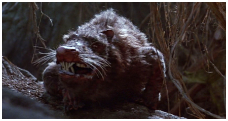
Naw, it's the Great Lakes Chupacabra.
Lederhosen sure have come a long way.
Twas not such when I was a wee one.
Particularly underrated is the patch on the arms (I have the maize jersey, but they patch could be universal). To me a close second place are the 07-08 jerseys. Both are just classic looking.
Best Jersey: White from 2 years ago (no block M)
#2: the road with arches michigan from the denny felsner days
#3: maize script from 95-96
the GLI jerseys are solid, and i love the roadies, minus the M
I like the GLI jerseys a lot, but I'm not sure I want to proceed with buying one (and encouraging the many jerseys) until they fix the home and away ones. Sadly, I think no matter what, we'll have new jerseys next year that we will find unsatisfactory. It's disappointing.
Comments