Writers chime in on best college football helmet
 I know old subject. Brought up every year, but this stuff never gets old to me and besides it's off season. Spring Game and recruiting commits not withstanding.
100% of the time, its the best everytime.
The contributors to the article seem to have 2 schools of thought: Michigan's is the best, or "Anything with a white background and dark logo is cool because it 'pops'". I'll go with the first.
it "pops" what kind of girlie ass langauge is that it "pops". The only time that word should be used when talking footbaw is did you hear that pop or damn he popped that guy or damn the ball did pop out of his hand. just say'n
I hate Tom Dienhart. He's such a clown. I knew ahead of time he wouldn't even mention Michigan just because he's a punk.
You suck, Tom. At least I got to rant about how he sucks.
He has to be among the five worst CFB writers.
The responses to the article are almost as funny as the actual article itself.
we love the best program in the nation, i feel so blessed.
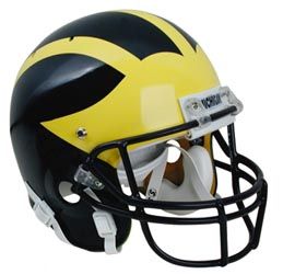
- Michigan (duh)
- Texas
- Notre Dame
- Alabama
- USC
- Princeton (just for the hell of it)
Probably not a crowd favorite, but I love PSU's helmets, and uniforms. I know it's tough to support an all white helmet, but I find that it's simplicity is unique, refreshing, and traditional.
<br>
<br>Go blue!
The fact that they rejected Nike's Pro Combat garbage earns them extra points with me. Of course, the wings still take it. The fact that Tsio turned the last two iterations of The Game into their little Nike fashion show still irks me.
Couple that with the Backyard Brawl horror show this year (went to Pitt so that's a big deal to me) and the uniforms I saw this year were awful.
Why don't they go back to the Dorsett era with the lighter blue and yellow and the "Pitt" spelled out (rather than "PITT")? I think that looks a lot better and much more identifiable than the current look. What do Pitt folks think about the two images?
All of my friends who would care think so too. Steve Pederson screwed the pooch on that one. Those helmets would probably make my top five too (though it's biased, but so was M at one).
If they need to do an MSU/Purdue style "image investigation", just be sure to put in a good word for PurpleStuff's House of Design. I'd be happy to take a few hundred thousand dollars, sit on my ass for a few months, then just print out a photo of Dan Marino in college to show everybody what the "new" uniforms look like.
It seems like a win-win for all parties involved.

Like it ... much better than the current model.
Than these guys did....
The Big Ten screwed that thing up royally. I would just have paid Shredder $20 to do an MS Paint portrait of Bennie Joppru, made that the new conference logo and spent the rest of my design fee throwing an MGoCrackParty.
Maybe down the road they will come to their senses and this horrible wrong can be righted.
When they change this first:

I remain 80% certain that this is all part of Dave Brandon's elaborate plan to only play Ohio State in corporate sponsored events taking place in mid-July at enormous foreign soccer stadiums. He will then use the sponsorship cash to finance his new movie, "Star Wars Episode VII: Jar Jar Binks Goes to Hollywood" where Yoda comes back from the dead to try Domino's new pizza recipe.
Plus the old Pitt helmets looked good with stickers too.
April 18th, 2011 at 12:53 AM ^
Michigan undergrad, but Pitt law. There's much to be said for the retro look...but to be honest, I like the block PITT look as well. In my opinion, it's six of one and half a dozen of the other. Not that either can compare with the winged helm...
What about Split M vs. Block M, or the location/prominence/number of Adidas or Nike logos on various uniforms over the last 2 decades? Not to mention helmet stickers :-)
OSU would have great helmets, probably top five, if it wasn't for those ridiculous stickers.
I actually like how the stickers look on their helmets. Without them they're a little boring. Ditto for FSU - I love when the tomahawks extend to the front of the helmets.
OTOH, our helmet design is busy enough as it is. When stickers were added, there was hardly any blue space left on the helmet.
I'd disagree. OSU without stickers would be kind of between PSU and Alabama, and I like both of those helmets.
I think stickers can work if they're smaller than the old ones, and tastefully done. Putting them on the ear areas of the helmet wouldn't interfere with the striping. That's where the numbers will be located for the throwback uniforms for the night game.
I can't believe you just posted that. Helmet stickers are the only thing keeping Buckeye Nation from the great, dark, airless void. JGB futures down 15% with heavy trading.
Posting this in a mood more appropriate for the night following The Horror than a starry, if somewhat windy night following two 4* LB commitments. Atlas Shrugged was worse than I expected and I pegged it to be 70/30 bad. I can't even describe how disillusioned I am with Hollywood. Even people who hate the book can share in shock that a book that sells that well made such a terrible movie: usually big books at least try to go big on the movies, it was just a joke.
Now that I've got that off my chest, I don't think OSU's helmets are that bad. I can't think of a second better helmet in the conference. It's simple and old school, though I do hate the stickers.
April 17th, 2011 at 10:01 PM ^
I'd go PSU over OSU. I like the single blue stripe over the black, red and white stripe on OSU's.
Or what about Indiana's "49ers" style experiment - not sure why they went away from that.
Sucks to hear Altas Shrugged wasn't very good. Wifey is a big fan and was looking forward to it.
But I do like their helmets. I'd put IU and NU at #2 behind OSU sans stickers. Either way, those dumbass stickers cost them big time.
April 17th, 2011 at 10:12 PM ^
Never, not in a million years. After I read that they recast the live-action Akira remake with all-white actors and set it in Manhattan, I don't trust Hollywood to make movies of any classic literature anymore. Harry Potter doesn't count.
Anyways...I posted a few days ago about how Brutus Buckeye is stupid and overexposed, and the battleship gray helmet is similarly overexposed in Columbus. You're sitting there at a stop light, minding your own business, when you suddenly notice OMG there's Brutus and three OSU helmet magnets on the car in front of you, staring you in the face. Now imagine that happening every day for the rest of your life, and you can imagine why I don't much care for their helmet design.
Some teams' away uniforms look better in the B1G then the home uniforms. NU, PSU, Purdue look better on the road. Michigan, Illinois, Wisky, OSU look better at home. The OSU helmets, though, god they make me want to vomit. If they just went with a simple red stripe on a white paint background like Penn State, with or without stickers, they would look so much better than that metallic, sparkly garbage.
April 17th, 2011 at 11:35 PM ^
But make it with middle aged white actors and set it in New York. Kids liked Keanu in the Matrix, they'll like this. Let's buy a property...and then change all of it.
<br>
<br>I'm still pissed I can't find the original dub for Akira on DVD, no more that...
Have you read Atlas BD? I'm curious about your thoughts on it, now that we're probably the only people on this thread.
I'm still working my way through the Akira pantheon, and I just re-read Maus. Yes, I am in graphic novel mode at the moment. If you like sci-fi, Blood Music by Greg Bear is awesomely awesome.
I'd recommend The Fountainhead when you're back into lit. Atlas is good as a message, but because it's so laden with message (Rand's attempt at all five branches of philosophy in one story) the plot suffers a bit. Basically, it's a distopic novel about the great thinkers and doers of the world going on strike, and how quickly life will suck if they chose to do that, as well as the wrong way to go about problems that arise as consequences.
Fountainhead focuses on an artist (he's an architect) and his individualist struggle against people unable to recognize greatness, and go with the popular thing without reasoning themselves. It's a very good story and introduces some of Rand's ideas without putting yourself on the line for 1,300 pages. Whatever you think of her (and I do not think she was infallible by any means) she's one of those "important to read" people, like Zinn or Marx or Milton Friedman.
You probably guessed this from that zoning discussion, but I'm a big fan of Rand in a broad, theory type way. Some of her specific opinions are absolute crap, even from someone who wishes her two big novels were even more popular than they are.
April 18th, 2011 at 12:27 AM ^
Who thought that would make a good movie? Nothing spells blockbuster excitement like a long ass explanation of why going off the gold standard was a bad idea. Or a terrifying villain who wants to plant a bunch of fucking soy beans.
Some things are just books and should just be left alone. Anyone who is smart enough to get what is going on and give a shit one way or or another is smart enough to pick up the book and read it.
Thanks, I don't know what to think, but I agree that Atlas wasn't written to be a movie (though maybe I hold it in higher regard than you). Honestly, I thought an HBO or Showtime mini-series would be the best.
"Anyone who is smart enough to get what is going on and give a shit one way or or another is smart enough to pick up the book and read it."
Honestly, I completely agree. It's the masses that I'm concerned with. This should have either been an appeal to the masses or an appeal to the fans. I just saw a halfhearted attempt at either.
April 18th, 2011 at 12:38 PM ^
It is also being directed by some dude who has never directed anything other than a few episodes of "One Tree Hill". Throw in a no-name cast, a limited budget, and an attempt to make the book into a theater-released trilogy (so that there is zero flow to the story for people watching in theaters who have to wait a year or more for part two) and this is what you get.
It just seems to me like one of those books/properties/ideas that either shouldn't have been messed with or should have gotten legitimate attention from qualified people with the financial investment to do it well. Instead we get a bunch of anonymous folks rushing to get something done before their option rights expired.
April 18th, 2011 at 12:14 PM ^
Or a terrifying villain who wants to plant a bunch of fucking soy beans.Ohio is a giant soy bean field. I guess we're all doomed.
April 18th, 2011 at 11:42 AM ^
But it's nice to know which players are smoking the most weed...
April 18th, 2011 at 12:15 PM ^
Or the guys that are drinking a 30 pack of cheap beer a day.
Now you made me think of the Big Chill jerseys. Thanks a lot.
Steve Margeree hit the nail on the head (no pun intended). I fell in love with UofM back when I was 10 or 11. All because of the helmet.
1) Michigan
2) Delaware
3) Princeton
I like Texas A&M''s helmet. Don't know why but I have always liked it. Also, LSU has a different kind of look. UCLA's is classic. Michigan's is by far the best but there are alot of other cool helmets.
The wings take the cake for #1 obviously. Trying to think of a number two was more difficult. I got:
2. Alabama
3. Penn State
4. TCU (love a team that can pull off purple)
5. Texas
Screw Notre Dame.
Michigan, Texas, and Alabama are all obvious Top 5 candidates, but I'm surprised there's no love for Florida State's burning spear.
I don't get the Texas love. A picture of a cow on a helmet is cool? Really?!?
What's next, Donald Duck...a beaver? Oh, wait.