The Wolverine Logo

I posted this question as a comment on another post about a week ago but it was buried.
What are your opionions on the lack of Michigan memorabilia (shirts, hats, etc.) with a Wolverine on them? The only wolverine I ever see these days is the retro one with the stiff upper lip wearing a hat. It seems like through the 70's and 80's, the wolverine was a lot more prevelant on Michigan shirts. What happened!? I, for one, think the wolverine is awesome and should be more widely used.
To give you an example, the wolverine on top of the block M in my icon photo is along the lines of what I'm talking about.
Spin off question.. Do you own a piece of retro Michigan clothing that you still hold dear because of it's uniqueness?
(BTW- This is my first post, so take it easy. Thanks!)
January 28th, 2015 at 10:38 AM ^
January 28th, 2015 at 10:52 AM ^
January 28th, 2015 at 11:22 AM ^
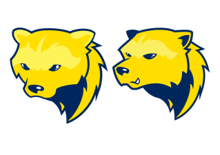
If it could be made to look a little less cartoon-y, it would be good.
January 28th, 2015 at 12:03 PM ^
The possible evolution of this creation scares me more then AI.

January 28th, 2015 at 12:53 PM ^
Sent from MGoBlog HD for iPhone & iPad
January 28th, 2015 at 1:00 PM ^
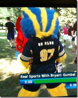
Some Wolverine costume the spartans created so they could have sparty tackle it back probably ten years ago.
January 28th, 2015 at 1:32 PM ^
January 29th, 2015 at 8:14 AM ^
You have to admit, the '97 is a nice touch.
January 31st, 2015 at 12:24 AM ^
I like it overall but maybe the teeth should be pointing in the other direction.
I still think we need to talk to marvel to co-promote, it's a win-win
![]()
January 28th, 2015 at 12:02 PM ^
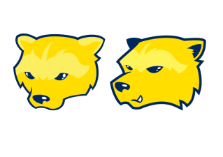
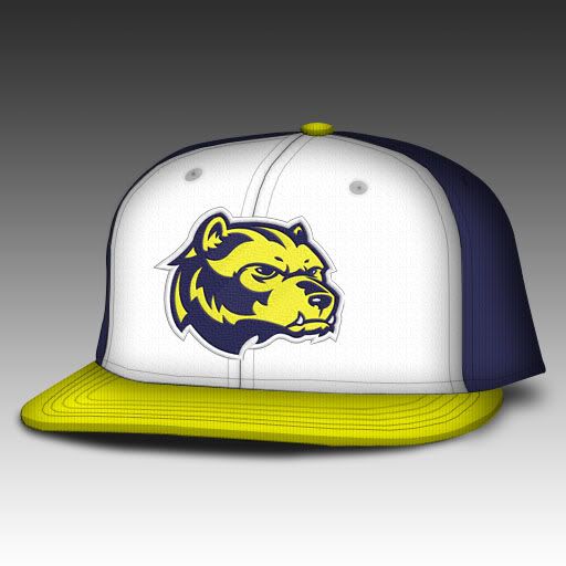
Those first two were just concepts put together by user JJSCOTT at SportsLogos.Net. Certainly not an official University of Michigan logo. See thread for the evolution of the concept.


January 28th, 2015 at 12:30 PM ^
My God.....those look great!
Side note: If we get stickers, I hope they're not ovals.
January 28th, 2015 at 12:32 PM ^
January 28th, 2015 at 12:51 PM ^
The Block M is the only helmet sticker I will support.
January 28th, 2015 at 12:58 PM ^
You mean footballs?
January 30th, 2015 at 7:56 AM ^
Footballs are ok because of the history of that sticker, but why limit it to history. Imagine how cool it would look to see Norfleet with a sea of block M stickers on his helmet as he dances around waiting for the kick.
January 28th, 2015 at 12:32 PM ^
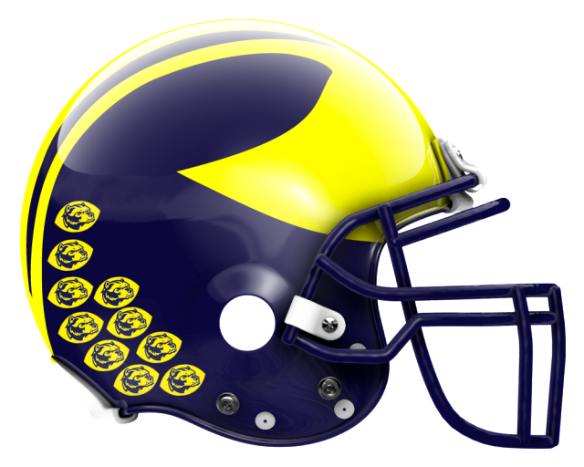
I like those. The wings on his head are a nice touch.
January 28th, 2015 at 4:25 PM ^
January 28th, 2015 at 12:24 PM ^
#1 looks pouty, and his winged helmet is the wrong colors.
#2 is as good as it gets using a Wolverine in our gear (aside from the classic with the little M cap on) - winged helmet correct colors, snarl angry rather than petulant. I'd get some shwag with that on it.
#3 Used too often by other teams (P.S. anyone who thinks it's Mizzou doesn't even know they wear black, not blue)

January 28th, 2015 at 3:22 PM ^
For some reason I've never been all about the claw. The snarling wolverine faces you've posted are the best I've ever seen. Would totally buy a shirt with that. Please never put it on the uniform, Mr. Hackett.
EDIT: I liked it so much I changed my avatar
January 28th, 2015 at 10:49 PM ^
January 28th, 2015 at 10:17 AM ^
January 28th, 2015 at 10:26 AM ^
January 28th, 2015 at 10:36 AM ^
January 28th, 2015 at 10:37 AM ^
January 28th, 2015 at 11:05 AM ^
January 28th, 2015 at 10:39 AM ^
January 28th, 2015 at 11:10 AM ^
Sent from MGoBlog HD for iPhone & iPad
January 28th, 2015 at 10:21 AM ^
I assume that it is one of his classic illustrations; the scowl and the sailor hat are distinctive markers of his work.
January 28th, 2015 at 10:21 AM ^
I love the M claw!
January 28th, 2015 at 10:23 AM ^
No animal logos, please. The block M is iconic. It should also be shown without the word "MICHIGAN" across it. Just a plain maize or blue block M.
January 28th, 2015 at 10:23 AM ^
GULO GULO BLUE
January 28th, 2015 at 12:49 PM ^
I see what you did there.
January 28th, 2015 at 10:25 AM ^
Block M baby, Block M

January 28th, 2015 at 10:25 AM ^
There is nothing bad about it except everything.
January 28th, 2015 at 11:59 AM ^
January 28th, 2015 at 10:26 AM ^
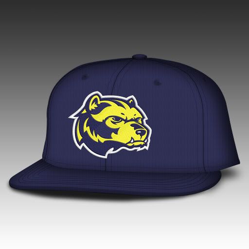
Looks more like a bear tho... lol
January 28th, 2015 at 11:24 AM ^
Cheeks are too fat.
January 28th, 2015 at 10:54 AM ^
His fur has wings!
January 28th, 2015 at 11:19 AM ^
with wings.
January 28th, 2015 at 8:46 PM ^
Sent from MGoBlog HD for iPhone & iPad
January 28th, 2015 at 10:25 AM ^
January 28th, 2015 at 12:39 PM ^
And get off your lawn?
January 28th, 2015 at 12:54 PM ^
January 28th, 2015 at 10:25 AM ^
Some of the vintage gear with a wolverine on it is awesome
January 28th, 2015 at 10:25 AM ^
this looks really nice. i agree with you. i for one would like one with this on it
January 28th, 2015 at 10:31 AM ^
January 28th, 2015 at 10:32 AM ^