Sugar Bowl Pseudo Clowniforms
Mgouser MASChicago posted this in another thread.
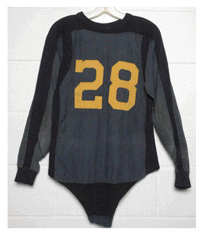
http://www.mden.com/shopping/product.cgi?BG120+1522
We're wearing the away jerseys for the Sugar bowl... but no! Not our "normal" away jerseys. Not Last year's away jerseys that we wore for much of this year (trim piping). Not the bumblebee awful-forms from the Michigan State game.... but a combination of them!

I personally don't like the Block M on the left chest. Or the shoulder stripes. The undershirt-as-uniform sleeves is a trend that I've found very interesting recently... but I dunno if the Blue Sleeve is as good as if it were a white sleeve, maize outline of a blue M (modern analog to the Thomas picture below). What is it with adidas and making us have stripes? In general I'd say these are OK, nothing earth shattering, and for a change not bad.

Those are the replicas you can buy.
December 13th, 2011 at 2:22 PM ^
because they drew Denard without his dreads.
December 13th, 2011 at 7:59 PM ^
no dreads and white, so not Denard.
December 13th, 2011 at 2:23 PM ^
Mark me down as in favor. I hope they've been experimenting with away jerseys and just trying to find one that people like. It looks clean, sharp, and it's not white/white or maize/maize. I wouldn't mind it at all if this became the normal away jerseys. Any word if they'll have their numbers on the side of the helmets?
December 13th, 2011 at 2:28 PM ^
December 13th, 2011 at 2:28 PM ^
they are alright myself. I actually thought the MSU unis would have been alright without the stripes. I thought I would hate white on white, but I thought it looked pretty sweet. Wouldn't want it in every game, but it was cool for a change IMHE. Anyway, I like this look as well TBH.
December 13th, 2011 at 2:29 PM ^
The shoulder stripes don't bother me at all. Similar to how the number on the helmet doesn't bother me. In fact, I love the number on the helmet. I also think that we should play with the away jerseys now and again. I know that the home jerseys are supposed to be dark and away light (unless you're LSU), but what about a maize away jersey? You could use white pants, or go all maize. That could be a sweet look, no?
December 13th, 2011 at 2:31 PM ^
I like the new ones road ones. I may even buy one when they go on sale after the Sugar Bowl.
I will NOT be buying the ultra-modern form-fitting $350 version, though.
December 13th, 2011 at 2:31 PM ^
You don't pull on Superman's cape
You don't spit into the wind
You don't pull the mask off that old Lone Ranger
And you don't mess around with jerseys for UM.
December 13th, 2011 at 2:42 PM ^
Except that U of M's road jersey pretty much changes every season. Granted they haven't changed multiple times in a single season in the past, but let's not pretend like our road uniforms are some sacred immutable icon.
I for one don't mind these too much, and kind of would like to see them bring the white pants back with them as well. That would be pretty cool.
December 13th, 2011 at 2:50 PM ^
While we may not have stuck with one look for road uniforms in the past, nothing sells Michigan like the winged helmets. They're iconic. I think we're better off, as much as possible, keeping the rest of the uniform iconic as well. I can live with nips and tucks here and there, but the MSU uni's were abominable, and I would avoid the stripes altogether. Class 132. Michigan fergodsakes. We're selling tradition here--why undercut it by moving to the Oregon end of the spectrum?
December 13th, 2011 at 2:59 PM ^
I was with you until the white pants part. I want my +1 back!
December 13th, 2011 at 2:38 PM ^
This is Michigan fergodsakes.
Seriously, this is where I really can't stand Brandon and his brand marketing B.S. Next we thing we know the Noid will be UM's mascot.
And, I can't beleive I am saying this but Addidas actually makes me miss Nike. Hell even Nutmeg Mills would be an improvement.
December 13th, 2011 at 2:43 PM ^
has got some REALLY big hands.
December 13th, 2011 at 2:43 PM ^
Make it stop.
December 13th, 2011 at 2:45 PM ^
What's funny is that I actually love these. THESE are what I pictured when they said we'd be wearing a throwback uniform. These have a nice "old" feel to them with the simple, plain, blue stripes on them. I wouldn't mind keeping these around.
December 13th, 2011 at 2:45 PM ^
December 13th, 2011 at 2:46 PM ^
Sooooo much better than the MSU jerseys we wore. I kinda like the block M on the shoulder, but I think it would be ever better without the stripes on the shoulder. I am very glad to not see any piping, though!
December 13th, 2011 at 2:48 PM ^
I really don't like the block M on the left chest. It makes the uniform too "busy". I'm not a fan of the shoulder strips, but I'n not all bent out of shape about them either. I wish we could just go back to the second-to-last Nike road jersey and be done with it. I loved those things, with the M on the sleeves and the two-toned collar.
From me, these unis get a resounding "meh."
December 13th, 2011 at 2:50 PM ^
Not a fan personally. I like the traditional aways. And by traditional, I of course mean the aways that get redesigned every year. But don't have stripes. Fuck those stripes.
December 13th, 2011 at 2:51 PM ^
eh, its better than this.

December 13th, 2011 at 2:57 PM ^
I like them, except the block M on the chest, sleeves, and "MICHIGAN" on the back of the neck is overkill. This is Michigan, we get it. The helmet should be enough to identify us.
On the other hand, the Sugar Bowl logo looks refreshingly small compared to past bowl patches.
December 13th, 2011 at 2:59 PM ^
I could do without the shoulder stripes but I like the block M on the left chest and the blue undershirt sleeves.
December 13th, 2011 at 3:05 PM ^
These can STAY ON MY LAWN.
December 13th, 2011 at 3:15 PM ^
We need to return to long sleeves and a button crotch!
December 13th, 2011 at 3:20 PM ^
Those are probably the best road jerseys we've had since 2006
edit: and if they put blue block m's on the shoulders instead of the stripes it would be tits
December 13th, 2011 at 3:20 PM ^
but I fear these new uniform patterns the same way Jim Delaney fears playoff creep. The new uniforms looks fine now, but then it opens the door for Dave Brandon to have all maize jerseys, have no wings on the helmets, play with a leather pattern on the helmets because it's "historic", put a giant wolverine logo on the chest complete with saliva and thunderbolts, an ad for Deja Vu in Ypsi as a tramp stamp on the jersey, etc
December 13th, 2011 at 3:22 PM ^
Photoshop Experts...
I'm not good at that stuff...
Could someone please make an ALL WHITE uniform with maize numbers and blue outline?
No blue collar or rings around the end of the sleeve. Literally all white, maize numbers, blue outline.
December 13th, 2011 at 3:30 PM ^
penn state?
December 13th, 2011 at 3:44 PM ^
Didn't know Penn St. had MAIZE numbers with a blue outline...
Also, I could've sworn they have a blue collar and blue ring around the end of the sleeves.
December 13th, 2011 at 3:24 PM ^
If the players are :) than I am :)
So many variations and I dont like any of them. I prefer what Michigan has always worn, but if the players like them that is what really matters. I will cast my vote by not buying it.
December 13th, 2011 at 6:06 PM ^
What does Bri'onte Dunn want? Cause that's what I want.
December 13th, 2011 at 3:24 PM ^
The shoulder stripes are awesome in my opinion. They go well with the winged helmet and give the impression of moving forward. Plus, I actually like that they align with Adidas logo (although the three stripes in the UTL unis do so more accurately).
December 13th, 2011 at 3:36 PM ^
Do you happen to work for adidas or the athletic department?
December 13th, 2011 at 3:25 PM ^
Not a fan of these. Without the stripes they would be OK.
December 13th, 2011 at 3:29 PM ^
I just don't understand. This is like something an athletic department stressed for money would do. Just wear what we've always wore.
December 13th, 2011 at 3:37 PM ^
How do I post a picture I made in Paint?
December 13th, 2011 at 3:38 PM ^
That's probably because of the throwback unis from the ND game. I loved those unis, so stripes have a bit of a special place in my heart now.
December 13th, 2011 at 3:40 PM ^
Is it common for major programs to wear alternate uniforms for bowl games? I don't feel like I've seen it very often.
December 13th, 2011 at 3:41 PM ^
I have no issue about how these look 2-D, but ill save my final opinion for when they run on the field.
December 13th, 2011 at 3:51 PM ^
I didn't like UTL jerseys. Hated them, actually. I didn't like the MSU-game road jersey, but I was too anxious to care. If true, I really don't like these.
Wearing multiple sets of uniforms during a season can't do wonders for our *brand*.
December 13th, 2011 at 4:00 PM ^
techfits? wearing em loose? Do people really pay that much attention to uniforms?
December 13th, 2011 at 4:04 PM ^
I don't think it looks bad, but I'm worried about this becoming a yearly thing with the Bama game neutral site throwbacks, Air Force camo throwbacks, ND game throwbacks, , MSU game throwbacks, OSU game throwbacks, BTCG throwbacks, and bowl game throwbacks next year.
December 13th, 2011 at 4:03 PM ^
I kinda like these. The blue stripes are subtle but a nice touch. Best road unis all year if you ask me.
December 13th, 2011 at 4:10 PM ^
I hate all the stuff on them - stripes, huge numbers, block Ms everywhere, yellow around the numbers. The jerseys wouldn't look terrible if we went with one or two of these items, not a goddamn Fourth of July grand finale of jersey add-ons.

December 13th, 2011 at 4:15 PM ^
hot fire unis
December 13th, 2011 at 4:17 PM ^
Better than the MSU game jerseys...although that is not saying too much
December 13th, 2011 at 4:36 PM ^
Careful boys, messing with the uniforms is fine, but touch that classic helmet, and ye shall have to deal with more than just Dave Brandon's pimp hand.............

December 13th, 2011 at 7:33 PM ^
have you seen the numbers payed on the sides!
December 13th, 2011 at 7:34 PM ^
* plastered Droid app won't edit
December 13th, 2011 at 4:41 PM ^
these are not disgusting, but i say move the block M to the back of the neck like on the home jerseys and i'm also not a fan of the sleeves. i'm thinking they'd match better in maize, maybe. no logos or words or any of that business on the them either.