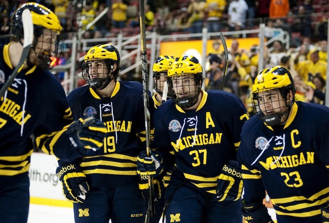
Retail version of the Nike Michigan Hockey jerseys (Photo)

I didn't like the look of the road jerseys at first but it looks better here.
Nice to see the laces back on all of them.
Also great to see that the B1G logo patch is on there. adidas/Reebok didn't have the rights to do it, but Nike does it for hockey.
Hopefully they'll do the other sports some day.

August 13th, 2016 at 2:09 PM ^
August 13th, 2016 at 6:00 PM ^
Sent from MGoBlog HD for iPhone & iPad
August 13th, 2016 at 6:55 PM ^
Sent from MGoBlog HD for iPhone & iPad
August 13th, 2016 at 2:11 PM ^
That's really what the blue ones look like? ...Why?
August 13th, 2016 at 2:12 PM ^
August 13th, 2016 at 3:11 PM ^
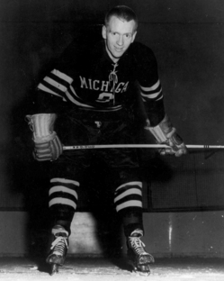
Is there a reason they went away from these?


August 13th, 2016 at 3:18 PM ^
Those maize jerseys are perfect. The blue ones are also much better than the new NIke version. But, geez that guy needs a haircut...
August 13th, 2016 at 5:36 PM ^
Sent from MGoBlog HD for iPhone & iPad
August 13th, 2016 at 5:04 PM ^
The maize jersey is perfect. Team got to wear these on Saturday night if they won on Friday night. Now a days they wouldn't wear them much but they would be beautiful to see again. The jerseys for next season are a complete disaster. Much like the team looks to be. Neg away but I'm a 20 year season ticket holder and am quite sick of the poor excuse for a team that has too often been foisted on us. They haven't been a consistenly good team at the national level since 2003.
August 13th, 2016 at 5:34 PM ^
Well, that's the less perfect of the maize script jerseys. The script changed slightly in the early 00s. This is the one they should be going for:

And totally agree on the blues. Those jerseys were perfection with the seal on the shoulders--still have mine in the closet.
And while we're at it, it's worth pointing out that the jerseys appear to be really chinsey in those pictures. The old Nike replicas were durable as heck--heavy-duty, sewn letters and high-quality decals... You could see your hand through the Adidas replicas. And apparently the new Nike sweaters aren't much better, if these pics are indicative of anything. At least make it worthwhile if you're going to charge someone $125 or so for a hockey jersey.
August 13th, 2016 at 2:12 PM ^
August 13th, 2016 at 2:18 PM ^
August 13th, 2016 at 2:18 PM ^
Sent from MGoBlog HD for iPhone & iPad
August 13th, 2016 at 2:26 PM ^
adidasworthy
August 13th, 2016 at 2:35 PM ^
August 13th, 2016 at 2:46 PM ^
Not really impressed with either one .. the maize one isn't horrible. The blue one would be ok as a volleyball uniform.
August 13th, 2016 at 2:51 PM ^
Like the maize version.
August 13th, 2016 at 2:58 PM ^
Snoresville, USA.
August 13th, 2016 at 3:21 PM ^
Sent from MGoBlog HD for iPhone & iPad
August 13th, 2016 at 3:25 PM ^
No Jumpman for sports other than football and bball. Those are the only two that get it, the others only get the swoosh.
Those hockey jerseys look like ass. Both of them, but especially the blue one.
August 13th, 2016 at 3:40 PM ^
Not jumping off the screen at me that's for sure.
August 13th, 2016 at 3:42 PM ^
Sent from MGoBlog HD for iPhone & iPad
August 13th, 2016 at 3:45 PM ^
August 13th, 2016 at 3:49 PM ^
Sent from MGoBlog HD for iPhone & iPad

August 13th, 2016 at 5:23 PM ^
Sent from MGoBlog HD for iPhone & iPad
August 13th, 2016 at 4:36 PM ^
turrible
August 13th, 2016 at 4:39 PM ^
August 13th, 2016 at 4:42 PM ^
You can get off Nike's dick sometimes, y'know? There aren't laces on these, so I don't know why you'd say that there are. This stuff sucks. Despite years as a stand-alone hockey company and more years in a partnership with Bauer, Nike just plain sucks at making hockey apparel. I have a few Nike USNTDP jerseys and they're all cheap feeling.
It's all presented in the interest of shaving a few ounces of weight but it just makes for a tacky and unsubstantial jersey. As a fan, I don't want that dye-sublimated or heat-pressed bullshit. Sew the stripes on. Tackle twill the logo on. I wouldn't pay $50 for one of these.
August 13th, 2016 at 4:49 PM ^
Agree. That blue one is like the worst-case scenario - just terrible. Maize one is okay I guess but as someone said, really uninspired. I still have a script Maize one and I certainly am not buying one of these to replace it. Ugh. I cannot believe the team has to wear these.
August 13th, 2016 at 5:22 PM ^
Sent from MGoBlog HD for iPhone & iPad
August 13th, 2016 at 5:30 PM ^
So this is the look they were going for with the road jerseys.

I gotta say I like it and appreciate what they're doing, but they've got to arch that lettering a little bit more and thin out the font a touch.
That being said, if you're going to go throwback, what was wrong with the throwbacks from a few years back?
Make that M the same size as the other letters, and bingo-bango you've got a pretty jersey. Also see: the home whites.
August 14th, 2016 at 1:22 AM ^
August 14th, 2016 at 7:57 AM ^
On what planet? That design was great, and was pretty much universally lauded.
And Red wore it. Good enough for me.
August 13th, 2016 at 11:34 PM ^
I've got a nice blue jersey with an obnoxiously large M, the Adidas "authentic" line was really nice quality, got it for $50 when they had that fire sale for the company in TX that briefly replaced MDen. Nothing here worth replacing that one with unfortunately
Sent from MGoBlog HD for iPhone & iPad
August 14th, 2016 at 9:09 AM ^