OT: The Yellow and Blue?

My wife and I had an outstanding visit to Michigan recently, and we made our way through the campus for dinner and whatnot. I was looking to pick up some things and stopped into the MDen and Moe's, when my wife made the comment, "Do you notice how there's no maize any more? It's yellow."
And I looked around. For the most part, she's right. It never occurred to me until that point.
They have recently started selling that highlighter yellow type of shirt that blinds you in the sun. I think it's just the "trend" now.
I thought this post was going to be about the alma mater, "The Yellow and Blue." I always thought it was odd that it is refered to as maize in almost everything, but the alma mater calls it yellow.
It's also strange to me that we only ever sing the first verse of the alma mater, which is only about yellow. Anybody know the history of the alma mater and why it's yellow? There have to be some MMB or Glee Club types on here...
I believe the second verse makes reference to a girl's blue eyes, which maybe isn't deemed politcally correct enough nowadays.
...to a maid with golden hair and blue eyes. Verse two refers to the sky.
- Sing to the colors that float in the light;
- Hurrah for the Yellow and Blue!
- Yellow the stars as they ride through the night
- And reel in a rollicking crew;
- Yellow the fields where ripens the grain
- And yellow the moon on the harvest wain;
- Hail!
- Hail to the colors that float in the light
- Hurrah for the Yellow and Blue!
- Blue are the billows that bow to the sun
- When yellow robed morning is due.
- Blue are the curtains that evening has spun
- The slumbers of Phoebus to woo;
- Blue are the blossoms to memory dear
- And blue is the sapphire and gleams like a tear;
- Hail!
- Hail to the ribbons that nature has spun;
- Hurrah for the Yellow and Blue!
- Here's to the college whose colors we wear,
- Here's to the hearts that are true!
- Here's to the maid of the golden hair,
- And eyes that are brimming with blue!
- Garlands of bluebells and maize intertwine,
- And hearts that are true and voices combine;
- Hail!
- Hail to the college whose colors we wear;
- Hurrah for the Yellow and Blue!
The University of Michigan has used a variety of shades of both Maize and Blue over the years. Sometimes the blue has resembled more of a sky blue than the dark blue associated with the school today.
So why "Yellow" instead of "Maize" in our school's Alma Mater?
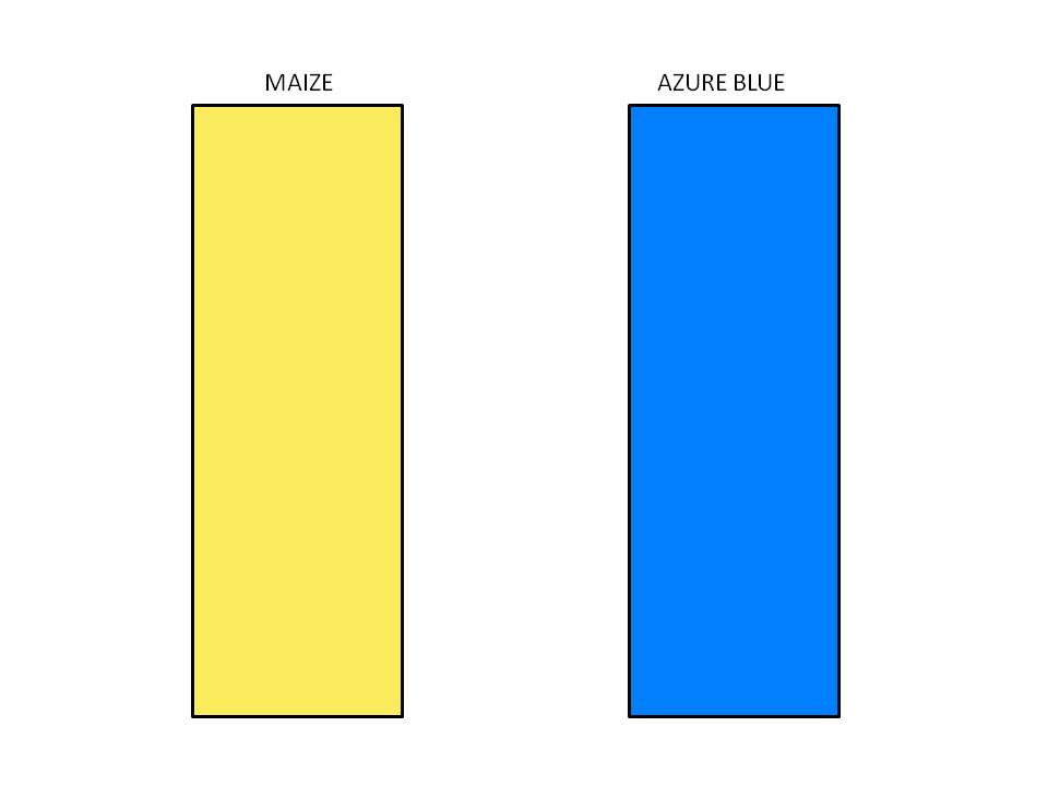
Maize was first used to describe a shade of Yellow in the English language 1861. Although the University had declared "Azure Blue and Maize" as the official colors in 1867 it wasn't common practice nationally yet to use the term Maize to reference a color.
Keep in mind that the school had some unofficial connections to shades of Yellow before it was officially declared to be a school color and before "Maize" was even a word used to describe a shade of Yellow. So when Charles Mills Gayley wrote the lyrics to the Alma Mater in 1889, there is a good chance that many at that time still referred to the school color merely as yellow, despite the fact that it was Maize.
Thanks for link it is a great little read.
...that's a great link. And at the end of the piece we have this:
As a graphic designer, I felt the search for a standard, official, consistent color to represent the University was a driving mission. I tracked every reasonable reference in the historical literature. On a fluke, I followed up an obscure reference to the minutes of the senate meeting of 1912. In the file at the Bentley Historical Library were the ribbons with the official shades of azure blue and maize that Lombard's committee had chosen as Michigan's colors. All this time, as if hiding in the Bentley, were ribbons of rich, deep, pure blue, and a soft yellow---the color of the summer's finest filled-with-sunshine sweet corn.

The article makes it clear that throughout the years since "Azure Blue and Maize" were selected by the 1867 student committee as the school's official colors, the definitions of what constitutes the correct shades of maize and blue have shifted and different entities within the University have simultaneously used different shades. It does seem that the "highlighter yellow" is closer to the official yellow (maize) than the former mustardy yellow.
was to get away from the piss color Nike sometimes tried to pass off as maize.
Do you mean to imply that the shade of yellow isn't "maize"? Because maize doesn't have an RGB specific value.
hmmm, i did not know this....I guess you learn something new everyday on MgoBlog.
(251, 236, 93)
BUT, various U of M emblems use different shades of both Maize and Blue in their emblems, all of which are acceptable.
Acceptable, yes. Official, no.
simply because there's so many different printers producing UM gear. If one print house was responsible for every single T-shirt in Ann Arbor, it would all look exactly the same. So until Underground and MGoBlog do make this happen, we're forced with shirts that use all different values of maize/yellow/gold, and plenty of different variations of the blue as well.
When I first started the MgoShirts last year, someone dropped me official PMS values. I always thought our 'maize' was much more yellow than it was gold, and many other fans feel it should be much more gold and not nearly as yellow. In reality it's not that extreme either way, but it's much more yellow than it is gold. Think Packers pants as opposed to Steelers pants, if that makes any sense.
Real gold looks pretty yellow to me. Why is that copper shade that ND and other schools use called "gold"?
And one of the things we talk about is the cultural connotations that have become attached to color names over the years. When we think of blue, our partisan nature obviously thinks of the blue that Michigan wears, but if you ask a Frenchman, or say someone in Toronto, to describe the color blue, you'll probably get a different answer.
One of the most flawed things in our society is that our eyes have the capacity to perceive an almost infinite number of shades and hues in the natural world (even 24-bit color systems offers over 16 million possible hues), and yet there's less than a hundred words in our language for those colors. The math just doesn't add up, and there's far too much generalization.
So I guess my response is, the word 'gold' has subjective definitions depending on who you ask. Notre Dame calls their color 'gold,' and Iowa calls their color 'gold,' yet clearly the two are desperately different. We should just jump in the DeLorean to the days and invent more Latin words for colors.
Maybe it shows up better for a Maize out on TV. Dull colors often don't stand out as well.
Well our original colors are yellow and blue, so I'm ok with it.
Anyone else see the maize (yellow) and blue Tigers hats they have in the MDen? They're quite sexy.
We signed the Nike deal in 1994. Three years earlier, the Fab Five debuted the maize uniforms against Duke. Those definitely were not the old yellow-orange color.
thinking you were going to comment on our alma mater, "The Yellow and Blue." In glee club, we would always sing the alma mater the moment we drove onto campus from any out-of-town concerts/trips. Good times.
And it really bugs me.
I also hate that they use a generic "M" now instead of the banner "M" that's on the back of the scoreboards. The banner version is more unique, more recognizable, and looks better. It's bad enough that when I say I went to U of M people respond with "Oh, Minnesota?" We don't need people confusing the logo too.
EDIT: Forgot to ask - how is this off topic?
90% of the country will not think that UofM is Minnesota.
And the mods always add OT to everything to try and justify their existence. That's probably what happened.
Generally I find that it depends on the individual you're talking to, but typically Minnesota and Miami, even Maryland, are more associated with "U of M" outside of the Great Lakes region.
It's just silly in general to tell someone outside the state of Michigan that you went to "U of M." Saying "Michigan" eliminates any possible confusion.
The split M has been getting phased out for some time now and is only supposed to be used in instances like the one you described
http://www.logos.umich.edu/faq.html#overblock
edit: I'll bet the scoreboards lose the split M if/when we update them.
Where the heck do you live that people think of Minnesota when you say U of M? Minneapolis?
And anyway, the Minny M looks nothing like the Michigan block M. It looks more like an upside-down W. Mizzou's M, on the other hand, is cleary a ripoff.


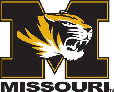
I'd call that a ripoff.
...but with the Tiger, it makes it less so. You can't mistake the Missouri M for the Michigan Block M in this context. It seems that the MU shield logo is the one the University is using as its mark while the M Tiger logo is the one the Mizzou AD is using.
But still...
http://www.ns.umich.edu/MT/96/Fall96/mta13f96.html
edit: with that said; the RGB value given in the wikipedia article above is pretty spot-on.
I was just about to link that site. ALL of those color combinations, and other similar combinations, are acceptable for U of M gear. Though the 1912 ribbon colors are now "official".
Thank you octal9, that is probably the article that I had read and was thinking of in my post just below.
It's really difficult to create uniformity across different materials and especially over large stretches of time. I haven't been able to find the source again, but I could swear that I once read that the original "maize and blue" were very similar to the gold and light blue of, for example, UCLA. These were chosen by the University in about 1870 and that it wasn't until some years later that the football coach switched the blue to a darker navy shade that he thought was more appropriate for football. Of course, with football being the face of the University, that's what it ended up becoming.
Maybe there is a historian out there who could either support or debunk my memory with some actual evidence.
Personally, I like the color of the student shirts nowadays. Call me crazy, but I think the vibrantness stands out well and gives a little bit more to our maize outs. At the very least, I feel that its closer to the color used on the helmets and such than the Wikipedia maize and the shade that some of my non-Adidas stuff is.
Plus, the shirts fade after being washed a few times anyhow, so if you really can't stand the brightness, all you have to do is wash it a few times to get a fade it a little more into what the color of the jersey numbers are like.
Ok. I'll take you up on it and say, you sir...are crazy.
In that one photo, you see the "new maize" on the helmets, and the "old maize" on the M Club banner.
All this is, is that the bright neon yellow performs better in focus groups than the traditional Maize. I don't like it as much, but obviously someone does. Either that, or the dye is significantly cheaper to produce.
But if the traditional maize rates as fugly, then they should be able to bargain a cheaper rate (like when you buy an ugly colored car, should always negotiate a discount)
is getting out of control, and most noticable with the road unis, I have to say that watching old games on classic or BTN, maize is not that attractive of a color. It is like a yellowish, brownish, orangish, doesn't really even look good with blueish type color. I like the transition into yellow, I am just not sure our players need to glow in the dark.
I noticed the 'maize' has gotten much lighter for some time now --

Per wikipedia's RGB definitions of "Maize" and "Azure Blue" which is how the official university committee defined it.
As the name implies, maize is supposed to be the color of corn. What we have now is closer to the true definition of maize than the yellow-orange we apparently used to use. (I say "apparently" because I've noticed that on overcast days, even our current shade seems to look more orangeish than it does in bright sunshine.)
...Gulden's yellow to French's yellow.


They have different tastes, but they're both mustard and they're both classics.
I think that they wanted the student t-shirts to look as cheap as possible, almost as if there's no relation to the University at all. That way, the kids all look like they're hot dog vendors (or hunters) instead of Michigan students. Besides, what goes better with piped-in Neil Diamond and GnR than neon!
First I thought you were talking about Guns N' Roses (G n R), then I was dissapointed when I realized you weren't, but I again perked up with the Neil Diamond reference.
He was...
jmblue brings up some good points.
A. Per the actual definitions, the "highlighter" yellow is closer to maize than the orangish yellow of years past.
B. A lot has to do with how the colors are transmitted and how we see them. On a bright day with the latest of technology the current maize really pops. But if you look at an older picture and the technology of the day isn't as capable as processing and capturing light, so the colors are not as vibrant.