OT: UCal Falls Victim to Building the Brand
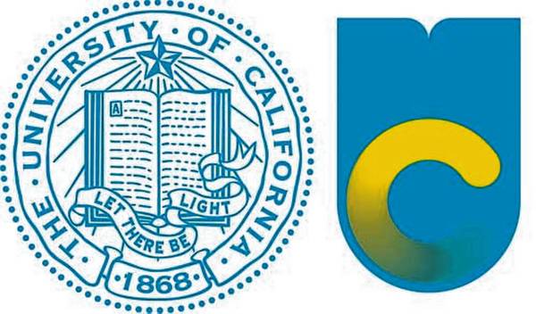
Since we're a board of conservative people who hate change, I present UCal's amazing misstep in branding. Their logo change:

Frozen loading bar or flushing toilet, you decide. Whatever it is, it isn't higher education. At the end of the day, let us just be thankful that Dave Brandon has yet to hire the design firm who performed this fuckup.
December 12th, 2012 at 3:57 PM ^
I find the full C (not the gradated one in yellow) in the picture you give here is a huge improvement. Mainly because it prevents it from looking like a loading icon. Most of their press is using the loading icon though.
December 12th, 2012 at 6:16 PM ^
btw that film clip is so so good.
December 12th, 2012 at 3:56 PM ^
The university response has been that a logo is not the same thing as the seal. The logo is not replacing the seal, it is serving a different function. Just like Michigan has a seal and the block M. The script "Cal" plays a role somewhat similar to the block M, but refers solely to the Berkeley campus.
So the idea of a UC logo is not necessarily a terrible one, but the one they came up with is certainly terrible.
On the other hand, I think people might be overestimating how often it will get used. There aren't really that many occasions to publicly refer to the UC system as a whole. People normally treat them as distinct institutions, which for most practical purposes they are. That being the case, however, why not just use the seal in those occasions?
December 12th, 2012 at 6:27 PM ^
I have to imagine that after the UC system paid some design firm $50k to design that, that they'll find ways to make sure everyone sees it
December 12th, 2012 at 6:54 PM ^
There is no way there was a design firm that built it. It was likely in-house marketing that created it.
December 12th, 2012 at 7:14 PM ^
Their website says the work was done in house and took three years.
I've been in the graphic design biz for over thirty years, and one of the unspoken rules for situations like this always has to be "first, do no harm." When the immediate visceral reaction of designers and non-designers alike is that the marks look like a coiler in the dumper or a toilet seat, the design process was not over yet. By a long shot.
December 12th, 2012 at 4:15 PM ^
At first glance I thought it was some form of a new Hartford Whalers logo
December 12th, 2012 at 5:51 PM ^
Quick, you are unfamiliar with the logos on the left and right: tell me what they represent?
If this question cannot be answered instantly: YOU HAVE FAILED AT BRANDING.
Alternate comment:

December 12th, 2012 at 6:57 PM ^
it's usually not the designer's fault. It's usually the client. Most designers are you know good at designing.
This was likely done by an in-house design group, not an agency or "design firm," and was overdirected by the people who had the idea to redo the logo.
December 12th, 2012 at 7:49 PM ^
Do they go by UCal? I thought they were just Cal.
December 13th, 2012 at 11:13 AM ^
I think they're called either Cal or UC-Berkeley.
December 12th, 2012 at 8:06 PM ^
December 12th, 2012 at 8:50 PM ^
Somebody got paid $500,000 this year for doing things like this. I want them to DIE!
December 13th, 2012 at 3:17 AM ^
"Fat Samurai" was one of the more complimentary nicknames for this thing:
 Not only was the symbol not striking, memorable, or sipid in any way, shape, or form, but many alums of CWRU were offended by the effort to rebrand the school as "Case", seemingly making the Western Reserve half of the two merged schools less important.
December 13th, 2012 at 8:29 AM ^
for use of the lost positive "sipid". I would like to start a list, and bring them all back from the byss.
Whoa! A temporary karma level of 2 for me, thanks to the posbang thread.
December 13th, 2012 at 9:52 AM ^
with the old logo? Were there slaves? Oppressed indigenous populations? Did it celebrate pollutants or promote rabid homophobia?
It was a pretty generic, harmless seal with you know, kind of a positive knowledge-based slogan.
Must have been lacking in WOW.
The new one is more boring than the old one and resembles a cross between a tounge with a yellow gummy worm on it & the dearly departed Hartford Whalers.
December 13th, 2012 at 10:15 AM ^

Looks like that fucker finally got to Pacman. Now he's sleeping or something, didn't even have the decency to digest him properly...

