


February 29th, 2016 at 9:14 AM ^
I don't hate it...what I do hate is the new away shirt.
February 29th, 2016 at 9:25 AM ^
February 29th, 2016 at 9:28 AM ^
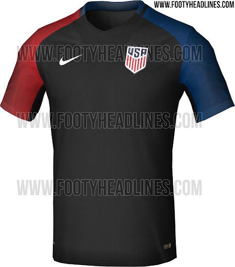
Ahhh America: The Red. The Black. And the Blue.
February 29th, 2016 at 11:25 AM ^
Sent from MGoBlog HD for iPhone & iPad
February 29th, 2016 at 9:40 AM ^
Yuck.
These "designers" are just people who throw crap out there because they are bored.
Get somebody to do it who really cares about the team and not themselves.
February 29th, 2016 at 9:54 AM ^
So they are like sports' bloggers.
/jk
February 29th, 2016 at 9:48 AM ^
Well at least it's not the rocket pops jerseys they wore for the 2014 World Cup, I am still not sure what they were thinking.
Also if the Raiders and Newcastle have taught us anything it's that Black Uniforms intimidate absolutely no-one anymore if they ever did.
February 29th, 2016 at 9:52 AM ^
The rocket pop jersey is better than that black pos or the white, black, and lime green trash uniforms the USWNT had to wear for the World Cup.
February 29th, 2016 at 1:38 PM ^
I like the women's black kits better but these aren't terrible.
February 29th, 2016 at 9:28 AM ^
That jersey is an abomination.
February 29th, 2016 at 9:33 AM ^
I mean, if Mexico & Ohio State both do it...


...it's quite clearly an awful, awful idea.
February 29th, 2016 at 9:17 AM ^
Nothing special, but solid. Nothing to really complain about.
Like the above said, if the leaks we've seen for the away shirt are true.....yuck. Looks like a warmup, not for a game. Really hope those were intentionally misleading leaks.
February 29th, 2016 at 9:17 AM ^
Centennial Crest was still so much better. I mean, this is clean, classic, and bold. But I also know that the use of stars in a crest are controversial in soccer circles.

February 29th, 2016 at 9:54 AM ^
Sent from MGoBlog HD for iPhone & iPad
February 29th, 2016 at 1:27 PM ^
Normally...
Stars above the crest: Championships
Stars inside the crest: Symbolic

February 29th, 2016 at 2:50 PM ^
Not always.
February 29th, 2016 at 3:20 PM ^
The Italians are one of the few exceptions... I think the point holds regardless.
February 29th, 2016 at 9:57 AM ^
Given the USMNT has won nothing, stars in the crest seems awfully presumptuous.
February 29th, 2016 at 11:26 AM ^
but its the distinguishing trait of our flag. If people get pissy, let's up the ante and make a crest with 50 stars in it and then steal their oil
February 29th, 2016 at 9:18 AM ^
Wait, does this mean the road shirt will be black? Because if so, that's fucking awful.
February 29th, 2016 at 9:18 AM ^
I like it. It's simple. Also, I think it's probably appropriate to remove the stars given that they normally stand for world titles.
February 29th, 2016 at 9:24 AM ^
The women wore black kits in 2011. Did not hate it. Kinda badass.
/cdn0.vox-cdn.com/uploads/chorus_image/image/47381458/GettyImages-118738010.0.jpg)
February 29th, 2016 at 9:25 AM ^
Hate. Fucking terrible.
February 29th, 2016 at 9:47 AM ^
Haters gonna hate. Doesn't make my opinion incorrect. I'm sure that Nike will call you next time to see what you think first.
February 29th, 2016 at 10:54 AM ^
...for teams without black in their color scheme, your opinion is incorrect. I'm sorry, Tyrone.
February 29th, 2016 at 1:32 PM ^
Agree to disagree. Let's just smoke this peace pipe?
February 29th, 2016 at 9:31 AM ^
German men wore black and it was pretty badass. Black and Germans kinda go together. haha. Say what you want about the Nazis, but their uniforms were sharp!
The uni above looks like a soccer jersey that a communist dictator or Hilary Clinton would wear.
February 29th, 2016 at 10:42 AM ^
Sent from MGoBlog HD for iPhone & iPad
February 29th, 2016 at 9:51 AM ^
Agree, but at least theirs were more of a clean look, the black with the red and blue looks like a warm-up shirt.
February 29th, 2016 at 10:13 AM ^
But:
- the red piping looks like some sort of camp lanyard;
- the mini-collar invokes asian semi-formal wear as you might expect to see on the hostess leading you to your table at a pretentious Chinese restaurant;
- no way the sleeve patch (which must be for the World Cup) should be larger than the logo crest
February 29th, 2016 at 9:28 AM ^
than the college football national championship logo.
So I guess thats a plus. or not.

February 29th, 2016 at 9:46 AM ^
Wow. The designer and the person that signed off on this logo probably shouldnt be placed in charge of children.
February 29th, 2016 at 10:44 AM ^
I mean, wow. Presumably there was a meeting where options were discussed and a room full of people saw this and not one of them said anything?
February 29th, 2016 at 5:08 PM ^
I'm sure they all thought it, but were too afraid to say anything . . . just in case nobody else actually thought it. You wouldn't want to be the sole voice on that one.
February 29th, 2016 at 9:34 AM ^
February 29th, 2016 at 9:36 AM ^
Sent from MGoBlog HD for iPhone & iPad
February 29th, 2016 at 9:41 AM ^
Looks more soccer-y. It also gets rid of the cartoonish ball flying through the symbol like we're some sort of U-10 rec league.
February 29th, 2016 at 9:42 AM ^
I like the 1995 logo. But I wish the stars were real on the men's side.
February 29th, 2016 at 9:55 AM ^
February 29th, 2016 at 10:03 AM ^
I think the new crest is fine. The Centennial crest is still better.
Nike needs to put together some better uniforms, though. The past few have been really bad.
February 29th, 2016 at 11:52 AM ^
There have been some bad ones...


And some good ones...


February 29th, 2016 at 11:57 AM ^
I actually didn't mind the red sash jersey, either.
White Centennial is the best Nike has done.
1994 Stars and Stripes was adidas, of course.
February 29th, 2016 at 12:06 PM ^
I liked these, too:

February 29th, 2016 at 12:25 PM ^
I'd like the 2nd one in this list if you know maroon and black were our colors. I also liked the 5th one myself.
The 1st one is the type of kit you see on AYSO fields all across America on a Saturday morning. It is shockingly bad.
1) The Denim Kit, while ugly, is amazing and super iconic.
2) The BombPop shirt is horrendous
and 3) those 1950s retros are 'meh' at best.
But that's just my opinion.
February 29th, 2016 at 10:03 AM ^
but I have used my eyes before, and they say that looks pretty good.
February 29th, 2016 at 10:10 AM ^
LIKE IT! Classic. Clean. Strong. A very good upgrade over the current one..which is cartoonish.
February 29th, 2016 at 10:12 AM ^
Dislike. Too European (/ducks). The 1950 logo gives a nice throwback look without the stars - which shouldn't be included in our logo as stated upthread.
February 29th, 2016 at 10:13 AM ^
boosting bass & treble since 2016.