OT: New Tampa Bay Bucs Uniformz
The Tampa Bay Bucs have new uniforms for the upcoming NFL season. Dave Brandon do not look at this thread.
http://www.buccaneers.com/news/article-1/New-Uniform-Design-Unveiled/b8…

Maybe they will grow on me, but good God, those are pathetically bad.
Is there ever a new uniform that MGoBlog likes? The Ermahgerd Uniformz take is kind of trite.
For the most part, I like oregon's jerseys. I liked the first time Maryland came out with the slit flag uniforms. The army/navy alternates are always badass. The Vikings jersey in the NFL, Nike didn't mess that up.
I am a huge advocate of the Sugar Bowl uni's. And loved the under the lights ones. Also, the throwback MBB jerseys from last year were sick. Red Wings winter classic was a win.
So yeah. I like new uniforms. Unless they suck. These suck.
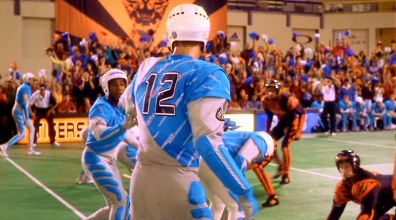
The new helmet started strong. Then the jersey just made them XFL caliber.
it is what Nike does. Its a step backwards for Tampa in my opinion.
This.
Their 80s uniforms were God-awful, and then they did a terrific job with the new ones. They went from my least favorite to my favorite uniforms in the NFL in one step. And now they get rid of them? And for that???
Hate the huge helmet logo. Give them a normal sized helmet logo and non-stupid numbers and I wouldn't hate it at all. The orange is a nice touch and goes well with the colors they have now. But as it is now it looks like the godless love child of Arena Football and the XFL.
Agreed, the logo needs to be reduced by 30%. It's a ziggy logo, way oversized to rest of area.
In all fairness, this is already better than than the alternate uniform design they didn't go with...

I'm sure someone more talented than I can do this with a football jersey
just scream out "SWASHBUCKLING" and "PIRATES", don't they?!!
/s
They actually mention in the article that the font/numbers are "inspired" by the blade of a sword. I dont mind the overall theme (love the big logo) of the uniform but its dumbass details like the numbers with the hard-to-see-numbers-because-we-shoehorned-a-fancy-pants-idea that get me and say...no. Just no.
They look more like they were inspired by a calculator display.
... as interpreted by some dork who thinks he speaks "Klingon."
If they're going to wear these atrocities, they should just bring back the goddamn creamsicle unis.
The numbers also apparently have reflective accents. So, no flash photography, please.
I like the darker coloured Pewter. I could do without the orange stripe and the numbers are look atrocious. also they should've changed the logo altogether or left it alone. Using the same one but enlarging it is silly.
Beats the all orange, creamsicle unis from the day.
Of course, they won a Super Bowl in those orange things. Just sayin' Lions...
was in san diego, attended with dad and brothers, and they most definitely did not have the creamsicle uni's. they also brutalized the raiders which is a blessing given that raider fans tend to be a blight on the world, much like buckeye fans, but with longer rap sheets.
trivia: my cousin did play for tampa bay back in the day, in the creamsicle uni's for 5 (long) years.
4-12
7-9
4-12
(New uniforms!)
?-?
Thank god another team is going to the color black with their uni's. I'm sure the Bengals, Eagles, Panthers, Saints, Ravens, Steelers, Falcons, Raiders, Cardinals, Jaguars and sometimes Lions were feeling lonely.
Amazingly, only 2 teams - Packers/Jets - use green.
Silver? Only Lions/Cowboys/Raiders/Panthers
Gold? Saints/Rams/Niners/Jaguars (kinda)
The bucs were the only team with that rust/chromish, brown/silverish color, and now they scrap (pun) it... Totally lame.
Patriots also wear silver helmets and pants.
but i agree with the arena league look of the jerseys,
they might look cool, but that shaded in shoulder thing makes it look cheesy, plus the helmet, yeah, too much.
The previous ones were much better.
I suppose these wouldn't be as "ugh" if the helmet logo were somewhat smaller and the numbering were something not reminiscent of my bedside alarm clock. Actually, the more egregious thing to me is the digital look, if you can call it that. It really does ruin it for me. As others said, as they are, I would think these were XFL or Arena League if the Buccaneers logo (plus the fact that the impending change was known) weren't a dead giveaway.
the numbers look exactly like a bedside radio/alarm.
I'm still partial to the inaugural Tampa Bay uni's. The helmet logo was fantastic.

This looks like one of those uniforms worn during the "future football" game in Starship Troopers.

was so damn hot in that movie.
so of course their asswipe marketing geeks decided they needed changing, because revenue streams.

