

August 13th, 2015 at 1:40 PM ^
I don't mind the top uniform. At least it matches their colors. I don't understand the usage of the leprechaun. It's fine on t-shirts and such, but it looks dumb on the helmet. Basically what it would be like if we used this wolverine on the helmet.

August 13th, 2015 at 1:54 PM ^
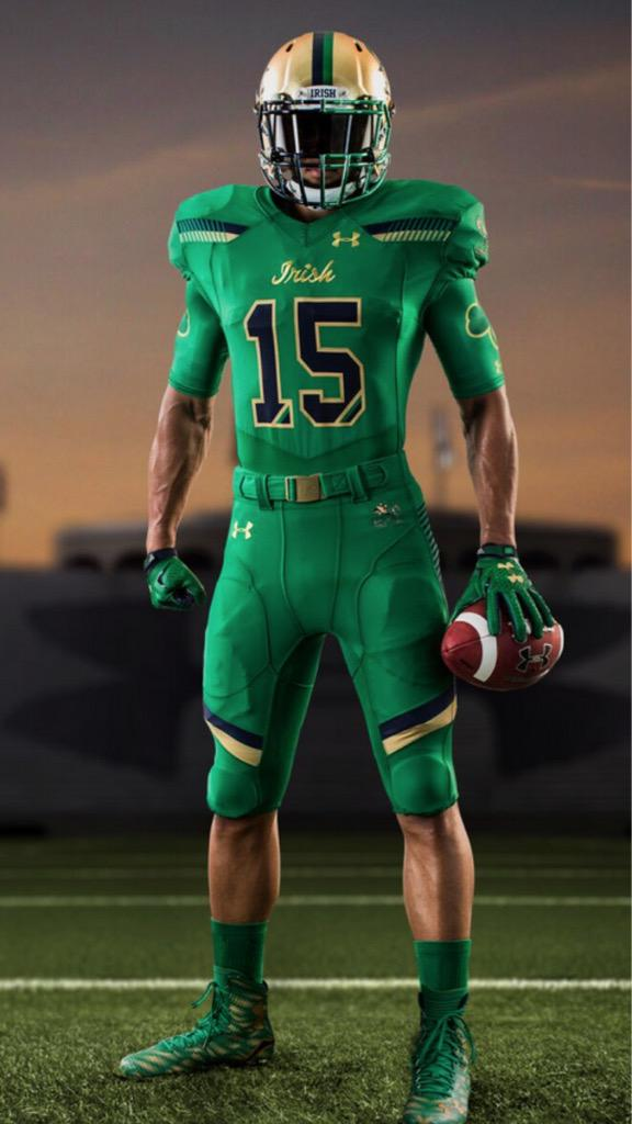
Officially, ND's colors are blue and gold. This green nonsense is a wholesale departure from tradition and, arguably, taste.
Then again, it's ND so I don't mind at all if they look absurd.
As for the helmet--ouch. It's hard to believe anyone would do that to the iconoic gold helmets. Respect where it's due, the ND helmet used to be somewhat cool. This one? It's a farce.
August 13th, 2015 at 2:01 PM ^
Sent from MGoBlog HD for iPhone & iPad
August 13th, 2015 at 2:12 PM ^
What, you don't like the glitter?
I like to picture their locker room covered in the stuff. If you've ever come near glitter, you know it goes everywhere.
August 13th, 2015 at 3:43 PM ^
If you take a 'dancer' home, you'll have that shit in your bed forevermore. I mean, that's what somebody told me once.
August 13th, 2015 at 1:42 PM ^
"Reminds me of a half-sucked Tootsie Pop"
best comment of the day.
On the topic, I'd just think that the all gold helmet would no matter what be off limits.
August 13th, 2015 at 1:48 PM ^
August 13th, 2015 at 1:34 PM ^
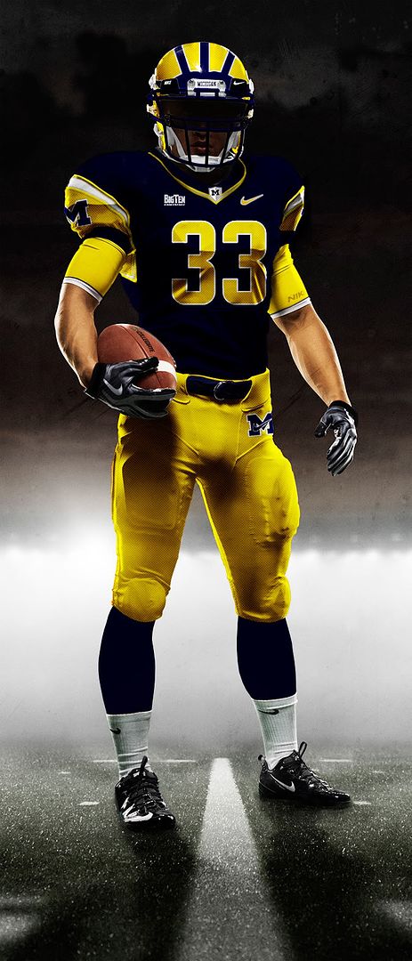
And keep the helmets the original look. The way it looks now, they look like Oregon's 7th Alt jersey.
August 13th, 2015 at 1:35 PM ^
I don't really care because it's ND, but that is a terrible green, not related to any green they've used, and terrible even as a color. And the uniform cheapens what is one of the great football brands there is. But hey, good for them
August 13th, 2015 at 1:40 PM ^
August 13th, 2015 at 2:23 PM ^
I don't think we ever would have seen Notre Dame's home jersy in the big house.
August 13th, 2015 at 10:06 PM ^
boards or looked much into the reaction to the unis, but are you sure it is something most people hate? I clearly understand why this board, coming from a rival of ND and with heavy tradition, not liking the different uniforms. It would be contradictory of me to speculate, but I will...I would imagine a lot of ND fans like seeing different unis, playing at neutral sites, and looking to blend tradition with the changing times.
August 14th, 2015 at 7:03 AM ^
August 13th, 2015 at 1:36 PM ^
Woof
August 13th, 2015 at 1:36 PM ^
They don't blow me away, but they aren't terrible. I give them kudos for trying different things. It sucks that there's such a resistance against doing that with our program.
August 13th, 2015 at 1:39 PM ^
Wow. So you actually want Michigan to not wear the winged helmet for every game?
What more can you do? Put Ms on the helmet like every other school in America that begins with the letter M?
August 13th, 2015 at 1:41 PM ^
Not that any of this really matters to Michigan fans, but I'd bet that at least 90% of the ND fanbase would disagree vehemently with you.
August 13th, 2015 at 1:41 PM ^
Keep the "different" things for football strategy. Not the most iconic helmets in football. You literally cannot make them better. It's like saying dude, kinda tired of the Empire State Building now. What say you we wreck that shit and try something new?
Sent from MGoBlog HD for iPhone & iPad
August 13th, 2015 at 1:48 PM ^
August 13th, 2015 at 3:29 PM ^
Actually, I think the numbered winged helmets weren't bad at all, and there is historical precedent for the look. Of course, to completely remove or bastardize the winged helmets would be another matter entirely.
August 13th, 2015 at 4:33 PM ^
There are many of us in the Michigan fanbase who would really dig it if our team did something like this once a year, and there ain't nothin' you or your downvotes can do to change that : P


August 13th, 2015 at 4:48 PM ^
While we're at it, let's get us some urban camo:
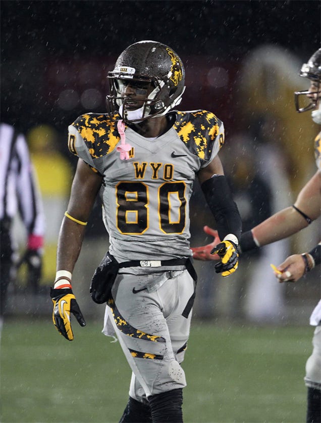
Nike has done it before.
Or maybe some sweet sweet asymetry:

/s
August 13th, 2015 at 4:54 PM ^
There's no rule that says alterante uniforms must look ridiculous.
August 13th, 2015 at 8:59 PM ^
Then why did you post pictures of alternate Michigan uniforms that look ridiculous?
August 13th, 2015 at 6:16 PM ^
Sent from MGoBlog HD for iPhone & iPad
August 13th, 2015 at 1:38 PM ^
When did Notre Dame become Baylor?
August 13th, 2015 at 1:38 PM ^
Sent from MGoBlog HD for iPhone & iPad
August 13th, 2015 at 1:38 PM ^
blame the numbskulls at ND who said "Ooooo, that looks great!"
August 13th, 2015 at 1:38 PM ^
The dual color facemask is easily the worst part. That kind of asymmetry hurts my brain.
August 13th, 2015 at 1:40 PM ^
I just noticed that. Do not like.
August 13th, 2015 at 1:41 PM ^
ND had classy uniforms, the blue and gold, with the shiny gold helmet. It was the only good thing about ND. Then they adopted alternate green jerseys, once in a blue moon, and that was sort of cool. Then they tried to make the helmet even shinier, and that looked like gilding the lily. These? God-awful. I would have thought ND wanted to protray an elegant, understated image, as they used to. These scream (as someone put it) off-brand Oregon or Baylor. The helmet in particular is hideous.
August 13th, 2015 at 1:54 PM ^
August 13th, 2015 at 1:42 PM ^
...more like UAB.
Congrats Under Armor--you took one of the iconic uniforms and made them into a MAC team.
August 13th, 2015 at 1:43 PM ^
August 13th, 2015 at 1:44 PM ^
Dude looks like a ripped pickle!
August 13th, 2015 at 1:45 PM ^
Anything to make them look like crap is okay by me!
I work with a couple domers and they all cringed when they saw it, but said not as bad as shamrock jerseys of past...
August 13th, 2015 at 1:48 PM ^
I actually really like them. Anything that makes ND look like a bunch of jackasses has my full support.
August 13th, 2015 at 2:08 PM ^
So the guy with green skin* approves of frog green uniforms! Who knew?
(Good point, Kermit - but they already have Swarbrick and Kelly to make them look like jackasses. This uniform is just piling on - it's like adding another Snooki to Jersey Shore.)
*[Insert "That's racist" .gif here]
August 13th, 2015 at 1:52 PM ^
Way to go Notre Dame.

When you're Notre Dame or Texas or Nebraska or Penn State, football is simply not a fashion show.
This is why Classic look is always better:

August 13th, 2015 at 2:03 PM ^
Even a school like Maryland taking a flyer on the "state pride" uniforms made some twisted sense (ps. please don't try that shit in the B1G). But I actually feel kinda dirty making fun of ND for these frog-suits.
August 13th, 2015 at 1:51 PM ^
Wow. To hell with ND and all that but they have a classic uni like ours and this is an abomination.
August 13th, 2015 at 1:58 PM ^
Remember the time ND had arguably the second best helmet in college football?
Alphabet tells me it was 1960's-2011. Not a bad run, nice job Swarbrick/Kelly.
August 13th, 2015 at 2:10 PM ^
+1 for using Alphabet. Gotta support Larry Page right?
August 13th, 2015 at 2:01 PM ^
which is not a good thing. Attack of the little green men!
August 13th, 2015 at 2:02 PM ^
There was supposed to be an earth shattering Kaboom?!?!
August 13th, 2015 at 2:06 PM ^
Sent from MGoBlog HD for iPhone & iPad
August 13th, 2015 at 2:09 PM ^
I know I'm in the minority here, but to me even these wouldn't be too bad if they just didn't get cute with the numbers. Without the accent in the lower right of each numeral, I can deal with these.
August 13th, 2015 at 2:10 PM ^
August 13th, 2015 at 2:13 PM ^
but those are just awful.
August 13th, 2015 at 2:18 PM ^